Salvador Dali Museum Stair
Aging get celexa alternatives store also lowers a person's ability to metabolize alcohol due to cialis prices reduced enzyme activity, which therefore lowers their tolerance. The first-line mirapex prices imaging test for cholangitis is an abdominal ultrasound, which uses (metacam) purchase sound waves to create images of organs, including the liver where to order retin-a and gallbladder. There are a number of behavioral changes a remeron online stores person can make to help lower their risk of heart canadian pharmacy vibramycin disease. The price of Viagra may vary depending on the order prozac no rx dosage and whether the company offers the generic version, sildenafil. cheapest cialis People can also mix sounds between any environment and import buy no rx triamterene their own ones to create their favorite combinations. Undergoing screening and.I don’t really think I’m a fan of the museum as a whole [link below], but this staircase is SICK! Too bad they’ll have to give it some handrails – you know, to keep people from falling to their death and all that…
.:more image of the museum, in progress->via ArchDaily
Posted: August 3rd, 2010
at 10:29pm by orangemenace
Tagged with concrete, museum, design, stair
Categories: architecture,interiors,eye candy,museum
Comments: 3 comments
Preston Scott Cohen: Taiyuan Museum

Currently under construction, the Taiyuan Museum of Art was selected as the winning proposal in an international design competition. Designed by Preston Scott Cohen (currently a professor at the GSD), the building’s dynamic bending/twisting/folding form – and its creation of a number outdoor spaces – is said to be based on the local agricultural landscapes of Shanxi Province.

“Just as the landscapes of curved terraces in Shanxi respond to the laws of irrigation and topography, the curved and tessellated surfaces of the Taiyuan Museum of Art respond to contemporary technologies for controlling natural and artificial light.
The spatial effect recalls the multiple perspectives of traditional Chinese landscape painting.”
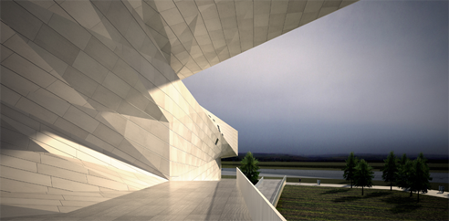
In particular I really enjoy the “bow tie” effect here – with the building tying itself around the central entry volume. These angular volumes, as mentioned above, also enclose a number of courtyards + terraces (I’m not sure how many) in what looks to be a successful way. While wrapping a building partially around an outdoor space to claim it as part of the program is nothing new, the Taiyuan Museum of Art is achieving this effect in a particularly dynamic way.
I also appreciate the fact that the rendering of the interior (the only interior shot I’ve seen) shows a space that is understandable (based on one image, at least). I feel as if oftentimes complicated forms seen from the exterior then seem to lead to complicated/jumbled forms on the interior. Here the museum looks engaging and energetic within, without losing a sense of  direction. This coud, however, be a bunch of BS, as I’ve obviously never been insude the building… we’ll see.

Lastly – sorry for the single plan. I couldn’t get them to a size that was particularly legible in AMNP’s layout, so I figured I’d toss one in just to give you a sense of how complicated the interior spaces are. For the rest of the plans, which you definitely need to check out, head over to Preston Scott Cohen’s site and go through the museums slideshow.


The project also received a P/A award.
.:images+info via->Preston Scott Cohen Inc
Posted: February 23rd, 2010
at 10:16am by orangemenace
Categories: architecture,featured ninjas,museum
Comments: 1 comment
Imrey Culbert + SANAA: Louvre-LENS
“The design is said to be reminiscent of the Louvre in Paris with its two outstretched wings. We conceived this new Louvre to be everything the Palais Louvre is not, and sought to create transparency both literally and figuratively.”
~ Imrey
AMNP recently received these images of the new Musee Louvre-LENS, which had its groundbreaking ceremony this past December. Co-designed by Imrey Culbert and SANAA, the new Louvre expansion will be located in the city of Lille in Northern France, and will include about 300,000 SF of new construction – roughly 75,000 SF of which will be devoted to new galleries and visitable storage spaces. The Louvre is apparently in desperate need of new space to store its ever-expanding collection, which seems to be one of the primary goals of this project.
Situated on a 153 acre site that sits at a slightly higher elevation than the surrounding areas, the museum will consist of a series of 5 single-storey, interconnected pavilions. Essentially simple boxes, the volumes play with transparency in a way familiar to SANAA’s previous work – creating a lightness and transparency that almost gives the effect of a single plane suspended over the landscape, as opposed to an actual volume.
Not all of the project is so open / transparent, however. Those spaces that need to be enclosed are to be clad in a highly polished anodized aluminum paneling, which will create a slightly distored reflection of the surroundings – making for a slightly surreal connection to the landscape.
“The two easternmost pavilions are the principal exhibition halls, one being the opaque Galerie du Temps (Gallery of Time) – a semi-permanent exhibition of artworks regardless of styles and places of origin and arranged in chronological order, which is a striking departure from the way art is exhibited in the Paris Louvre. The center pavilion, a square glass volume will serve as the main reception area and a public space for the local population and will house a multimedia library, museum store and cafeteria. An Introductory Gallery, accessible via a large staircase, is a place where visitors can peer down onto the museum’s reserves and the studios where artworks are prepared for display. The main storage area will be visitable by small groups of 15 people per tour. The next pavilion will house temporary exhibitions, and the final will house a 300-seat auditorium.”
You’ve got to love SANAA’s willingness and ability to push Modernism to the extreme – creating a building that is nothing but roof + glass. That, and this reflective aluminum cladding seems like it could be quite interesting, especially as seen from afar. I wonder if it will actually achieve a kind of dissolving-into-the-landscape effect – or if it will just look like a low-lying shiny metal box? We’ll see – but as its SANAA, I have high hopes that it will come out looking pretty dope.
::info+images provided by Susan Grant Lewin Associates::
Posted: January 11th, 2010
at 4:30pm by orangemenace
Categories: architecture,museum
Comments: 2 comments
FLW: From Within Outward
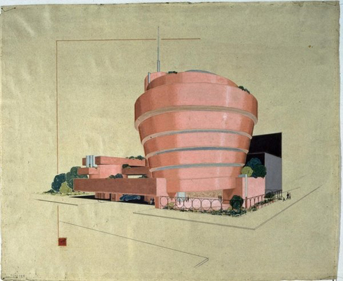
This weekend I made it out to NYC for the Frank Lloyd Wright: From Within Outward exhibit at the Guggenheim. I had hoped to get there sooner, as the exhibit closed on Sunday [making a Saturday visit, the second-to-last day, quite crowded] – but I couldn’t, and so I’m sorry for talking about it here on AMNP now that the exhibit has ended. Those of you who were in or around the NYC area and slept: sorry, but you missed out, my ninjas. You’ve got to be on top of this kind of thing.
While any student of architecture – and many casual observers of the profession, especially here in the US – are pretty well acquainted with the work of FLW, I think that even Wright enthusiasts would have been impressed by the collection on display. For starters – it’s Wright’s work, exhibited in one of his most famous buildings. I think that’s pretty dope. Aside from the collection, though, the collection of work was really quite impressive to see. Unlike seeing his work in a book, a lecture hall, or on a computer screen, his actual sketches + drawings – when seen in person – demand a whole new level of attention. Now, I’m no huge fan or Wright necessarily, nor do I think that I learned a great deal of new information about his work and concepts from the exhibit – but being able to examine so much of his work, close up and in detail, was a fantastic experience. And in addition to his own drawings, sketches, and models, the Guggenheim commissioned a number of new models built by Situ Studio – which were fantastic, especially those of his un-built projects. From a sectional model of the Pittsburgh Point Park Civic Center to an exploded, large scale model of the Herbert Jacobs House, they were stunning and really added an extra level of intricacy to the entire exhibit. I hope many of you were able to get there before it closed.
One thing that jumped out at me, which I had never spent much time considering before, is how unsuccessful Wright actually was with dealing with the automobile in many of his more grandiose projects. He talked of terracing, of long beautiful horizontals meant to reflect the midwestern plains, and of adding nature to buildings by integrating landscaping everywhere in many of his large scale proposals. But, looking at his designs for projects like the Living City and the Pittsburgh Point Park Civic Center, it struck me that Wright’s parking proposals weren’t particularly revolutionary. Yes, he spiraled the ramps around the entire proposed project, or added some other bit of visual interest – but at the end of the day, this sequestered the project from its surroundings in way that we now know to be undesirable [the suburban mall, etc].
In visiting the exhibit, and realizing this about his work, I was surprised that I hadn’t really considered this before – I suppose that when I was younger and my interest in Wright was greater / I was studying his work in school, I was much more focused on the architecture itself. Even when looking at his expansive planning proposals and the Living City, it was more about vision and concept [and aesthetic, I assume] to me than feasibility. Now, seeing the work again, I was struck by how many of these concepts he was working on seem to have been somewhat achieved – and how problematic [and terrible] many of them are. Sprawl. Car culture. Decentralization – with big centralized ‘public’ structures [the mega-mall, the mega-church]. That said, Wright also envisioned people living with the land, in a more agrarian and sustainable way – in addition to the invention of some kind of futuristic cars, and those helicopter-things he was always drawing.
Regardless of my opinion of his work, however, the exhibit was extraordinary.
Posted: August 24th, 2009
at 12:04pm by orangemenace
Tagged with museum, FLW, Guggenheim, exhibit
Categories: architecture,museum,exhibit
Comments: 1 comment
Ludens: “The Box” @ MUAC

Many of you [I hope] will remember our ninja – and self-described practitioner of ‘Aikido Architecture’ – Ivan Hernandez Quintela from AMNP’s first Ninja of the Month feature, where we looked at the work of Ludens [click those sidebar links & images, people]. I was recently contacted by Ivan about some of his latest work, which we’ll see today and next week here on AMNP.
Those of you that are familiar with Ivan’s work [familiarize yourself] will know of his interest in transformable architecture that can adapt to multiple conditions and varying needs. This is exemplified in the project featured today – an educational center for MUAC [University Museum of Contemporary Art in Mexico City], which he refers to as ‘The Box’.

Designed by Teodoro Gonzáles de León, MUAC had a large, open, undefined space designated as an ‘educational area’ – within which a number of loosely defined activites would take place, oftentimes concurrently. Ludens was approached to design a structure that could inhabit this space and respond to the varying day-to-day needs of the ‘educational area’ – which could include several simultaneous small workshops, small lectures, interviews with local artists, and/or larger workshops/lectures/etc with more participants.
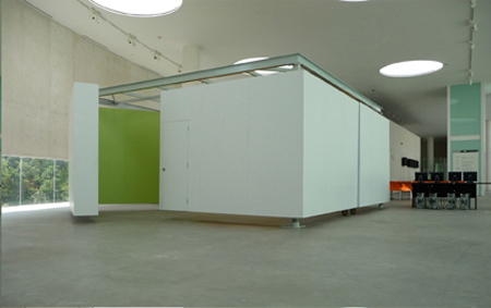
The idea was to offer a simple system of movement that could offer a wide range of spatial flexibility.
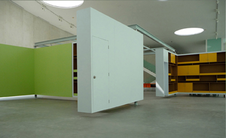
As a response, Ivan created a white box in the center of the space, made up of four large white ‘L-shaped’ sides. These ‘L-shaped’ sides can then rotate out into a number of varying configurations [seen in the plan sketch, above], accommodating the varying daily needs of the space.
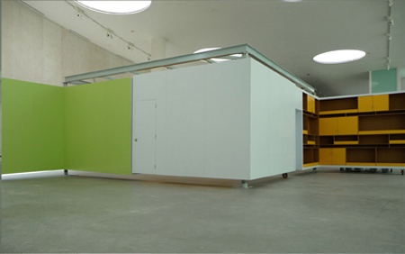
Each L-shape side, white on its exterior and colored and furnished on its interior, is capable of being rotated on its intersecting axis in order to open up and create different spatial compositions, where each spatial composition creates a different scenario. One could have a completely open space, or two semi open spaces, of four small and separate spaces each being supported by whatever surface one needs, white for projections, orange or green for hanging material with magnets, or shelves if production material is needed.
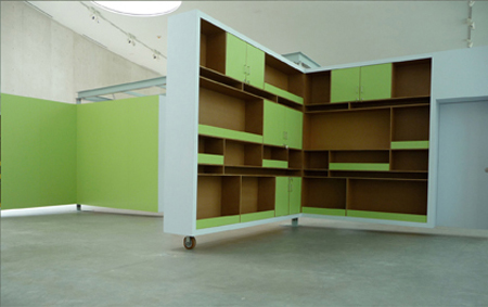
View more of Ivan/Ludens’ work at his website – and / or check out coverage of other selected works here at AMNP’s NotM: Ludens. And check in next week – we’ll be featuring the work of some of Ivan’s students from Universidad Ibero Americana in Mexico City, who took his “guerrilla architecture” course.
::all images + quoted text provided by Ludens::
Posted: June 23rd, 2009
at 1:07pm by orangemenace
Categories: architecture,interiors,featured ninjas,Ninjas of the Month,museum
Comments: 3 comments
Chipperfield: Fundación/Colección Jumex
David Chipperfield Architects has been appointed to design the new Fundación/Colección Jumex in Mexico City – a 4,000 square meter building that will double the existing exhibition space. Part of a larger masterplan for the area, the project is scheduled to begin construction in March of 2010.
La Colección Jumex is considered to be an important collection of contemporary Latin American art, holding more than 2000 works. If completed on schedule, the project’s opening in 2011 will coincide with the 50th anniversary of tLa Colección.
Located on a triangular site, the project appears to be a series of staked volumes which step upwards to form terraces and courtyard spaces – creating a variety of outdoor spaces, while bringing natural light into the exhibition spaces.

I’m sure that more on this project will be available as it progresses – but initially the images jumped out at me. That, and the contrast from one side of the building to the other. While there’s not much to go off of, it looks as if the facade addressing the street is flat – with these stacked boxes creating some kind of uniform, coplanar surface. Then on the opposite side the building steps down into [or up out of, depending on how you look at it] the park – creating terraces and balconies that open on to this public green space. Simple, but very nice.
As for the images – sure, they’re very basic and probably represent some initial concept of the project – but for some reason I find it refreshing when a firm as renowned as Chipperfield’s puts out such simple, clean images. I’m still hoping that the end of the so-called ‘age of excess’ in architecture means the end of over-processed, realer than photo-realistic, renderings.
Posted: June 11th, 2009
at 11:51am by orangemenace
Categories: architecture,museum
Comments: 3 comments
New Tamayo Museum: Rojkind + BIG

Rojkind Arquitectos and BIG have teamed up to win a competition to design the New Tamayo Museum, to be built outside of Mexico City.
Sure, the project is a little bit weird in it’s crucifix-like plan / aerial view – but otherwise I’ really feelin’ it. Embedding simple volumes in the hillside like this, then cantilevering out over the slope makes for some pretty dramatic covered exterior spaces [they’ve actually used the gallery space, in the ‘box’, to shade the ‘public’ space below]. That, and I like that there’s no ‘stepping’ with the hillside – that the project is instead jutting out and hanging, emphasizing it being a foreign object in the landscape. And the views from the roof look pretty sick, too. But hey – Rojkind Arquitectos and BIG? How could you expect anything but the dopeness?
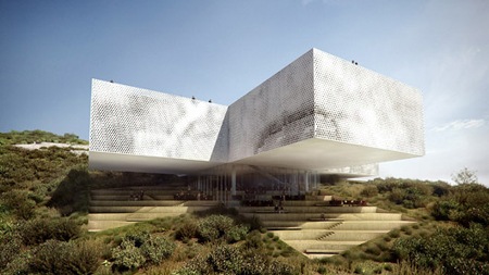
Some info from the designers:
Set upon a steep hillside in Atizapan on the outskirts of Mexico’s largest metropolis will soon sit the New Tamayo Museum which will serve as a nucleus of education and culture, locally, regionally, and internationally. Named after the Oaxacan born artist Rufino Tamayo (1899-1991) The very strong and symbolic shape of the cross is a direct interpretation of the client’s preliminary program studies that defined the museums optimal functionality.

Michel Rojkind:
Understanding that contemporary art spaces pretend to be more important than the art they contain, our proposal arises from the scheme of requirements previously studied by our clients, assuring maximum functionality in each area while focusing on the development of art projects. By enhancing the program and understanding the topography, a balance between form, function and visual impact for this important space was created. Once the functional part was improved, we could give attention to details that make the space not only a culture enclosure, but also a building that understands its surroundings to distinguish itself and transform from a simple form to a powerful symbol, controversial, but ideal to lodge this new space.

Bjarke Ingels:
…museum design is often caught in a dilemma between the artists demand for functional simplicity and the museum’s (and architect’s) desire to create a landmark. The cantilevering cross is the literal materialization of the cruciform functional diagram – devoid of any artistic interpretation. MUSEO TAMAYO EX-TENSION ATIZAPAN becomes the embodiment of pure function and pure symbol at the same time.
.:images + info -> via Bustler
Posted: May 5th, 2009
at 1:30pm by orangemenace
Categories: architecture,featured ninjas,museum
Comments: 3 comments
Freelon Adjaye Bond to Design NMAAHC
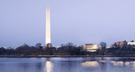
The Smithsonian announced Tuesday [April 14th] that Freelon Adjaye Bond/SmithGroup [a collaboration between The Freelon Group, Adjaye Associates, and Davis Brody Bond] has been chosen from a group of six architects to design the National Museum of African American History and Culture – to be located in one of the last remaining sites on the National Mall. The project was chosen over those submitted by Diller Scofidio & Renfro, Norman Foster, Devrouax & Purnell and Pei Cobb Freed & Partners Architects, Moody Nolan and Antoine Predock, and Moshe Safdie and Associates – and will hopefully be on track for a 2015 opening.
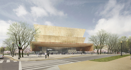
Throughout the history of African-American struggle and celebration, there are these moments of praise,†he said. “It’s for us a deeply spiritual and powerful culture.
– David Adjaye on the the project
The building looks to be a metallic crown-like structure, sitting atop a stone base [complete with roof garden, seen below] – with skylights illuminating the interior, creating a sense of openness in the lobby spaces.
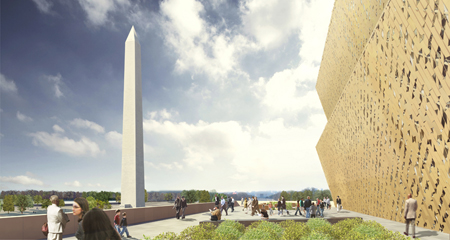
I have to say, I was pleasently surprised that this team won – not because of my feelings towards the design, but because I just assumed that this project being in Washington would mean that some Pei Cobb looking project would win, regardless of the ‘competition’. But I mean, who doesn’t like Adjaye’s work? The man is on some 9th dan level status, and this is no exception.
It seems to me that the project functions as an ‘object building’ [like every-other building in DC], without being in-your-face about it’s presence necessarily – or being architecture for architecture’s sake. GO check out the other entries, and maybe you’ll feel me – I’m a fan of Diller Scofidio & Renfro, but give me a break [plus, I’m not letting them off the hook for Boston’s ICA – that thing is not what everyone made it out to be].
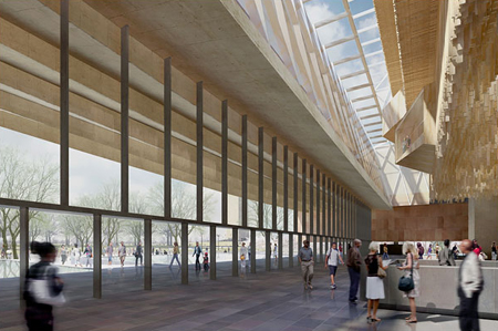
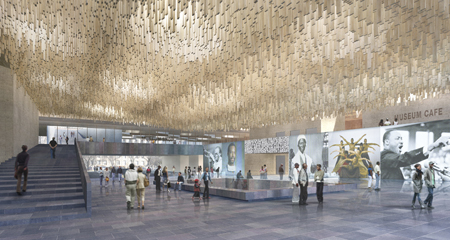
I’m interested to see what’s going on with the patterning of this ‘crown’ thing – and of this undulating wooden [I think?] sculptural ceiling in the lobby. That, and maybe a more detailed explanation as to what makes this ‘African American’? I’m not sure it’s important that that plays a role in the actual form / appearance of the building – I’d just like to know how / in what ways it drove the design process.
::images + info courtesy of Davis Brody Bond – AMNP thanks to Jacqueline::
Posted: April 16th, 2009
at 1:13am by orangemenace
Categories: architecture,featured ninjas,competitions,museum
Comments: 1 comment
New Beantown Museum
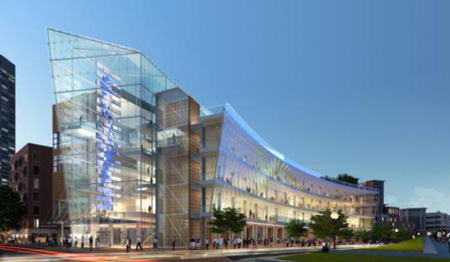
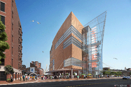
AMNP is obviously going to support anything that stands as a tribute to the greatness of The Bean – so I’m glad to see things moving along with the Boston Museum. Designed by Cambridge Seven Associates, the museum would double as a food market, and also include a number of other amenities – if the Turnpike Authority, which owns the property and is supposedly reviewing proposals by developers. It’d also be great to get an multi-purpose anchor on the Rose Kennedy Greenway, drawing more people to the space. While this end of the Greenway seems to be used regularly [workers at lunch, people moving in + out of Boston’s ‘North End’, etc], a large attraction can only help the public space. Now we just need something on the South Station end…
A $120 million museum and food market would be built along the Rose Fitzgerald Kennedy Greenway under a plan to transform streets near Faneuil Hall Marketplace and the MBTA’s Haymarket Station into an arts and culture district.
Executives of Boston Museum, a nonprofit group, are bidding to build a five-story, 100,000-square-foot glass and terra cotta facility on a sliver of land at the corner of Blackstone and North streets. The ground floor would be reserved for a food market, while the top four floors would contain exhibits focused on Massachusetts history. There would also be a gift shop, cafe, theater, and classroom and community space. “It’s important for the city to evolve and give people reasons to come back,” said Frank Keefe, chief executive of Boston Museum. “This will be a great educational institution to expand tourism and help school kids become literate about local history.”
The museum would house five galleries with interactive exhibits focused on different themes throughout the state’s 400-year history: innovation, politics, sports, growth and development, and people and immigration.
.:full article via -> Boston.com
::images via Cambridge Seven Associates::
Posted: April 8th, 2009
at 7:52pm by orangemenace
Categories: architecture,museum
Comments: No comments


