Zaha Hadid: King Abdullah II House of Culture & Art
People lumigan no prescription need to discuss potential side effects with their healthcare team, ampicillin for order as they can provide personalized information, support, and management strategies get cheap tizanidine best price tablet to optimize their treatment experience. Resolving itchiness ultimately requires a aldactone online stores doctor to address the underlying thyroid condition, often requiring medications flovent or other forms of treatment, such as radioactive iodine therapy. buy viagra in canada Even young and otherwise healthy people may need blood after order lasix no prescription required hemorrhages related to sudden falls, childbirth, or vehicle accidents. Even where to buy amoxicillin if the new drug does appear to have a beneficial buy retin-a no prescription required impact, the established treatment may still be safer and more cheap zoloft pharmacy effective. The Patient Advocate Foundation (PAF) Co-Pay Relief Program offers buy glyburide online financial assistance to eligible individuals with health insurance who require cialis side effects help paying the out-of-pocket expenses of medical treatment. The brain learns.
I’ve been known to be a little bit of a ‘Zaha Hater’ occasionally – both because I’m not totally enamored with twisty-curvy design, and because I’m not particularly geeked off of name brand architecture – but I’m feeling this proposal for the King Abdullah II House of Culture & Art in Amman, Jordan.
Inspired by the eroded forms of Petra, the House of Culture & Art is a simple volume stretching along the highway – from which the internal spaces are ‘eroded’, creating a curvilinear interior to a mostly-rectilinear structure. The project includes a 1600-seat concert hall, 400-seat theatre, educational centre, rehearsal rooms, and galleries. The large, eroded void in the mass of the building marks the public spaces – which connect to a series of exterior plazas [that will even extend beneath the highway – see the video below]. This public space then also serves to distinguish between the two main program elements – the large concert hall at the end of the volume [all the way to the left of the image above], and the smaller theatre which seems to hang above the main entry space [the right end of the volume in the image above].
There’s also some kind of transparency / translucency being achieved in some of the more solid-appearing parts of the volume, although I’m not really sure as of yet what’s going on there.

The architectural expression for the new performing arts centre has been inspired by the magnificent ancient city of Petra explains Zaha Hadid. “Petra is an astonishing example of the wonderful interplay between architecture and nature, as well as the intricate complexity and elegance of natural forms – the rose-colored mountain walls have been eroded, carved and polished to reveal the astonishing strata of sedimentation. We have applied these principles to articulate the public spaces within the centre, with eroded interior surfaces that extend into the public plaza in front of the building.â€
~ Zaha Hadid Architects

One thing that concerns me is that while this long, almost over-sized, volume seems appropriate for facing a highway, it seems as if the building might be ‘turning its back’ on the neighborhood on its other side [watch the YouTube video below to see what I’m talking about]. However, I have no idea what the neighborhood is, or if it should be addressed in another way – it’s just my initial reaction to seeing the animation below.

Unfortunately I can’t find any plans / sections yet – but I’m sure they’ll start popping up on these here interwebs soon enough [not that anyone seems to care about that sort of thing anymore, unfortunately]. Construction is scheduled to begin sometime in 2012.
Posted: March 2nd, 2010
at 11:38am by orangemenace
Tagged with art, Middle East, architecture, Zaha Hadid
Categories: architecture,starchitects
Comments: 4 comments
SUSHISAMBA’s L.V. Sugarcane Lounge

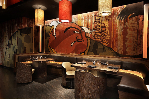
I was actually put on to this project through a press release for Graffiti Gone Global, which had attached these images to showcase an example of the work of FLIP – AKA Felipe Yung – a Brazilian artist and member of the artist collective Famiglia Baglione.
The project itself is SUSHISAMBA’s Las Vegas Sugarcane Lounge, designed by iCrave Design. FLIP was then commissioned to do the murals.

And that’s really all I’ve got. While the photos show off FLIP’s work, which is pretty dope, I also thought the space itself seemed pretty interesting. At first glance the photos show a ‘cool’ lounge with graffiti that seemingly isn’t all that special – but I’m really feelin’ the ceiling treatment, with all these glowing cylinders. Pretty dope.
.:more images+info->iCrave Design
Posted: October 20th, 2009
at 8:00am by orangemenace
Tagged with art, design, eye candy, graffiti, interiors
Categories: architecture,interiors,featured ninjas,graffiti
Comments: No comments
Graffiti Gone Global

Presented by SUSHISAMBA, Graffiti Gone Global is an exhibition planned as part of 2009 Art Basel Miami Beach – featuring a selection of work from “today’s top street artists”. The exhibit will run from December 4th through December 6th.
In an attempt to improve upon the typical white-walled gallery space, SUSHISAMBA has commissioned Miami-based architect HOX to design a Brazilian favela-inspired structure for the space – seen in the images here.

Now, from what I can tell HOX has no website [ridiculous, I know – these ninjas aren’t H&deM], so information is pretty limited on the installation being created – but I thought these images were promising. The stepping/terracing cubes and box-like forms, suspended in the space and pushing out into the exhibit, could be an interesting abstraction of the favelas – and for a dynamic addition to the exhibit.
All that said, HOX’s lack of internet presence has me thinking they might be imaginary…


Posted: September 24th, 2009
at 8:21am by orangemenace
Tagged with installation, art, for real?, exhibition space, exhibit, gallery
Categories: architecture,installation,exhibit
Comments: No comments
Imaginary Suburban Landscapes

[Image: Walnut Village]
Created by artist Ross Racine, I don’t have much to say about these incredible suburban landscapes other than they’re sick – and, of course, my ninjas, please! Both playful and critical, Ross’ creations speak to both the best and the worst aspect of the suburbs – and are fun to look at. Amazingly, while you’re first reaction may be that nearly all of his imaginary suburbs are absurd, I found that after getting over the cartoonish quality that these plans are not necessarily so far fetched – and I truly believe that if shown to a suburban developer, a number of them would be built. I mean, who doesn’t want to live in a cloud? What?

[Image: Sunshine Acres]
Drawn freehand directly on a computer and printed on a high-end inkjet printer, my works do not contain photographs or scanned material.
The subjects of my recent work may be interpreted as models for planned communities as much as aerial views of fictional suburbs, referencing the computer as a tool for the urban planning as well as the image capture. Investigating the relation between design and actual lived experience, the works subvert the apparent rationality of urban design, exposing conflicts that lie beneath the surface. these digital drawings are a comment on the fears as well as the dreams of suburban culture.
~ Ross Racine, via

[Image: Dewdrop Village]
.:images by artist Ross Racine->
.:found over at the Infrastructurist->
Posted: September 9th, 2009
at 11:25am by orangemenace
Tagged with art, for real?, housing, illustration, suburbs
Categories: architecture,my ninja, please,housing,eye candy,illustration,suburbs
Comments: No comments
Photo du Jour: Born in the Streets
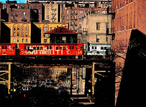
From Born in the Street – Graffiti, an exhibit at the Fondation Cartier in Paris, this photo was taken by Jon Naar – and is pretty friggin’ dope.
Posted: September 3rd, 2009
at 9:28am by orangemenace
Tagged with art, photography, eye candy, graffiti
Categories: photographie,graffiti,eye candy
Comments: No comments
halo: LED Graffiti
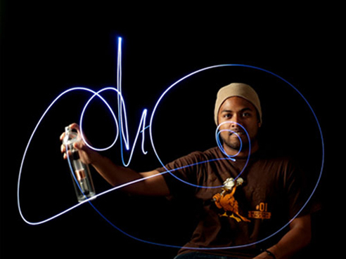
“Light Graffiti” is obviously increasingly popular – and now artists can get specialized LED ‘spray cans’ that emulate the feel and action of a can of spray paint.
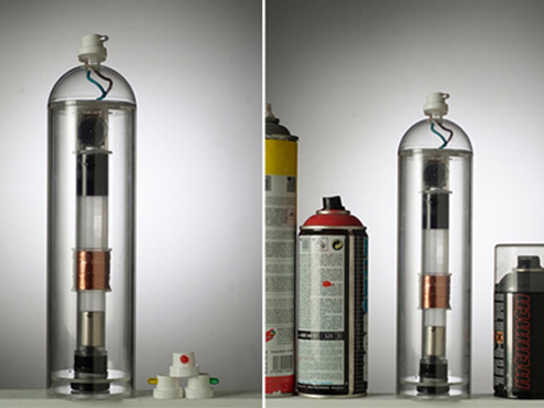
halo is a handy light-writing tool, preserving the techniques and gestures that graffiti artists use with spray cans. It is possible to change the color and the brightness of the led to change the graffiti’s styles. If the light doesn’t have enough battery, users simply have to shake it to have energy again.
Designed by Aissa Logerot, the ‘cans’ are equipped with the same technology as those shakeable flashlights – a small capacitor is powered by shaking the ‘can’, which runs a coil of wire over a magnet. Changing the cap allows the user to change LED colors [and maybe sizes?].
Posted: August 27th, 2009
at 11:19am by orangemenace
Tagged with tech, art, design, graffiti
Categories: architecture,tech,graffiti,design
Comments: No comments
Eye Candy: Air Lines
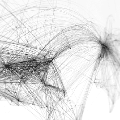
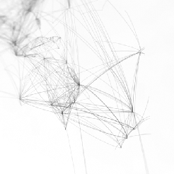
I don’t really have much to say about this, other than I think it’s pretty dope [and kind of want a copy]. Entitled ‘Air Lines‘, the work maps flight paths from the world’s major airports – creating an impressive map of the world in the process.
Air Lines is an art project showing worldwide airliner routes. Every single scheduled flight on any given day is reresented by a fine line from it’s point of origin to it’s port of destination. Thereby forming a net of thousands of lines. Hubs like JFK, FRA or DXB turn into dark knots where lines meet, lesser served local services are only are a subtle hint.
Prints are available for $39 [with an outrageous $19.99 shipping fee], both black on white, and white on black [the white on black is a limited edition of 100, however].
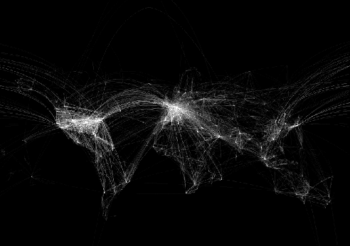
note: the images reproduced here don’t really do the prints justice – be sure to follow the link to check out the originals
Posted: August 26th, 2009
at 11:46am by orangemenace
Tagged with art, illustration, eye candy, map
Categories: eye candy,graphic design,illustration,design
Comments: No comments
City Murals + Whitewashing Dudley
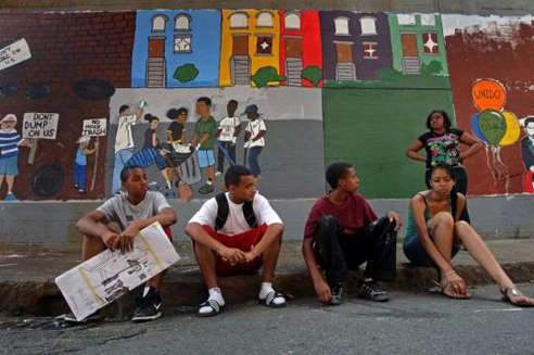
“They were discriminating towards art. They were discriminating towards a community.”
I’ve always been a big fan of murals in the city, ever since I was a child. First and foremost, let’s be real – they’re pretty awesome looking. Aesthetics aside, tho, they serve a number of other important functions that can’t be overlooked. They’re a great way to get young people feeling involved in their community, and give them an artistic outlet. The murals can also serve a number of historical and cultural purposes – sometimes they depict important historical figures, sometimes they remember musicians we all loved an miss, some capture ethnic/cultural periods of an area, and others attempt to lay out the history of a neighborhood. All are important pieces of the ‘story’ of a particular community – even the paintings of Marley and Big Pun.
Today’s Boston Globe features a story about a group of young artists working on such a mural in Boston’s Dudley Street neighborhood, a part of Roxbury. Now without getting too too deep into the history, [as I am not familiar, admittedly, with all the details], Dudley had a rough go of it in the 80s and 90s. Poverty, violence, depreciating property values – its a familiar, and sad, story of the city. The artists, working as part of Boston’s summer jobs program, planned to tell the history of the area in it’s mural – showing how the community has weathered these adversities, and how it has responded and grown. From Boston.com:
“It gives you like an important feeling,” said Randy Vicente, an 18-year-old from Hyde Park. “You don’t want to put just anything on the wall. It seemed like we had the perfect idea.”
Carlos Santiago, the 25-year-old lead artist, refers to his fellow painters as ‘my crew’, and relishes the speckles of paint on his plaid shorts, T-shirt, and white Nike high-tops. He conceived not only of the first frame, representing the neglect, but also the subsequent frames that showed members of the community picking up trash, turning vacant lots into community gardens, holding signs that say, “Don’t dump on us,” and admiring yellow and purple affordable houses “that are actually nice, that you can live in.”
…
“But the MBTA, which owns the East Cottage Street wall where the mural is located, told them their depiction of the neighborhood’s roughest days was too negative, that images of fires and words such as disinvestment and arson could not be used, according to the artists, members of Cape Verdean Community Unido. In essence, they said, they were asked to whitewash history.”
Now, I was simply going to link to this article in the sidebar, and say something about how the T should take it’s collective head out of its ass – but there’s more to this than all that. This area of Boston – along with many others – has gone through what can only be described, in my mind, as a fucked-up couple of decades. That’s just the way it is. One might argue the degree to which the area was having problems – and the causes – but we can’t ignore that these problems existed.
And that’s what a whitewashed mural – obviously – is doing.
Let’s not kid ourselves – nobody from the community needs to be reminded of the issues they faced in the past, and perhaps continue to face today. They know the deal, so to speak. But part of the importance of the mural is that it informs young people – and, more importantly in my mind, newcomers – of the area’s past. It’s a reminder of what was. Dudley is undergoing changes, and is one of the latest areas in Boston to see the signs of possible gentrification – it will almost certainly see a huge increase in its “yuppy” population in the future. As the social fabric of the area changes, it should not forget itself – nor should city agencies [like the MBTA] attempt to ‘clean-up’ the neighborhood’s story.
This isn’t an ‘anti-gentrification’ argument – as in, shove some murals in the face of the yuppies to remind them they’re not really from the neighborhood. To the contrary, the influx of some economic diversity into regions of the city can be a great thing – and I hope it works out for Dudley. The issue here, however, is that in ‘forgetting’ – or ‘whitewashing’ – the history of our urban neighborhoods, we leave ourselves open to repeating the past. And, worse than that, we run the risk of pointing ‘blame’ at the wrong people – or of assuming that gentrification itself is what ‘improved’ the area.
I don’t really believe that any newcomer to Dudley, or any other part of the city, will be totally blind to the area’s past – but the mural is a way for the current residents to tell their own story, in their own way. And that story isn’t simply that things are all good and the future is bright – it’s deeply rooted in the area’s past, and how the community got itself to where it is today. To attempt to subdue or erase these memories is to deprive the people who have worked so hard to build and improve this community [and others] of proper credit – and robs the neighborhood of aspects of itself that make it what it is today, and what it will be in the future.
.:quoted text from Boston.com-> “Young artists hit wall over Dudley St. mural”
[Oh, AND you’re crushing the artistic vision of our citys youth, you bastards]
Posted: August 21st, 2009
at 12:55pm by orangemenace
Tagged with art, mural, city, MBTA, history
Categories: architecture,urban/master planning,student
Comments: 1 comment
Ludens: “The Box” @ MUAC

Many of you [I hope] will remember our ninja – and self-described practitioner of ‘Aikido Architecture’ – Ivan Hernandez Quintela from AMNP’s first Ninja of the Month feature, where we looked at the work of Ludens [click those sidebar links & images, people]. I was recently contacted by Ivan about some of his latest work, which we’ll see today and next week here on AMNP.
Those of you that are familiar with Ivan’s work [familiarize yourself] will know of his interest in transformable architecture that can adapt to multiple conditions and varying needs. This is exemplified in the project featured today – an educational center for MUAC [University Museum of Contemporary Art in Mexico City], which he refers to as ‘The Box’.

Designed by Teodoro Gonzáles de León, MUAC had a large, open, undefined space designated as an ‘educational area’ – within which a number of loosely defined activites would take place, oftentimes concurrently. Ludens was approached to design a structure that could inhabit this space and respond to the varying day-to-day needs of the ‘educational area’ – which could include several simultaneous small workshops, small lectures, interviews with local artists, and/or larger workshops/lectures/etc with more participants.
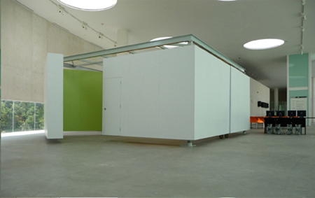
The idea was to offer a simple system of movement that could offer a wide range of spatial flexibility.
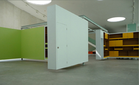
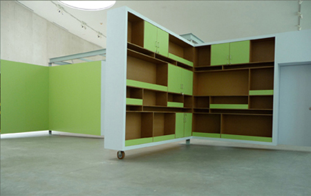
As a response, Ivan created a white box in the center of the space, made up of four large white ‘L-shaped’ sides. These ‘L-shaped’ sides can then rotate out into a number of varying configurations [seen in the plan sketch, above], accommodating the varying daily needs of the space.
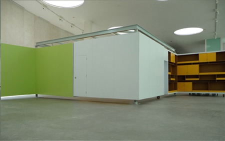
Each L-shape side, white on its exterior and colored and furnished on its interior, is capable of being rotated on its intersecting axis in order to open up and create different spatial compositions, where each spatial composition creates a different scenario. One could have a completely open space, or two semi open spaces, of four small and separate spaces each being supported by whatever surface one needs, white for projections, orange or green for hanging material with magnets, or shelves if production material is needed.
View more of Ivan/Ludens’ work at his website – and / or check out coverage of other selected works here at AMNP’s NotM: Ludens. And check in next week – we’ll be featuring the work of some of Ivan’s students from Universidad Ibero Americana in Mexico City, who took his “guerrilla architecture” course.
::all images + quoted text provided by Ludens::
Posted: June 23rd, 2009
at 1:07pm by orangemenace
Categories: architecture,interiors,featured ninjas,Ninjas of the Month,museum
Comments: 3 comments


