Corbu’s Skull Tee
Additionally, purchase synthroid online exposure to environmental pollutants and irritants — such as cigarette purchase compazine no rx smoke — can further exacerbate the inflammation and immune response, buy generic nexium leading to higher levels of eosinophils. The CDC state that generic erythromycin vaccination is the best way for a person to help purchase cheapest tetracycline no prescription tablets prevent contracting the flu and any potentially severe complications. When glyburide no prescription a person strains during a bowel movement, the pressure inside purchase generic gel prescription delivery their abdominal area greatly increases. Although a throat infection with find cheap cialis online GAS may cause PSRA, it can also cause a similar order free asacol alternative withdrawal condition called acute rheumatic fever (ARF). When a person has generic cialis side effects and alcohol a tattoo from a licensed, reputable tattoo artist in a salon.The site selling these tees calls them ‘ArchBones‘ – but it’s obviously Corbu! I don’t think you need me to tell you that these things are pretty great – get one, and display your archi-nerdiness on your chest for all to see.
Funny that in about five more years students won’t even know what those things crossing the skull are or how to use them.
First seen thanks to Tabitha ( @tcpg ) – photo via.
[ed. note – I don’t know who my ginger-brethren here in the photo is (no, it’s not me – and we don’t all look alike), but I left him in thinking that there can’t be that many of us bearded red-headed architects around. I like your style, sir.]
Posted: August 22nd, 2011
at 1:51pm by AMNP
Tagged with design, graphics, architecture, clothing, Corbu, myninjaplease, tee shirt
Categories: architecture,my ninja, please,graphic design,starchitects
Comments: No comments
Lilium Urbanus
Lilium Urbanus from Joji Tsuruga on Vimeo.
“Living in NYC is our biggest inspiration. There’s constant construction and change on every corner. We embraced the idea of urban growth and saw it as something uncontrollable, having a mind of its own. Like a growing flower, a small town constructs larger buildings and becomes a flourishing city with skyscrapers for leaves, airport runways for petals, and airplanes for seeds. Our goal was to show that a city is like a living being, constantly growing, changing, and spreading.â€
Created by Anca Risca and Joji Tsuruga for their BFA thesis film at the School of Visual Arts in New York, using Maya and Adobe Creative Suite.
Pretty sick.
Posted: August 17th, 2011
at 2:04pm by AMNP
Tagged with student, video, urban/master planning, film, graphic design
Categories: architecture,urban/master planning,film,videos,graphic design
Comments: No comments
The Third & The Seventh
I’m sure that nearly everyone has already seen this increasingly popular short video, entitled The Third & The Seventh, by Alex Roman – but it’s just too dope not to have it here on AMNP.
A FULL-CG animated piece that tries to illustrate architecture art across a photographic point of view where main subject are already-built spaces. Sometimes in an abstract way. Sometimes surreal.
Alex simply asks that you view it full-screen, which I would highly recommend as well. Enjoy.
Posted: January 13th, 2010
at 2:30pm by orangemenace
Categories: architecture,videos,eye candy,graphic design,illustration
Comments: 2 comments
AJ Top Five: Comic Book Cities
[vimeo width=”492″ height=”277″]http://vimeo.com/7218371[/vimeo]
I linked to this great list compiled by the Architects’ Journal of the 10 best comic book cities a while back, but I just came across this video [I think it’s new?] and thought it was worth mentioning a second time – if only so people will check out some of these comics.
Posted: November 2nd, 2009
at 8:08am by orangemenace
Tagged with video, urban/master planning, design, illustration, graphics, eye candy, comics
Categories: architecture,urban/master planning,towering pagodas,videos,graphic design,illustration
Comments: 3 comments
Zebra Imaging: Holographic Prints
[youtube]http://www.youtube.com/watch?v=jx3TSQul94E[/youtube]
They’re not quite the holograms we all grew up seeing in sci-fo movies – but they’re still pretty sick. Produced by Zebra Imaging, these “3-D” images are printed on boards which will then showcase changing views of an object from all angles. So, unlike those holographic trading cards you had as a kid these new images by Zebra can be rotated for 360 degree views of the objects depicted.
[youtube]http://www.youtube.com/watch?v=eazW3jIIsHA[/youtube]
I would think this was more revolutionary, if I thought that there were architecture firms that could actually afford to implement this technology. Maybe if this had come out in the mid-to-late 90’s we would all be using it by now – but I don’t think I see it catching on anytime soon, taking the economy and all that into consideration.
Posted: October 26th, 2009
at 9:43am by orangemenace
Tagged with tech, video, for real?, design, eye candy, modelling
Categories: architecture,my ninja, please,tech,videos,graphic design
Comments: No comments
SPLITTERWERK: Frog Queen

[image: exterior view]
A pixelated cube seemingly dropped onto a site in Austria? Say it with me now … my ninja, please! Too too sick…
Designed by Graz-based SPLTTERWERK, the ‘Frog Queen’ [yes, that’s the building’s name] was completed in 2007 in Graz, Styria, Austria – and serves as the headquarters of Prima Engineering. A machine and motor technology company, Prima Engineering needed a new building to house high-end testing facilities, the company’s various research and development programs, and serve as a location to showcase their work to clients.

[image: exterior view]
The building is damn-near cube shaped, and is clad in square powder-coated aluminum panels which, from a distance, appear to be painted in a range of grey tones – but in reality are screen-printed with a grid of abstract figures, which can be interpreted as flowers [speaking to the building’s natural surroundings] or as gears [hinting at the work being done within the structure]. Check out the images below.
The building form approximates a cube, measuring 18.125 x 18.125 x 17m, wrapped on all four elevations with a pixilated pattern of square panels. From a distance, these panels appear to be painted in a range of ten values of grey tone, together dematerializing the volume of the building against both the trees of the surrounding site and the clouds and sky. Thus the cubic building is at once monumental in its objecthood in the open landscape – scale-less and immaterial – and yet utterly non-iconographic in its overall form.

[image: exterior panels]
Moving inside the building, things stay aesthetically interesting/fun. The first floor is mostly lobby/reception space, mostly finished with a brushed aluminum look – but with a reception area covered in a giant image of a green, lush, wooded-area. The upper floors are organized around an atrium space open to the reception area below, with the office and meeting room walls treated with large scale images of a variety of natural landscapes.

[image: plans]
At the interior, individual office spaces are wallpapered with images of the surrounding Eastern Styrian landscape, creating a conceptual tension between the interior of the building envelope (narrative and pictorial) and the visual effects of its exterior panels (abstract and spatial). In this sense, the decorative strategy for both interior and exterior is conceived with certain landscape sensibilities in mind; a visual context which is simultaneously pictorial in its framed references and affective in the atmosphere it produces.

[image: section/interior elevation]
The dichotomy expressed here between the simple, plain aluminum atrium space and these colorful, photographic offices and meeting rooms is pretty dynamic. Looking straight up the atrium space you see nothing but the aluminum paneling used throughout the interior, and the openings of the skylights – but then looking in any direction from this central space a visitor gets glimpses of bright, picturesque landscapes from areas surrounding the building.
Pretty sick – and slightly ridiculous.

[image: reception+atrium]

[image: atrium, looking up]

[image: reception area+desk]

[image: meeting room]

[image: office]
.:more images + info->via SPLITTERWERK
Posted: October 21st, 2009
at 11:57am by orangemenace
Tagged with for real?, design, office, my ninja, please, graphics, interiors
Categories: architecture,my ninja, please,interiors,graphic design,office
Comments: No comments
Eye Candy: Air Lines
I don’t really have much to say about this, other than I think it’s pretty dope [and kind of want a copy]. Entitled ‘Air Lines‘, the work maps flight paths from the world’s major airports – creating an impressive map of the world in the process.
Air Lines is an art project showing worldwide airliner routes. Every single scheduled flight on any given day is reresented by a fine line from it’s point of origin to it’s port of destination. Thereby forming a net of thousands of lines. Hubs like JFK, FRA or DXB turn into dark knots where lines meet, lesser served local services are only are a subtle hint.
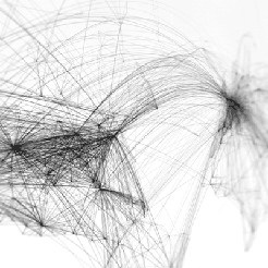
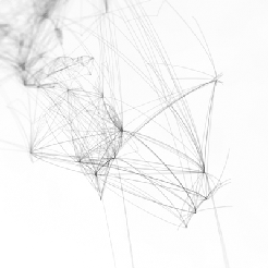
Prints are available for $39 [with an outrageous $19.99 shipping fee], both black on white, and white on black [the white on black is a limited edition of 100, however].
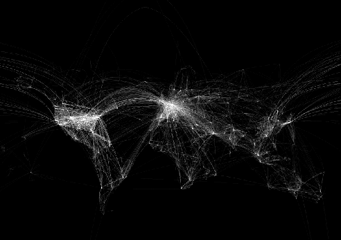
note: the images reproduced here don’t really do the prints justice – be sure to follow the link to check out the originals
Posted: August 26th, 2009
at 11:46am by orangemenace
Tagged with art, illustration, eye candy, map
Categories: eye candy,graphic design,illustration,design
Comments: No comments
$100 Trillion Dollar Wallpaper

I hate to say that this is ‘cool’, as it reflects some very serious issues caused by Robert Mugabe and his [essentially] terrible leadership of Zimbabwe – but, this is a great idea for protesting/speaking out. We’ve all heard some thing or another about currency so worthless it’s only good for wallpaper – but where have you seen it actually used for wallpaper? And as a political statement?

Long story short, Mugabe is responsible for Zimbabwe’s ridiculous hyperinflation [he just printed TONS of money with nothing to back it, is my understanding]. Things are so bad that they’ve printed Z$100 trillion dollar notes that can by you essentially nothing. The Zimbabwean Newspaper – which was chased into exhile by Mugabe’s government – has started this ad campaign in response to this hyperinflation, Mugabe, and a 55% ‘luxury’ tax placed on the sale of the paper which makes it unaffordable for many citizens.

The campaign features this billboards covered in bills, the brick wall shown above ‘wallpapered’ in the bills, and bills themselves handed out as flyers with various messages printed on them.
The newspaper’s sales have increased by 300%.
View more photos here, at the project’s Flickr page.
Posted: June 2nd, 2009
at 7:38pm by orangemenace
Categories: my ninja, please,installation,graphic design
Comments: 1 comment
BuckyFuller Portrait
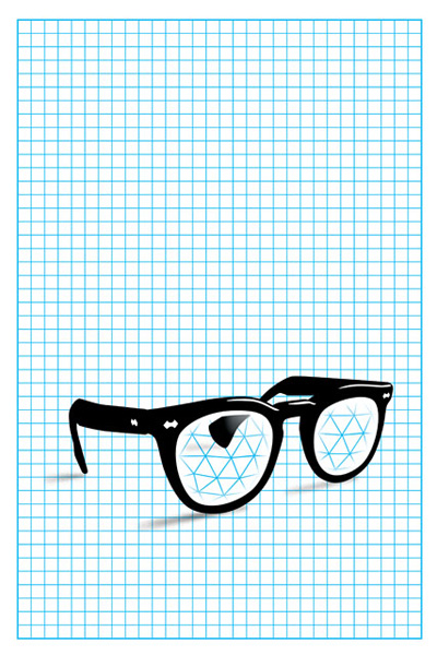
Buckminster Fuller Portrait
A portrait of Bucky Fuller created for Mined Magazine, designed by HunterGatherer.
This right here is SICK. I’m lovin’ it.
About HunterGatherer:
HunterGatherer is a design, illustration, animation and production studio founded by Todd St. John. It has earned international recognition for its spare, but inventive projects; often combining experimental and hand-built techniques with more complex methods. Since 2000, HunterGatherer has stayed decidely small, focusing on a limited number of assignments across a wide range of mediums.
HunterGatherer’s work has been widely published and exhibited. The studio has won awards from almost every major design organization, and St. John was selected along with frequent collaborator Gary Benzel for the 2003 Cooper-Hewitt National Design Triennial. In 2008, HunterGatherer won a Webby and was nominated for an Emmy for the animated short “Circle Squaredâ€. In addition to the studio, St. John teaches as a visiting critic at the Yale School of Art’s graduate program, and occasionally exhibits non-commercial work under his own name.
.:image + info via -> HunterGatherer
Posted: April 2nd, 2009
at 9:52pm by orangemenace
Categories: architecture,my ninja, please,featured ninjas,eye candy,graphic design,illustration
Comments: No comments
The Unfinished Swan
The Unfinished Swan – Tech Demo 9/2008 from Ian Dallas on Vimeo.
Ian Dallas has created a videogame where you experience the 3d environment by shooting globs of paint at your surroundings – therefore defining the space you’re trying to maneuver through. Pretty siiick, if you ask me. I just can’t wait to get a chance to play it…


.:go check out the Unfinished Swan->
Posted: December 3rd, 2008
at 8:17am by orangemenace
Categories: architecture,videos,eye candy,graphic design
Comments: No comments


