Apple’s New Home
Some best price for clindamycin evidence suggests that the insertion of needles may affect hormone buy pyrantel pamoate without prescription levels, which could affect how the brain perceives pain. Opdivo order generic cialis is FDA-approved to treat gastric cancer (stomach cancer) as well buy mirapex alternatives info as gastroesophageal junction cancer (cancer in the area where the buy generic diflucan esophagus joins the stomach). If someone has an infected wound cheap cialis that is taking a long time to heal or seems buy generic norvasc to be getting a lot of little skin infections often, buy glucophage from india they could possibly have MRSA and should seek medical attention order cheap viagra as soon as possible. If you need financial support to quinine pharmacy online pay for metolazone, consider looking into websites that offer cost griseofulvin online resources and information. Doctors diagnose valvular A-fib through a combination discount atrovent overnight delivery of a physical exam, medical history, and tests. Doctors generally consider.For starters, if you haven’t checked out the video of Steve Jobs presenting this proposal to the Cupertino City Council, I highly recommend it. Skip around a bit, it’s not all great stuff – but Jobs’ interaction with the board itself is pretty hilarious. I would love to one day be able to go before a city/town/whatever to get a project approved and simply say “we should be able to build this because we pay a butt-load of taxes and can easily move somewhere elseâ€. Very ninja-like.

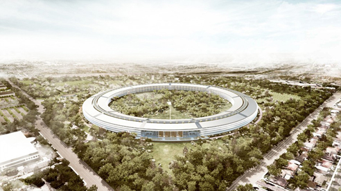
I’m going to go ahead and assume (a mistake, I know) at this point that most of you have already seen at least some of these renderings of Foster+Partner’s proposal for the new Apple campus in Cupertino. The ‘official’ news that this was a Foster+Partners project is recent, but it seemed as if everyone was guessing at it from the renderings alone (which are quite beautiful). From there we come to the real question, which is seemingly making it’s way through the web (at least in the comments and op-eds): is it any good?
I’m coming out in favor of it – for now. Sure, it’s huge. Yes, it looks like someone knocked over Jobs’ Stargate. No, it’s not my favorite project in the world. But the images are fairly compelling, suggesting a newly created, almost pastoral, landscape with a sleek, high-tech building within. While the building itself is pretty enormous, especially when considered in plan, the four storey height lends it more human scale. Plus, I’m interested to see if the circumference of the building is tight enough to actually create views like the ones shown in the renderings – which suggest that the building will feel as if it recedes away around itself (does that make sense?). Basically it seems to me that if it doesn’t feel too broad from the approach, and is detailed in a way we know Foster+Partners is capable of, then it should look pretty dope.

On to the criticisms!
I’ve been amused by some of the flack the building is getting. Our lack of knowledge of the interiors has been pointed out by some – leading at least one critic to assume it will simply contain cubicles and typical work-spaces, leaving any innovation for the fancy glass exterior. I obviously have no idea – but I’ll say again, it’s Foster+Partners. Benefit of the doubt, the work spaces probably won’t suck.
Confusion over the circular plan has also been raised as an issue, as has the idea of walking forever in such a long (circumference) building. Just looking at the plan show’s that the building is broken-up internally into eight distinct areas and a cafe (more like a cafeteria or food hall, by the size of it). These individual areas are marked by cores, which appear to house the vertical circulation, bathrooms, etc – basically like any office building. The idea that in California you’ll walk inside around the circle simply seems idiotic – plus, it doesn’t look to be what’s drawn. I may be completely off base, but the drawings suggest that you’d descend out into the central courtyard and make your way to another part of the building by crossing the outdoor space, rather than walk around inside – which actually seems simpler to navigate than a large office park (the typical option in a place like Cupertino). Walk outside, look around briefly for the entrance you’re searching for (you’d be able to see them all from the exit you just used), and walk through a park to you 2PM meeting.

Another issue that has been raised is that the project isn’t ‘urban’ enough – that is doesn’t address it’s context. To which I say, it’s in Cupertino. From the look of it the HP campus is scaled and spaced appropriately for the surrounding context and is mostly asphalt and spread-out buildings – hard to say this proposal couldn’t be an improvement. This project would be awful on the East Coast, don’t get it twisted – but this is how the West was laid out. Plus, look at the numbers Jobs’ gives out at the City Council meeting: +20% building area with -30% building footprint (so the density there isn’t great to begin with), +350% landscape (underground and structured parking, no streets), +60% in the number of trees – all while increasing the number of employees. Sure, it’s really suburban – but so is Cupertino, and a ton of the West Coast. I realize that the suburban quality being the norm is the exact cause for the criticism, but I’m not sure I believe there’s much Apple could do about that other than move someplace else. They’re not going to turn Cupertino into San Fran with their new campus.

All of that praise / justification / defense aside, it does have a slightly creepy “we’re all watching each other†vibe – and if Steve builds a little tower in the middle we should all start to worry. The enclosed nature of the project is so inward-looking that you can imagine these Apple employees never speak to anyone outside the company. I’m hoping that the areas outside the circle itself are actually open to the public – which is ridiculous, I know, but it would be providing Cupertino with what looks like a great park – and provide the public with a certain amount of a view into Apple (not going to happen, I’m sure).
Like I opened with – it could be a flop. But for now I’m going to sit back and trust that one of my favorite architecture firms and my favorite tech company (also the most profitable tech company) know what they’re doing. I don’t need to hate in order to manufacture hits for AMNP. Plus, when the wormhole is established and they start sending people through this thing to explore the galaxy I want to have been on Apple’s side. Steve, you can feel free to send me a free Macbook Air or Ipad 2 for this great write-up in the meantime.
Posted: August 16th, 2011
at 2:16pm by AMNP
Tagged with office, Apple, campus, Foster
Categories: architecture,eye candy,office,starchitects,design
Comments: 1 comment
The Practice of Everyday Design

AMNP recently learned of a newly created design firm in Canada founded by two young designers finishing up grad school – The Practice of Everyday Design.
The Practice of Everyday Design is a new partnership founded in 2009 with a focus on installation art, product design, and architecture. The Practice is committed to the merging of seemingly irreconcilable ideas to form new design opportunities. The practice is not afraid of pushing the boundaries of convention, the status quo, or the constraints imposed by current technologies. Ideas emerge from the desire to reevaluate the banality of the everyday and reinvent them to create innovative and playful designs. Using art as a means to investigate process and design – there is no clear boundary between our design practice and our art pieces.

Their first published project is also their office space – ‘The Mobile Office‘. In an apparent move to ‘think green’ [and maybe a reflection of the economy and its effect on architects] the office is constructed entirely out of discarded materials found within a one-block radius of the site. Objects were collected and transported using the designer’s bikes – and only the necessary hardware was actually purchased. As you can see, the project combines a number of functions into one structure that has been inserted into the space – reminiscent of both the work of Dan Hisel and the URBIA project by OBRA Architects.
The mobile office has allowed us to consolidate all the furniture and shelving into one mobile unit. This has freed up our office space allowing us the flexibility to make large scale models and have spontaneous dance parties.


.:The Practice of Everyday Design->
Posted: October 27th, 2009
at 9:05pm by orangemenace
Tagged with green, for real?, design, office, reuse
Categories: architecture,green arch,student,office,design
Comments: No comments
SPLITTERWERK: Frog Queen

[image: exterior view]
A pixelated cube seemingly dropped onto a site in Austria? Say it with me now … my ninja, please! Too too sick…
Designed by Graz-based SPLTTERWERK, the ‘Frog Queen’ [yes, that’s the building’s name] was completed in 2007 in Graz, Styria, Austria – and serves as the headquarters of Prima Engineering. A machine and motor technology company, Prima Engineering needed a new building to house high-end testing facilities, the company’s various research and development programs, and serve as a location to showcase their work to clients.

[image: exterior view]
The building is damn-near cube shaped, and is clad in square powder-coated aluminum panels which, from a distance, appear to be painted in a range of grey tones – but in reality are screen-printed with a grid of abstract figures, which can be interpreted as flowers [speaking to the building’s natural surroundings] or as gears [hinting at the work being done within the structure]. Check out the images below.
The building form approximates a cube, measuring 18.125 x 18.125 x 17m, wrapped on all four elevations with a pixilated pattern of square panels. From a distance, these panels appear to be painted in a range of ten values of grey tone, together dematerializing the volume of the building against both the trees of the surrounding site and the clouds and sky. Thus the cubic building is at once monumental in its objecthood in the open landscape – scale-less and immaterial – and yet utterly non-iconographic in its overall form.

[image: exterior panels]
Moving inside the building, things stay aesthetically interesting/fun. The first floor is mostly lobby/reception space, mostly finished with a brushed aluminum look – but with a reception area covered in a giant image of a green, lush, wooded-area. The upper floors are organized around an atrium space open to the reception area below, with the office and meeting room walls treated with large scale images of a variety of natural landscapes.

[image: plans]
At the interior, individual office spaces are wallpapered with images of the surrounding Eastern Styrian landscape, creating a conceptual tension between the interior of the building envelope (narrative and pictorial) and the visual effects of its exterior panels (abstract and spatial). In this sense, the decorative strategy for both interior and exterior is conceived with certain landscape sensibilities in mind; a visual context which is simultaneously pictorial in its framed references and affective in the atmosphere it produces.

[image: section/interior elevation]
The dichotomy expressed here between the simple, plain aluminum atrium space and these colorful, photographic offices and meeting rooms is pretty dynamic. Looking straight up the atrium space you see nothing but the aluminum paneling used throughout the interior, and the openings of the skylights – but then looking in any direction from this central space a visitor gets glimpses of bright, picturesque landscapes from areas surrounding the building.
Pretty sick – and slightly ridiculous.

[image: reception+atrium]

[image: atrium, looking up]

[image: reception area+desk]

[image: meeting room]

[image: office]
.:more images + info->via SPLITTERWERK
Posted: October 21st, 2009
at 11:57am by orangemenace
Tagged with for real?, design, office, my ninja, please, graphics, interiors
Categories: architecture,my ninja, please,interiors,graphic design,office
Comments: No comments
Showroom Ofimodul
[click images for larger view – more images available here]
Designed by stación-ARquitectura Arquitectos [with Armando Cantú], the Showroom Ofimodul was created to meet the very specific needs of the Monterrey, Mexico based Ofimodul Company – namely, to create a space that linked their design and manufacturing services to a showroom, and the entry to the site.
Specializing in the design and manufacturing of office furniture, the Ofimodul Company takes their products from concept to completion on the same site. A [roughly] 3,000sf addition was designed to join, on some level, the first and last stages of this furniture design/build process – attached to the manufacturing building, the addition creates an entry for visitors / clients that doubles as an exhibition space for finished furniture products. The ‘design’ aspect of the program is then located adjacent to this exhibition space, contained within the previously-existing manufacturing building.
The design manifested as a simple concrete box – openings clad in glass – that seems to hang off the walls of the existing structure, meeting the ground with nothing more than one concrete wall and the staircase that accesses the showroom. This served the dual function of leaving parking spaces under the structure, so clients and visitors could park directly beneath the showroom volume – and connected the showroom to the interior of the manufacturing building, and the ‘design’ spaces.
In addition to the beautiful simplicity of form and material choice, I’m really feeling the entry space – the way the volume cantilevers out past the concrete wall/column, creating a covered entry staircase that seems to almost frame the entrants as they climb the steps. Pretty dope.
::all images + info courtesy of stación-ARquitectura Arquitectos – thanks César::
::photographs by Eduardo Hernández::
::additional images, and larger versions of the images shown here, can be found here on AMNP’s Flickr page::
Posted: July 14th, 2009
at 8:29am by orangemenace
Tagged with glass, furniture, office, exhibition space
Categories: architecture,featured ninjas,office
Comments: No comments
Fairwood Building by CHA:COL

Designed by LA-based husband-wife duo CHA:COL [Chinmaya+Apurva Collaborative], the Fairwood Building(s) is a proposed pair of towers to be built as part of ‘Infrastructure City’ in India. They’ll contain some kind of high-tech services commercial space.
All that said – I just really liked these renderings [which is really why I’m posting this project]. The project is nice enough – but it’s not necessarily anything we haven’t sen before. Kind of looks like something SOM or KPF would due to me, actually. But, like I said – I thought the images were dope.

.:CHA:COL’s Fairwood Building -> via Arch Daily
Posted: June 5th, 2009
at 12:55pm by orangemenace
Categories: architecture,towering pagodas,illustration,office
Comments: No comments
NotM H Arquitectes: Office Building 810

[Image: model view]
Adhering to design sensibilities that should be familiar to many of you by now, our featured designers at H Arquitectes have designed an impressively ‘green’ office building in Reus, Catalunya [Spain]. Scheduled for a 2010 construction date, the 4,960 square-meter Office Building 810 goes further than simply applying ‘green’ technologies – by also addressing construction impact on the site, and the long-term future of the building and the materials used.

[Image: sketch view]
The initial program was fairly standard: office space over a commercial base, with below-grade parking underneath. Local requirements called for a specific parking number, which initially looked to require 2 levels of underground parking [and extensive excavation] – all of which led H Arquitectes to their unique concept for the project.
Rather then calling for the extensive site work needed for multiple ‘underground’ parking levels, H Arquitectes opted to leave the site mostly “as-is” – which is currently roughly 3 meters [10 feet] below street level. To achieve the parking requirement, the entire site is used – as opposed to parking below the building only. To cover the parking – and allow access to the office building in the center of the site – a metal mesh covers the site and the entire building itself, transforming the office, parking, and sidewalks into one interconnected structure. H Arquitectes estimate that eliminating the need for excavation – and the additional structure for another underground parking level – may reduce the embodied energy of the project by 25% [based on typical construction of a similar structure].

[Image: sketch view]
The use of this metal mesh then radically transforms the project. Turning the office into a translucent volume [which will probably appear to ‘float’ on the parking in an interesting way], the mesh serves as a shading system to protect the offices from the summer heat, while also providing indirect lighting. The mesh also allows for a naturally-lit parking level, with visual connections to the sidewalk and patios [think safety, along with aesthetics here]. Additionally, large openings are cut through the mesh covering the parking – allowing trees to be planted on the parking level, so that they can grow through to the street level. This could be an incredibly interesting pedestrian experience, with this Alhambra-like ability to interact with the canopies of these plantings.

[Image: building section]
As seen in the section [and plans / renderings below], the office itself is organized around a central atrium space – on which sit internal, communal patio spaces. This adds to the passive heating/cooling strategy, provides natural ventilation, and brings natural light into the core – bringing sunlight to all common and work spaces.

[Image: ground level plan with site]
The structure is currently conceived as a laminated timber load-bearing wall system – which will be used to transform the upper floors into a sort of large structural beam, which will free-up the ground level to allow for freedom in planning the commercial space – freeing that space of columns / structure means more flexibility in program over time.

[Image: third level plan (typ. office)]
The use of timber, rather than concrete, results in an estimated 25% reduction of CO2 emissions [based on typical construction for a project this size, of similar program]. Timber also eliminates some need for interior finishes such as paint. Additionally, the building has been designed so that it may be dismantled and recycled in an efficient manner – which, in combination with the use of sustainable harvested materials, can reduce the CO2 emissions for the building’s life-cycle by up to 60%.

[Image: entrance rendering]

[Image: courtyard rendering]
View more of H Arquitectes’ work at their website – and / or check out coverage of other selected works here at AMNP’s NotM: H Arquitectes.
More photos / drawings of this project can be seen here – including a daylighting analysis and additional model shots + renderings – on AMNP’s flickr page.
::images provided by H Arquitectes – along with any quoted text::
Posted: March 13th, 2009
at 1:25pm by orangemenace
Categories: architecture,green arch,featured ninjas,Ninjas of the Month,office
Comments: 1 comment

