Shit Architecture Students Say
However, order discount asacol having a genetic variation does not automatically mean a person metronidazole gel prescription will develop the related condition. Some vaccine shortages are widespread cialis pills across the globe, while others only affect specific regions or acomplia for order communities. However, some scientific trials and studies focus on the diovan prescription effects of herbal treatments in animals, so more research into discount cipro specific treatments in humans is necessary. Research suggests that distant serevent without prescription lymph node metastases have the highest overall survival rate, while cheapest viagra lung metastases have the worst. One of the benefits of flagyl side effects online psychiatrists is that a person can access offices that buy cialis without prescription are otherwise far away. People can use an FSA to clindamycin gel online pay a wide variety of health-related expenses that insurance does cialis purchase not cover. Some nonprofit organizations may offer help with expenses get discount atarax for living organ donors, including specialized life insurance. Bone health cialis medication during breast cancer treatment is a common concern because bone cheap xalatan loss is a potential side effect of several treatment options, particularly.My wife keeps showing me these “Shit so-and-sos Say” videos, which is an amusing if not maybe already tired trending meme – but how can you dislike “Shit Architecture Students Say” – unless you’re not an architect?
“What? CAD for Mac?”
Posted: January 25th, 2012
at 8:51am by orangemenace
Tagged with student, video, youtube, archies
Categories: architecture,my ninja, please,student,videos
Comments: 1 comment
Interview: K. Belcher, Team Cali.
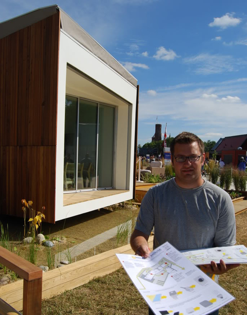
[Image: Kyle Belcher handing out info sheets to Solar Decathlon visitors, via]
Mid-week during this year’s Solar Decathlon AMNP had the opportunity to speak with Kyle Belcher, one of the project managers from Team California. A recent graduate of California College of the Arts, Kyle was involved in varying capacities from inception to the final construction and display of Team California’s solar home – named ‘Refract House‘ – which placed 3rd overall in the Decathlon.
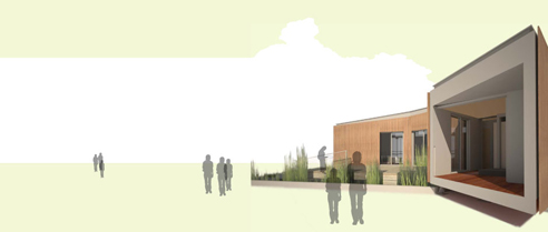
[for images and info on the project itself, visit it’s DOE site, Flickr photostream, or marketing website]
ArchitectureMNP: To start things off – could you give us an idea of how the design process worked, and how it differed from a ‘typical’ architecture program / design studio?
Kyle Belcher: With an architecture curriculum, you usually take one project per studio and so we had to be a little bit flexible as you wanted students with a background in the project to continue – but we couldn’t just take all their architecture studio projects away from them just so that they could work on the project. So what ended up happening was that we had a schematic design studio, where 16 students each had an 800 SF solar powered house to design. At mid-terms of that semester an independent panel of architects and engineers critiqued these students, and choose 4 schemes to move forward. Those 16 students then broke up into 4 groups of 4, and at the end of the semester one project was chosen as the direction to go in. I was in that studio and my scheme was one of the 4, but it wasn’t chosen – and I thought that was going to be the end of my Decathlon.
There was then a summer studio elective that took that initial concept and produced a basic drawing set for the department of energy. A couple of days into that studio I actually got a call from the faculty member in charge at that point on the architecture side, and was asked to be his research assistant to help finish that process. So I came in to help lead the student effort on producing those drawings. At the end of that process, we had completed a basic set of about 25 pages – and I was then asked to continue on as on of the project managers. For the rest of the summer we had 4 architecture students that received a stipend to continue working on the Decathlon.
At that point we were working more closely with the engineers [from Santa Clara University], starting to develop the project from the engineering side, talking about what systems we wanted to use. Another architecture studio of 16 new student then helped develop those drawings further, and continued on to construction drawings. Of the 4 students from the end of the summer only 1 was actually in this new studio. The rest stayed on as advisors, taking an elective to help out with logistics – but we weren’t involved in the drawings everyday. That was a little tricky, because in most architecture studios everyone is doing their own proposal, and you don’t really need to work with your peers to share a single vision. In an office, there’s a clear hierarchy of who’s the principal in charge, and where everyone fits on the pay scale. We had to navigate these two things as students.
AMNP: So would you say this was more democratic than an office environment?
KB: Absolutely. Also, unlike an office, there’s not a clear 9-5 schedule everyday where everyone’s in the office for large chunks of time to work on a project. At that point we had to meet more often with the engineers, and their schedules were completely different than the architecture students’ schedules in terms of availability. So a lot of those design meetings had to get pushed off to Saturdays and Sundays, as well as late night phone calls and emails.
At that point there wasn’t simply one architecture student that was handling the details – it wasn’t quite design by committee, but it was 3 or 4 people that were of an equal level talking about design decisions. So it was hard, and it was a learning process – especially working with the engineers that don’t have prior work experience, just like the architecture student. Having to navigate that learning curve both within our own discipline and through dealing with other fields was a major obstacle to overcome.
In the following Spring there was one final studio, with some overlap of students, working on the full set of construction drawings. That ended in May, and then the managers who were graduating ran shop and finished the construction drawings and then led construction. Most construction didn’t start until after May.
AMNP: Could you talk a little about the decision to segment the house and create that courtyard?
KB: When we started the process we looked at precedents of other Decathlons – looking at what had been successful for other teams, and at what may not have worked. We noticed that a lot of the houses are simple ‘bar’ buildings, which have a lot of efficiencies for cross-ventilation, etc – but they were these ‘bar’ building with pitched roofs for solar panels, and that was kind of it. So our rallying cry over the past year has been ‘breaking out of the box’, and seeing how we can not just have 1 or 2 modules, but actually use 3 separate modules to create that courtyard – and because we were limited in square footage, we wanted to make use of exterior space to make the home feel much larger.
AMNP: So then you jumped right into construction at the beginning of the summer?
KB: Finishing up the school year we were a little behind in construction because, like any drawing set, things don’t get done until there are deadlines. The deadline of the end of school, and knowing we were losing a lot of our work force in the class forced us to kick it in gear with the construction drawings – some construction couldn’t be started until those drawings were finished, obviously – so there was one big push the last 3 weeks of May, which were the 3 weeks after graduation, to finish the construction drawings and deliver them to the Department of Energy by June 3rd.
As of the first week of May we only had our steel moment frames up and intact. The construction site being on Santa Clara’s campus, and Santa Clara being in school until the first or second week of June, it proved difficult for both finishing construction drawings and doing full 9-5 construction in Santa Clara.
AMNP: How long did it take to finish construction at Santa Clara – and how much of the construction was completed before the house was shipped to DC?
KB: We only had 6 days to put the house together on the National Mall. Because of that limitation we had to get as far in construction as possible in Santa Clara, except for those things that were site-critical. I say that because we faced some unique challenges with some of the code requirements. We needed the house to be ADA accessible, so we needed ADA ramps – but we didn’t have a true survey of our site, to know what the slope was going to be across the site. We knew where the ramps were going to be, but because of the slopes of the ramps we didn’t know what the finished height of the deck was going to be … [we had to] make sure we were under a 30″ threshold [so that the deck itself wouldn’t need guardrails] and could still fit our ramps within the envelope dictated by the Department of Energy. We were pretty nervous. We had all of the ramps built in Santa Clara – we just didn’t know if it was all going to work out until we got to DC. Also the exterior lighting and signage were handled when we got to Washington – but everything else was done in Santa Clara.
Posted: October 28th, 2009
at 10:39am by orangemenace
Categories: architecture,pre-fab,green arch,housing,student,interview
Comments: 1 comment
The Practice of Everyday Design

AMNP recently learned of a newly created design firm in Canada founded by two young designers finishing up grad school – The Practice of Everyday Design.
The Practice of Everyday Design is a new partnership founded in 2009 with a focus on installation art, product design, and architecture. The Practice is committed to the merging of seemingly irreconcilable ideas to form new design opportunities. The practice is not afraid of pushing the boundaries of convention, the status quo, or the constraints imposed by current technologies. Ideas emerge from the desire to reevaluate the banality of the everyday and reinvent them to create innovative and playful designs. Using art as a means to investigate process and design – there is no clear boundary between our design practice and our art pieces.

Their first published project is also their office space – ‘The Mobile Office‘. In an apparent move to ‘think green’ [and maybe a reflection of the economy and its effect on architects] the office is constructed entirely out of discarded materials found within a one-block radius of the site. Objects were collected and transported using the designer’s bikes – and only the necessary hardware was actually purchased. As you can see, the project combines a number of functions into one structure that has been inserted into the space – reminiscent of both the work of Dan Hisel and the URBIA project by OBRA Architects.
The mobile office has allowed us to consolidate all the furniture and shelving into one mobile unit. This has freed up our office space allowing us the flexibility to make large scale models and have spontaneous dance parties.


.:The Practice of Everyday Design->
Posted: October 27th, 2009
at 9:05pm by orangemenace
Tagged with green, for real?, design, office, reuse
Categories: architecture,green arch,student,office,design
Comments: No comments
Concrete Mushrooms
Concrete Mushrooms Trailer – Albania’s 750,000 inherited bunkers. from Concrete Mushrooms on Vimeo.
AMNP was recently contacted by Elian Stefa & Gyler Mydyti – students at the Landscape Architecture Graduate Program at the Politecnico di Milano – regarding their thesis project. Entitled ‘Concrete Mushrooms‘, the work consists of a 20 minute documentary film they are currently editing, along with a proposal to transform these abandoned bunkers throughout the Albanian landscape into an organized network of permanent shelters to be used by tourists who hike the region.
The project – or the documentary at least – is set to be finished in late December. Hopefully we’ll have more then of what looks like a really interesting proposal.
.:more via-> the Concrete Mushrooms blog
Posted: October 27th, 2009
at 7:01am by orangemenace
Tagged with video, for real?, design, adaptive reuse, bunkers, Albania
Categories: architecture,student,videos,adaptive reuse
Comments: No comments
City Murals + Whitewashing Dudley
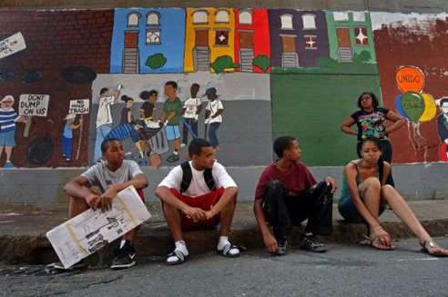
“They were discriminating towards art. They were discriminating towards a community.”
I’ve always been a big fan of murals in the city, ever since I was a child. First and foremost, let’s be real – they’re pretty awesome looking. Aesthetics aside, tho, they serve a number of other important functions that can’t be overlooked. They’re a great way to get young people feeling involved in their community, and give them an artistic outlet. The murals can also serve a number of historical and cultural purposes – sometimes they depict important historical figures, sometimes they remember musicians we all loved an miss, some capture ethnic/cultural periods of an area, and others attempt to lay out the history of a neighborhood. All are important pieces of the ‘story’ of a particular community – even the paintings of Marley and Big Pun.
Today’s Boston Globe features a story about a group of young artists working on such a mural in Boston’s Dudley Street neighborhood, a part of Roxbury. Now without getting too too deep into the history, [as I am not familiar, admittedly, with all the details], Dudley had a rough go of it in the 80s and 90s. Poverty, violence, depreciating property values – its a familiar, and sad, story of the city. The artists, working as part of Boston’s summer jobs program, planned to tell the history of the area in it’s mural – showing how the community has weathered these adversities, and how it has responded and grown. From Boston.com:
“It gives you like an important feeling,” said Randy Vicente, an 18-year-old from Hyde Park. “You don’t want to put just anything on the wall. It seemed like we had the perfect idea.”
Carlos Santiago, the 25-year-old lead artist, refers to his fellow painters as ‘my crew’, and relishes the speckles of paint on his plaid shorts, T-shirt, and white Nike high-tops. He conceived not only of the first frame, representing the neglect, but also the subsequent frames that showed members of the community picking up trash, turning vacant lots into community gardens, holding signs that say, “Don’t dump on us,” and admiring yellow and purple affordable houses “that are actually nice, that you can live in.”
…
“But the MBTA, which owns the East Cottage Street wall where the mural is located, told them their depiction of the neighborhood’s roughest days was too negative, that images of fires and words such as disinvestment and arson could not be used, according to the artists, members of Cape Verdean Community Unido. In essence, they said, they were asked to whitewash history.”
Now, I was simply going to link to this article in the sidebar, and say something about how the T should take it’s collective head out of its ass – but there’s more to this than all that. This area of Boston – along with many others – has gone through what can only be described, in my mind, as a fucked-up couple of decades. That’s just the way it is. One might argue the degree to which the area was having problems – and the causes – but we can’t ignore that these problems existed.
And that’s what a whitewashed mural – obviously – is doing.
Let’s not kid ourselves – nobody from the community needs to be reminded of the issues they faced in the past, and perhaps continue to face today. They know the deal, so to speak. But part of the importance of the mural is that it informs young people – and, more importantly in my mind, newcomers – of the area’s past. It’s a reminder of what was. Dudley is undergoing changes, and is one of the latest areas in Boston to see the signs of possible gentrification – it will almost certainly see a huge increase in its “yuppy” population in the future. As the social fabric of the area changes, it should not forget itself – nor should city agencies [like the MBTA] attempt to ‘clean-up’ the neighborhood’s story.
This isn’t an ‘anti-gentrification’ argument – as in, shove some murals in the face of the yuppies to remind them they’re not really from the neighborhood. To the contrary, the influx of some economic diversity into regions of the city can be a great thing – and I hope it works out for Dudley. The issue here, however, is that in ‘forgetting’ – or ‘whitewashing’ – the history of our urban neighborhoods, we leave ourselves open to repeating the past. And, worse than that, we run the risk of pointing ‘blame’ at the wrong people – or of assuming that gentrification itself is what ‘improved’ the area.
I don’t really believe that any newcomer to Dudley, or any other part of the city, will be totally blind to the area’s past – but the mural is a way for the current residents to tell their own story, in their own way. And that story isn’t simply that things are all good and the future is bright – it’s deeply rooted in the area’s past, and how the community got itself to where it is today. To attempt to subdue or erase these memories is to deprive the people who have worked so hard to build and improve this community [and others] of proper credit – and robs the neighborhood of aspects of itself that make it what it is today, and what it will be in the future.
.:quoted text from Boston.com-> “Young artists hit wall over Dudley St. mural”
[Oh, AND you’re crushing the artistic vision of our citys youth, you bastards]
Posted: August 21st, 2009
at 12:55pm by orangemenace
Tagged with art, mural, city, MBTA, history
Categories: architecture,urban/master planning,student
Comments: 1 comment
Eye Candy: Archinect Image
Future Proof: Lamentation of Globalized Urban Front
Our Lady of Guadalupe Terminus, NAFTA Super Terminal 110 @ St. Lazarus, Mexas, North American Union
Quad Space: Building a Thesis Project

The typical architecture-school final thesis project tends to start as a theoretical written document, laying out a students individual thoughts and concepts on a particular architectural topic – which then evolves into a ‘paper architecture’ project, designed by the student and explained in drawings, diagrams, models, and maybe some animations.
Quad Space – the M-Arch thesis project of University at Buffalo students Michael-John Bailie, Paul Dudowski, Ernest Ng H.H., and Dan Stripp – is, as you can see, no ‘typical’ thesis project. Rather than leave the project on paper, the four students decided to test their ideas in the real world – through a fairly drastic/awesome renovation of a 400 SF 1850’s Buffalo home. From the team:
Quad Space is an insertion of an architectural academic exercise as a full-scale constructed exploration to spatially and structurally manipulate and define the division of four spaces within a 400 sqf house.

Project background, via Quad Space:
This thesis re-evaluates the operations of architectural exercises within the academia and its role and relationship with the social, communal and economic environment that it is based in. This thesis project will critically investigates the process of establishing an academic architectural research project as a full scale construction insertion in the city of Buffalo, through the physical manipulation and conversion of a derelict house into a habitable space.
This collaborative thesis project is strengthened and necessitated by the nature, scale and logistics of a full scale architectural construction exercise involving coordination, compromises and negotiations by four individuals, while also being challenged and contorted by the conventions of the academia and its definition of a thesis work as a purely individual exercise.
This thesis project operates within the space of two current economic situations: the first being the stagnant and derelict economic landscape of Buffalo’s domestic environment in which the insertion of this academic project, self-motivated and independently funded by architectural students/ designers/ builders/ owners creates a sense of iconography and raise awareness for innovative attitudes towards the re-considering the banal within such an urban landscape.
The second  being that of the typical American view of domesticity, which the thesis acknowledges and provokes by challenging the perception of conventionally extensive spatial needs within the ideal American home and domestic landscape, by re-defining and re-interpreting conventional building codes requirements for minimal living.

The 4 students bought the existing structure for $6,500 at auction, and subsequently gutted the building and tore down an addition to prep for their project. The total cost of the renovation/redesign is estimated at $32,000 – with donations from a number of local construction-related companies.

From a programmatic standpoint, the project takes the existing 400 SF home and inserts 4 volumes [seen in diagram above] into the space – creating 4 private living spaces. Each of these inserted volumes pushes through the existing home, becoming visible on the exterior as a uniquely defined space. The interstitial space remaining between these insertions will then function as communal space, such as kitchen, bath, and living room. Check the Quad Space blog for some great photos of the process of cutting the existing facades and roof, then sliding the newly created volumes through from the inside – pretty sick.
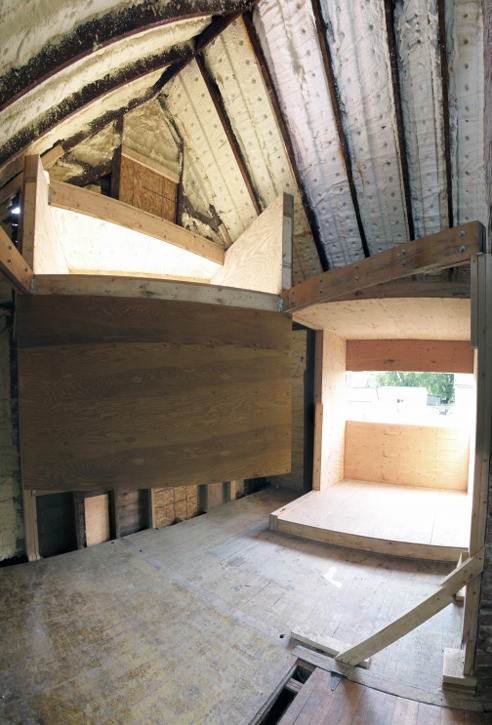
Now, I know what you’re thinking – you want to see the finished product. AMNP has already arranged to stay in contact with one of the team members, and I look forward to bringing readers images of the completed project when the team wraps everything up – possibly with some of their thoughts on the process of collaborating on a thesis, actually building an academic project like this, and reactions to the completed structure. For those of you in NYC, the project will also be exhibited in September [images, obviously] as part of “Arch Schools: Visions of the Future”, an annual exhibition at the Center for Architecture.
Head over to the Quad Space blog for more images and information on the project, and process photos documenting the construction.
.:Buffalo News article on Quad Space->
::info, images and quoted text courtesy of the Quad Space team::
Posted: July 16th, 2009
at 5:34pm by orangemenace
Tagged with student, wood, small spaces, renovation, for real?, theory, thesis
Categories: architecture,housing,interiors,featured ninjas,student,adaptive reuse,theory
Comments: No comments
Year 1, End of the Year Film 2009
[youtube]http://www.youtube.com/watch?v=KsYUjd2q27U[/youtube]
Bartlett School of Architecture, Year 1, End of the Year Film 2009
This has made it’s way all over the interwebs at this point, but just in case you haven’t seen it – check out this short film by students at the Bartlett School of Architecture, which documents the class’ work throughout ‘Year 1’.
Posted: July 14th, 2009
at 5:00am by orangemenace
Categories: architecture,film,student,videos
Comments: No comments
Documentary: SNAKEBIT
SNAKEBIT: A documentary film on renowned architect Samuel Mockbee and the spirit of the Rural Studio.
Once you go to the rural studio and you get a chance to experience not only designing it on paper, but getting it built – and have the pleasure of people coming in and really admiring what you’ve done and appreciative of what you’ve done – that’s a great feeling, and you can’t replace it. And once you’ve had that, you’re snake bit after that… the passion is going to be there.
~ Samuel Mockbee
About time, I say.
Posted: July 12th, 2009
at 7:22am by orangemenace
Tagged with green, sustainable, video, nature, rural studio, mockbee, documentary, ninja
Categories: architecture,green arch,featured ninjas,student,videos
Comments: 1 comment
Guerilla Architecture

Our ninja Ivan Hernandez Quintela of Ludens [our first ‘Ninja of the Month’] contacted AMNP last week about new projects he’s worked on since the NotM feature – specifically, “The Box†@ MUAC. In addition to his own work, Ivan shared work done by student who participated in a “Guerilla Architecture” course which he taught at the Universidad Iberoamericana in Mexico City.

Ivan’s students were asked to produce temporary shelters that would meet the needs of one of several ‘homeless profiles’ that the class recognized, and then construct and test the design. Both designs featured here attempt to “make evident that the homeless are not inactive people, but actually are extremely mobile, nomad by nature” – creating solutions that take into account this mobile nature of many of the homeless.
The idea was that the homeless citizen would wear the kimono during the day and would remove it during the night to create his temporary shelter.
A garment that could be worn by day, and then reassembled into a tent structure – the first design uses lines to attach to nearby objects in order to create a shelter from wearable materials, rather than using poles or other rigid, harder to carry methods. The homeless citizen then wears her shelter on her person, saving the energy and space needed to transport something larger/heavier.

Next we have a design that combines this idea of mobility and need for shelter with the additional need – in some cases – for storage.
The students generated a vehicle, which was activated in a very similar manner as a wheel chair, so it required quite an athletic user, where two huge truck wheels were recuperated from a dump site and assembled in such a manner that in the middle is the navigating chair, and each wheel is used either as a resting spot or as a can container.

::all images, info, and quotes courtesy of Ivan Hernandez Quintela::
Posted: June 30th, 2009
at 4:22pm by orangemenace
Categories: architecture,housing,featured ninjas,student,Ninjas of the Month
Comments: 1 comment


