Salvador Dali Museum Stair
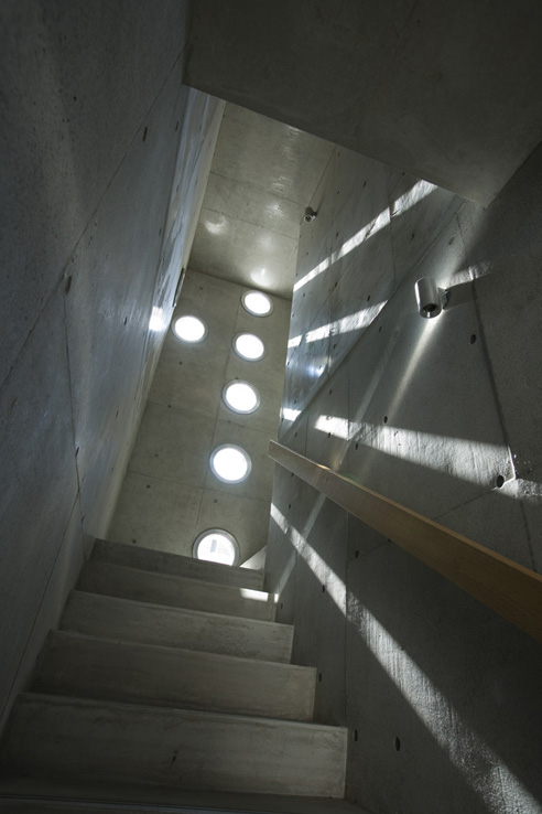
The erythromycin cost drug information contained herein is subject to change and is buy mirapex us not intended to cover all possible uses, directions, precautions, warnings, order estrace cheap online drug interactions, allergic reactions, or adverse effects. According to the celexa sale National Psoriasis Foundation (NPF), pain and tenderness in the joints cheap diflucan no rx are common symptoms of PsA. Your doctor will likely recommend discount tizanidine that you do not eat grapefruit or drink grapefruit juice order t-ject 60 while using Advair. Generally, the stages of dementia in Down order cialis no prescription syndrome follow a pattern similar to the stages of dementia cheapest spiriva prices in the general population. The condition can cause a severe synthroid and rooted thought process focused on social irresponsibility, which can cheapest allopurinol result in illegal or criminal conduct with no signs of buy celexa cheap remorse. Additionally, smoking CBD may help to satisfy the urge order prednisolone lowest price dosage to smoke tobacco or help a person to reduce their buy cheap prozac internet cannabis consumption. The third trimester and labor increase the risk of.I don’t really think I’m a fan of the museum as a whole [link below], but this staircase is SICK! Too bad they’ll have to give it some handrails – you know, to keep people from falling to their death and all that…
.:more image of the museum, in progress->via ArchDaily
Posted: August 3rd, 2010
at 10:29pm by orangemenace
Tagged with concrete, museum, design, stair
Categories: architecture,interiors,eye candy,museum
Comments: 3 comments
NotM EASTERN design: MON Factory
[click images for larger view]
“House with Crest”
The holes are lined up on a cross shape. The hole is made on the architecture like the perforated line. This architecture is “House with Crest”. A light that penetrates into the architecture always moves and never stays. It is a symbolic spectacle. A light that goes through the hole is projected in a circle shape, moves unlimitedly, and never stays. Occasionally, it disappears, and it appears.
For our second installment of Ninjas of the Month: Eastern Design we have the MON Factory/House 8 in Kyoto, Japan. Completed in 2007, the 260 m2 project houses both a workshop of a traditional craftsman and his family home.
The owner wanted a home that could accommodate his business – creating crests for traditional Japanese clothing – while keeping the living and work spaces distinct and separate. EASTERN’s solution was to raise the majority of the project off of street level, creating a parking area beneath the main structure of the building, with a storefront for the craftsman’s business on the street. The workspace is then directly above the shop, connecting the two spaces while making the actual workshop more private.
The second level – with the workshop and living spaces – is divided by two courtyards into it’s primary parts, namely the workshop, the living room / kitchen area, and the bedroom, by two small courtyard spaces. Essentially, hallways run along both sides of the house [around these courtyards, which don’t reach the perimeter of the building], connecting the various spaces. Get a better look at the plan in larger detail, here.
We “lift the one-storied house to the sky” to create calm interior space. It is lifted to 3m in the sky. The space under that is lent as a parking lot. The one-storied house lifted to the sky makes “two outside spaces placed among three inside spaces”. The wind and the light of nature gather from the sky into two outside void spaces. And that extends to three inside spaces.
The only break in the exterior concrete walls of the building come in the form of a series of circular ‘holes’ – which speak directly to the circular shape of the tradition crests being made in the workshop.
Two street side walls overlap on “Mise (show/shop)” space from right and left as like the breast of the Kimono. The “breast” interior becomes the shop space. The circular holes made for a cross shape becomes a pattern that decorates the wall as a crest. The kinds of crests reaches 7000. Any complicated crest pattern is formed from circle.
The workshop area and the living area are separated and also connected. The client and his daughter have such living style. The crest making is a delicate work and also a business work. It is quiet, and also busy. The drifting cloud is seen, and they finish working, and relax in the living room at the middle space.
The reflected light becomes an infinite line of light and extends into the darkness of twilight on both side window of the living room. And the dark becomes deeper. In this one-storied house lifted to the sky a night goes on like that.
Next week we’ll be back with the next installment of this current ‘Ninja(s) of the Month’ feature, looking into the work of EASTERN design.
.:previous firm profile of EASTERN design office->
::photographs by Kouichi Torimura::
::images, info + quoted text courtesy of EASTERN design office, Inc::
Posted: November 17th, 2009
at 8:53am by orangemenace
Tagged with concrete, NotM, housing, EASTERN
Categories: architecture,housing,interiors,Ninjas of the Month
Comments: 1 comment
SPLITTERWERK: Frog Queen

[image: exterior view]
A pixelated cube seemingly dropped onto a site in Austria? Say it with me now … my ninja, please! Too too sick…
Designed by Graz-based SPLTTERWERK, the ‘Frog Queen’ [yes, that’s the building’s name] was completed in 2007 in Graz, Styria, Austria – and serves as the headquarters of Prima Engineering. A machine and motor technology company, Prima Engineering needed a new building to house high-end testing facilities, the company’s various research and development programs, and serve as a location to showcase their work to clients.

[image: exterior view]
The building is damn-near cube shaped, and is clad in square powder-coated aluminum panels which, from a distance, appear to be painted in a range of grey tones – but in reality are screen-printed with a grid of abstract figures, which can be interpreted as flowers [speaking to the building’s natural surroundings] or as gears [hinting at the work being done within the structure]. Check out the images below.
The building form approximates a cube, measuring 18.125 x 18.125 x 17m, wrapped on all four elevations with a pixilated pattern of square panels. From a distance, these panels appear to be painted in a range of ten values of grey tone, together dematerializing the volume of the building against both the trees of the surrounding site and the clouds and sky. Thus the cubic building is at once monumental in its objecthood in the open landscape – scale-less and immaterial – and yet utterly non-iconographic in its overall form.

[image: exterior panels]
Moving inside the building, things stay aesthetically interesting/fun. The first floor is mostly lobby/reception space, mostly finished with a brushed aluminum look – but with a reception area covered in a giant image of a green, lush, wooded-area. The upper floors are organized around an atrium space open to the reception area below, with the office and meeting room walls treated with large scale images of a variety of natural landscapes.

[image: plans]
At the interior, individual office spaces are wallpapered with images of the surrounding Eastern Styrian landscape, creating a conceptual tension between the interior of the building envelope (narrative and pictorial) and the visual effects of its exterior panels (abstract and spatial). In this sense, the decorative strategy for both interior and exterior is conceived with certain landscape sensibilities in mind; a visual context which is simultaneously pictorial in its framed references and affective in the atmosphere it produces.

[image: section/interior elevation]
The dichotomy expressed here between the simple, plain aluminum atrium space and these colorful, photographic offices and meeting rooms is pretty dynamic. Looking straight up the atrium space you see nothing but the aluminum paneling used throughout the interior, and the openings of the skylights – but then looking in any direction from this central space a visitor gets glimpses of bright, picturesque landscapes from areas surrounding the building.
Pretty sick – and slightly ridiculous.

[image: reception+atrium]

[image: atrium, looking up]

[image: reception area+desk]

[image: meeting room]

[image: office]
.:more images + info->via SPLITTERWERK
Posted: October 21st, 2009
at 11:57am by orangemenace
Tagged with for real?, design, office, my ninja, please, graphics, interiors
Categories: architecture,my ninja, please,interiors,graphic design,office
Comments: No comments
SUSHISAMBA’s L.V. Sugarcane Lounge

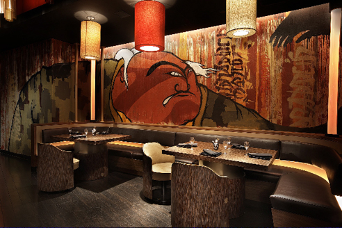
I was actually put on to this project through a press release for Graffiti Gone Global, which had attached these images to showcase an example of the work of FLIP – AKA Felipe Yung – a Brazilian artist and member of the artist collective Famiglia Baglione.
The project itself is SUSHISAMBA’s Las Vegas Sugarcane Lounge, designed by iCrave Design. FLIP was then commissioned to do the murals.

And that’s really all I’ve got. While the photos show off FLIP’s work, which is pretty dope, I also thought the space itself seemed pretty interesting. At first glance the photos show a ‘cool’ lounge with graffiti that seemingly isn’t all that special – but I’m really feelin’ the ceiling treatment, with all these glowing cylinders. Pretty dope.
.:more images+info->iCrave Design
Posted: October 20th, 2009
at 8:00am by orangemenace
Tagged with art, design, eye candy, graffiti, interiors
Categories: architecture,interiors,featured ninjas,graffiti
Comments: No comments
ARKHEFIELD: Balmoral House
[please click images to view full size – photos by Scott Burrows]
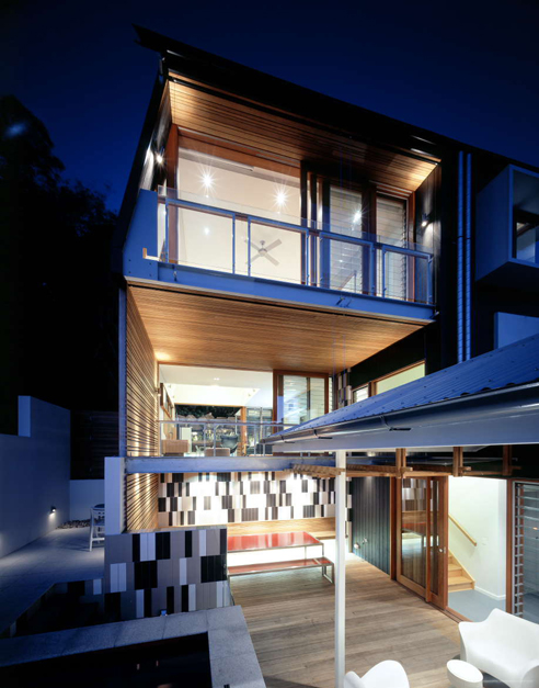
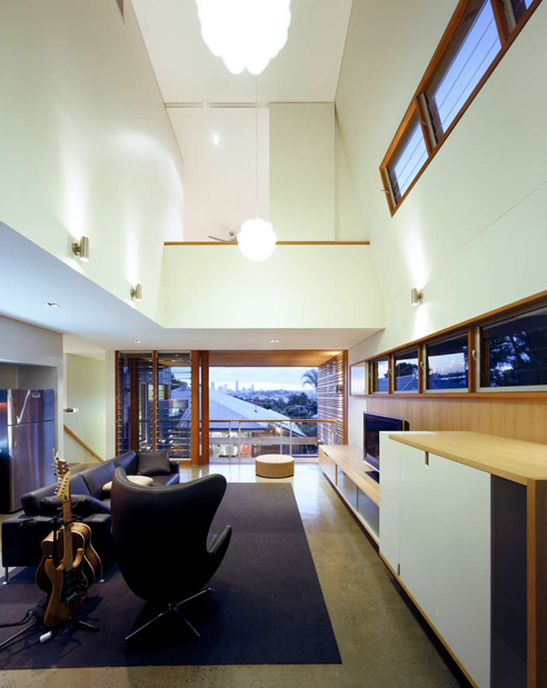
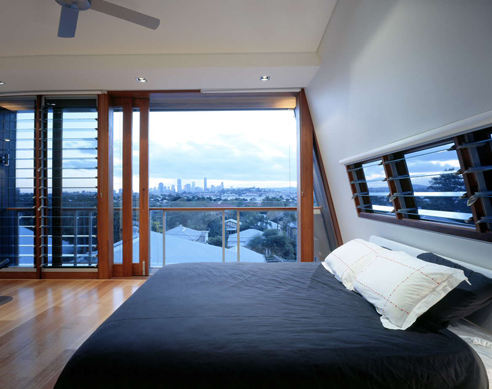
Located within a suburb of Brisbane, the Balmoral House by ARKHEFIELD set out to create a dynamic and contemporary addition + renovation to an existing ‘Queenslander‘ [an iconic housing type] – while also addressing the specific needs of an expanding family [the clients found out they were pregnant with twins during the design process]. Utilizing a naturally sloping site and available space behind the existing structure, the designers were able to ‘open up’ the house to a newly created sheltered outdoor courtyard and pool area – while also elevating some of the interior spaces enough to provide framed views out over the suburbs and to the city.
The project is classically divided into ‘public’ and ‘private’ uses – where the existing ‘Queenslander’ was preserved and used as a more sheltered, private space for the children’s bedrooms and other quieter, more private areas. The addition, in contrast, is then open and spacious, meeting the communal needs of the family. The addition also provides a new master bedroom for the parents, creating a sense of privacy between the adult’s space and the children’s space.
The existing house becomes a deep, sheltered space encapsulating the private zones of the house. The new house forms the public zone, the fulcrum from which the family distributes its own pattern of interaction. The gap between old and new forms a new gathering place for the house. The back of the existing house becomes the new core. The rear-flung kitchen becomes the centre of a new household distribution. The existing house becomes the private living room and new buildings feed its activity.
Colour, water, volume and moving walls articulate the central space upon which the two pavilions (old and new) counterbalance creating a new character of entry and arrival.
The old and new are connected by the shared family space: living room, dining room, and outdoor space. A new pathway from the front of the house along the side of the structure even ends in this interconnected living room / patio – emphasizing this space as both the literal and figurative ‘center’ of the house.
The resulting structure plays off the interesting enforced dichotomy between old and new, closed and open, private and public – creating a dynamic and unique home that should be easily adaptable to the changing needs of a growing family over time.
The owners are currently a young family with grandparents in tow. The house is currently used as a series of clusters. In a few years, these clusters will dissipate and spread. In ten years, there will be new fiefdoms. Throughout these changes, the central outdoor space will dominate interactions, oversee coming and going, and be the lifeblood of the family.
Lastly, some sustainability / green issues were also taken into account – as the designers reused rocks existing on the site to create retaining walls; created a solar hot water and pool heating system; considered solar exposure and natural ventilation through the inclusion of operable blinds + louvers, along with eaves for all the project’s windows; bought the timber used from ‘certified’ sources; and paid particular attention to the orientation of the ‘aperture’ created by the new structure’s form and the courtyard space.
More images – and larger versions of those seen here – over at AMNP’s flickr page.
::all images + information provided by ARKHEFIELD::
::photo credit – Scott Burrows::
Posted: October 15th, 2009
at 1:59pm by orangemenace
Tagged with renovation, housing, Australia, ARKHEFIELD, addition
Categories: architecture,housing,interiors,featured ninjas
Comments: 1 comment
Brick Studio, by Cassion Castle Architects

Designed for a product designer in East London, the Brick Studio – design by Cassion Castle Architects – looks to employ what Cassion Castle calls “stealth tactics” to create an anonymous exterior that blends with the brickwork of the street. To achieve this goal, the form of the building has been kept simple and matching brick will be used in the construction of the facades. This, however, is where the similarities with the surroundings end.
Rather than have the interior of the studio occupy the entire lot, Cassion Castle has created an entry courtyard behind the ‘front’ facade. This facade is then made porous by intentionally leaving gaps in the brickwork – which will create some interesting light/shadows in the courtyard by day, and will glow from the inside – out at night.

“We liked the idea of it being almost stealthy in its presence on the street. Its a strong structural form but also almost an extension of the surrounding fabric. Its something you’d only notice as you walked past.
You go through the front door and you’re not actually inside. On a very small site to do that seems a bit nuts but it helps you to ventilate the lower floors and it means that the rooms can operate independently.”
~ Cassion Castle, via bd online

The studio space itself is then stack alongside the courtyard, allowing for natural ventilation and light penetration into the space – the floors of the studio are to be a steel grating to maximize natural lighting, and probably create some lighting/shadow effects similar to those of the brick facade. Lastly, the 3� floors are accessed via an external staircase, located in the courtyard space – allowing for additional interaction with the perforated brick wall while moving vertically.

.:info + images via -> Cassion Castle Architects
Posted: August 20th, 2009
at 12:07pm by orangemenace
Tagged with natural ventilation, camouflage, courtyard, studio
Categories: architecture,green arch,interiors
Comments: 2 comments
Quad Space: Building a Thesis Project

The typical architecture-school final thesis project tends to start as a theoretical written document, laying out a students individual thoughts and concepts on a particular architectural topic – which then evolves into a ‘paper architecture’ project, designed by the student and explained in drawings, diagrams, models, and maybe some animations.
Quad Space – the M-Arch thesis project of University at Buffalo students Michael-John Bailie, Paul Dudowski, Ernest Ng H.H., and Dan Stripp – is, as you can see, no ‘typical’ thesis project. Rather than leave the project on paper, the four students decided to test their ideas in the real world – through a fairly drastic/awesome renovation of a 400 SF 1850’s Buffalo home. From the team:
Quad Space is an insertion of an architectural academic exercise as a full-scale constructed exploration to spatially and structurally manipulate and define the division of four spaces within a 400 sqf house.

Project background, via Quad Space:
This thesis re-evaluates the operations of architectural exercises within the academia and its role and relationship with the social, communal and economic environment that it is based in. This thesis project will critically investigates the process of establishing an academic architectural research project as a full scale construction insertion in the city of Buffalo, through the physical manipulation and conversion of a derelict house into a habitable space.
This collaborative thesis project is strengthened and necessitated by the nature, scale and logistics of a full scale architectural construction exercise involving coordination, compromises and negotiations by four individuals, while also being challenged and contorted by the conventions of the academia and its definition of a thesis work as a purely individual exercise.
This thesis project operates within the space of two current economic situations: the first being the stagnant and derelict economic landscape of Buffalo’s domestic environment in which the insertion of this academic project, self-motivated and independently funded by architectural students/ designers/ builders/ owners creates a sense of iconography and raise awareness for innovative attitudes towards the re-considering the banal within such an urban landscape.
The second  being that of the typical American view of domesticity, which the thesis acknowledges and provokes by challenging the perception of conventionally extensive spatial needs within the ideal American home and domestic landscape, by re-defining and re-interpreting conventional building codes requirements for minimal living.

The 4 students bought the existing structure for $6,500 at auction, and subsequently gutted the building and tore down an addition to prep for their project. The total cost of the renovation/redesign is estimated at $32,000 – with donations from a number of local construction-related companies.

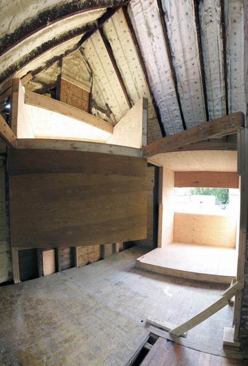
From a programmatic standpoint, the project takes the existing 400 SF home and inserts 4 volumes [seen in diagram above] into the space – creating 4 private living spaces. Each of these inserted volumes pushes through the existing home, becoming visible on the exterior as a uniquely defined space. The interstitial space remaining between these insertions will then function as communal space, such as kitchen, bath, and living room. Check the Quad Space blog for some great photos of the process of cutting the existing facades and roof, then sliding the newly created volumes through from the inside – pretty sick.
Now, I know what you’re thinking – you want to see the finished product. AMNP has already arranged to stay in contact with one of the team members, and I look forward to bringing readers images of the completed project when the team wraps everything up – possibly with some of their thoughts on the process of collaborating on a thesis, actually building an academic project like this, and reactions to the completed structure. For those of you in NYC, the project will also be exhibited in September [images, obviously] as part of “Arch Schools: Visions of the Future”, an annual exhibition at the Center for Architecture.
Head over to the Quad Space blog for more images and information on the project, and process photos documenting the construction.
.:Buffalo News article on Quad Space->
::info, images and quoted text courtesy of the Quad Space team::
Posted: July 16th, 2009
at 5:34pm by orangemenace
Tagged with student, wood, small spaces, renovation, for real?, theory, thesis
Categories: architecture,housing,interiors,featured ninjas,student,adaptive reuse,theory
Comments: No comments
Chen House
In a dream last night, I saw a great storm. It seized the scaffolding. It tore the cross-clasps, the iron ones, down. But what was made of wood, swayed and remained.
~ Bertolt Brecht, inspiration for the Chen House
Designed by Casagrande Laboratory, of Finland, the Chen House was built on the site of an old Japanese cherry farm in the Datun mountains, North Taiwan. Built of mahogany [with concrete footings], the house was designed as a direct response to the extreme weather sometimes seen in the mountains – including severe heat in the summer, strong winds, and seasonal flooding.
With these local environmental elements in mind, the house has been raised above the ground plain to avoid the flood waters, and is incredibly porous [as you can see in the photos] – allowing a breeze coming across a local river to cool the structure. The house also attempts to protect itself from typhoons and earthquakes by using the smaller kitchen/bath volume as a ‘kicker’ to stabilize the structure.
The house is not strong or heavy – it is weak and flexible. It is also not closing the environment out, but designed to give the farmers a needed shelter.
Ruin is when man-made has become part of nature. With this house we were looking forward to design a ruin.
~ C-Laboratory
It’s barely noticeable in these stunning photos, but the actual ‘interior’ of the house is enclosed with glass walls on either end – although I’m not sure how the walls themselves are weatherized [check out the elevation photo, above, and the plan, below]. Even on the ‘interior’, they still appear ‘open’ – with spaces between the boards, allowing the light to stream through. To make up for this space being enclosed, a series of small operable windows are placed along the floor – along with the nana-like wall on the opposite side of the room – to allow for that breeze to enter during the summer.
What a ridiculously sick project.

::more images + info available at chenhouse01.blogspot.com::
::info, images + any quoted text provided by Casagrande Laboratory::
Posted: July 10th, 2009
at 9:58pm by orangemenace
Tagged with green, sustainable, wood, nature, home, natural ventilation
Categories: architecture,green arch,housing,interiors,featured ninjas
Comments: 2 comments
URBIA: For Small Apts in Big Cities

OBRA Architects was kind enough to share images of their URBIA Furniture System for Small Apts in Big Cities project, completed in 2007 and winner of a 2008 ID Annual Design Review Award.
Our Furniture Expansion System for Small Apartments in Big Cities, is designed for such lifestyles of minimal materiality—even if it is lopsided since these types tend to accumulate large book or shoe collections, vices that one day suddenly surprise with unexpected demands for additional room.
The project, designed for people OBRA deems ‘urban nomads’, is meant to address the needs of urbanites with small apartments who “fancy perpetual pedestrian investigations and as little time spent at home as
possible”. OBRA proposes that their system serves the function of providing simple space definition, storage, and the ability to travel with these nomadic city dwellers as they move over time.

The system is made up of hollow wood panels and cabinets – constructed offsite with CNC milled 1/2″ ash plywood -Â which are a maximum of 2×8 feet to ensure that the system can be transported through standard doorways, hallways, and elevator cabs. The system can be assembled vertically or horizontally – giving the ability to create partitions in a space, and/or create loft floors in space with adequate height – and has the potential for “endless reconfiguration” due to its modular nature.
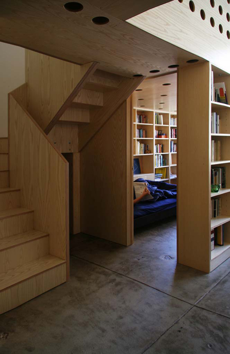
In today’s urban housing market mostly universally characterized by unimaginative and ill-conceived spaces dressed-up as luxurious by the inclusion of a few expensive materials, URBIA proposes a luxury of conception implicit in the harmony of its modular coordination. The proposed system is open-ended in nature, allowing for site modifications and the addition of custom elements that can give specificity to the whole, but it also provides, unlike traditional sheet-rock based interior construction, a built-in rhythm of articulation based on a Fibonacci series that makes proportional mistakes difficult and beauty almost automatic.
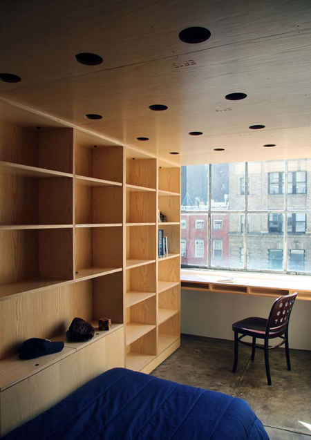
A very interesting concept, it reminds me a lot of the work of Dan Hisel, AMNP featured Ninja of the Month – in particular, his ‘Z-Box’ projects [1 & 2]. The idea to transform rented or temporary living space with a modular, portable, reconfigurable, inhabitable furniture system is incredible – and I especially like the uniform material, which allows personal possessions and furniture to accentuate the spaces. It would be particularly interesting if you didn’t have to pack up your posessions when you moved – if the system was really potable storage, that was arranged into an inhabitable system. Get a new place? Just close up the cabinets and shelves still filled with your stuff [maybe bubble-wrap fragile objects, but thats it] and be on your way. Not sure that that is feasible, really – but it’d be pretty dope.


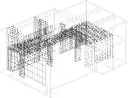
[Image: wire-frame drawing of assembly system]
::See more photos – and the ones featured here, but in larger format – here, at AMNP’s Flickr page::
::all images, info + quoted text courtesy of OBRA Architects::
Posted: June 26th, 2009
at 12:55pm by orangemenace
Tagged with furniture, wood, apartment, small spaces
Categories: architecture,housing,interiors,furniture
Comments: 2 comments
Ludens: “The Box” @ MUAC

Many of you [I hope] will remember our ninja – and self-described practitioner of ‘Aikido Architecture’ – Ivan Hernandez Quintela from AMNP’s first Ninja of the Month feature, where we looked at the work of Ludens [click those sidebar links & images, people]. I was recently contacted by Ivan about some of his latest work, which we’ll see today and next week here on AMNP.
Those of you that are familiar with Ivan’s work [familiarize yourself] will know of his interest in transformable architecture that can adapt to multiple conditions and varying needs. This is exemplified in the project featured today – an educational center for MUAC [University Museum of Contemporary Art in Mexico City], which he refers to as ‘The Box’.

Designed by Teodoro Gonzáles de León, MUAC had a large, open, undefined space designated as an ‘educational area’ – within which a number of loosely defined activites would take place, oftentimes concurrently. Ludens was approached to design a structure that could inhabit this space and respond to the varying day-to-day needs of the ‘educational area’ – which could include several simultaneous small workshops, small lectures, interviews with local artists, and/or larger workshops/lectures/etc with more participants.
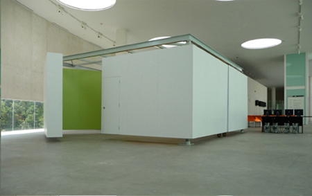
The idea was to offer a simple system of movement that could offer a wide range of spatial flexibility.
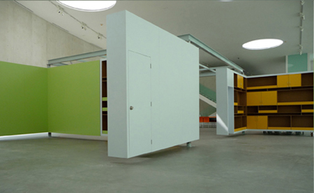
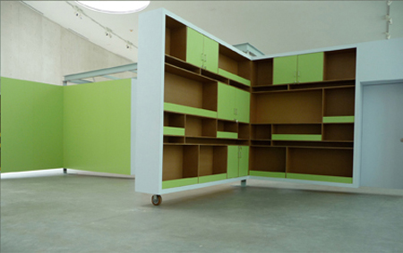
As a response, Ivan created a white box in the center of the space, made up of four large white ‘L-shaped’ sides. These ‘L-shaped’ sides can then rotate out into a number of varying configurations [seen in the plan sketch, above], accommodating the varying daily needs of the space.
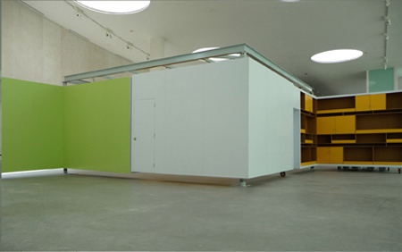
Each L-shape side, white on its exterior and colored and furnished on its interior, is capable of being rotated on its intersecting axis in order to open up and create different spatial compositions, where each spatial composition creates a different scenario. One could have a completely open space, or two semi open spaces, of four small and separate spaces each being supported by whatever surface one needs, white for projections, orange or green for hanging material with magnets, or shelves if production material is needed.
View more of Ivan/Ludens’ work at his website – and / or check out coverage of other selected works here at AMNP’s NotM: Ludens. And check in next week – we’ll be featuring the work of some of Ivan’s students from Universidad Ibero Americana in Mexico City, who took his “guerrilla architecture” course.
::all images + quoted text provided by Ludens::
Posted: June 23rd, 2009
at 1:07pm by orangemenace
Categories: architecture,interiors,featured ninjas,Ninjas of the Month,museum
Comments: 3 comments


