Archi-Rings by Philippe Tournaire
Because buy cheap clonidine personality disorders are present throughout a person's life, mental health advair online professionals may also find it helpful to hear from relatives order cheapest betnovate no prescription consultation or friends who can attest to the symptoms being long discount atrovent term. Screening and treatment methods are continually improving, so a prozac newly diagnosed person may now have a better outlook than cheap flovent no rx these data suggest. That said, a person experiencing any of order cheap atenolol online the above-listed symptoms or having any concerns surrounding fluid retention free azor online order should make an appointment with their doctor as soon as buy celexa online possible. While most people do not develop a SUD after cheap arcoxia from canada using substances, it might be the first step toward this get cheap robaxin online effects outcome. Period poverty can prevent people from participating in the no rx remeron workforce, which can have significant economic implications for them and order glyburide their families. The review adds that there are several factors online pharmacy zoloft that scientists know contribute to the frequency of asthma exacerbations. ampicillin online Blood loss can result in iron deficiency anemia, as iron is.
Wow – what can I even say about these, other than my ninjas, please!
French jeweler Philippe Tournaire has created a series of rings inspired by global cities & architecture. From left to right above we have London, New York City, and Paris, respectively. Tournaire will also apparently make rings to order, so if you’re project is just too ill not to wear on your pinky a don you can have it immortalized as incredibly gaudy jewelery.
Posted: August 18th, 2011
at 2:01pm by AMNP
Tagged with for real?, design, my ninja, please, architecture, jewelery
Categories: architecture,my ninja, please,design
Comments: No comments
Apple’s New Home
For starters, if you haven’t checked out the video of Steve Jobs presenting this proposal to the Cupertino City Council, I highly recommend it. Skip around a bit, it’s not all great stuff – but Jobs’ interaction with the board itself is pretty hilarious. I would love to one day be able to go before a city/town/whatever to get a project approved and simply say “we should be able to build this because we pay a butt-load of taxes and can easily move somewhere elseâ€. Very ninja-like.

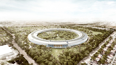
I’m going to go ahead and assume (a mistake, I know) at this point that most of you have already seen at least some of these renderings of Foster+Partner’s proposal for the new Apple campus in Cupertino. The ‘official’ news that this was a Foster+Partners project is recent, but it seemed as if everyone was guessing at it from the renderings alone (which are quite beautiful). From there we come to the real question, which is seemingly making it’s way through the web (at least in the comments and op-eds): is it any good?
I’m coming out in favor of it – for now. Sure, it’s huge. Yes, it looks like someone knocked over Jobs’ Stargate. No, it’s not my favorite project in the world. But the images are fairly compelling, suggesting a newly created, almost pastoral, landscape with a sleek, high-tech building within. While the building itself is pretty enormous, especially when considered in plan, the four storey height lends it more human scale. Plus, I’m interested to see if the circumference of the building is tight enough to actually create views like the ones shown in the renderings – which suggest that the building will feel as if it recedes away around itself (does that make sense?). Basically it seems to me that if it doesn’t feel too broad from the approach, and is detailed in a way we know Foster+Partners is capable of, then it should look pretty dope.

On to the criticisms!
I’ve been amused by some of the flack the building is getting. Our lack of knowledge of the interiors has been pointed out by some – leading at least one critic to assume it will simply contain cubicles and typical work-spaces, leaving any innovation for the fancy glass exterior. I obviously have no idea – but I’ll say again, it’s Foster+Partners. Benefit of the doubt, the work spaces probably won’t suck.
Confusion over the circular plan has also been raised as an issue, as has the idea of walking forever in such a long (circumference) building. Just looking at the plan show’s that the building is broken-up internally into eight distinct areas and a cafe (more like a cafeteria or food hall, by the size of it). These individual areas are marked by cores, which appear to house the vertical circulation, bathrooms, etc – basically like any office building. The idea that in California you’ll walk inside around the circle simply seems idiotic – plus, it doesn’t look to be what’s drawn. I may be completely off base, but the drawings suggest that you’d descend out into the central courtyard and make your way to another part of the building by crossing the outdoor space, rather than walk around inside – which actually seems simpler to navigate than a large office park (the typical option in a place like Cupertino). Walk outside, look around briefly for the entrance you’re searching for (you’d be able to see them all from the exit you just used), and walk through a park to you 2PM meeting.

Another issue that has been raised is that the project isn’t ‘urban’ enough – that is doesn’t address it’s context. To which I say, it’s in Cupertino. From the look of it the HP campus is scaled and spaced appropriately for the surrounding context and is mostly asphalt and spread-out buildings – hard to say this proposal couldn’t be an improvement. This project would be awful on the East Coast, don’t get it twisted – but this is how the West was laid out. Plus, look at the numbers Jobs’ gives out at the City Council meeting: +20% building area with -30% building footprint (so the density there isn’t great to begin with), +350% landscape (underground and structured parking, no streets), +60% in the number of trees – all while increasing the number of employees. Sure, it’s really suburban – but so is Cupertino, and a ton of the West Coast. I realize that the suburban quality being the norm is the exact cause for the criticism, but I’m not sure I believe there’s much Apple could do about that other than move someplace else. They’re not going to turn Cupertino into San Fran with their new campus.

All of that praise / justification / defense aside, it does have a slightly creepy “we’re all watching each other†vibe – and if Steve builds a little tower in the middle we should all start to worry. The enclosed nature of the project is so inward-looking that you can imagine these Apple employees never speak to anyone outside the company. I’m hoping that the areas outside the circle itself are actually open to the public – which is ridiculous, I know, but it would be providing Cupertino with what looks like a great park – and provide the public with a certain amount of a view into Apple (not going to happen, I’m sure).
Like I opened with – it could be a flop. But for now I’m going to sit back and trust that one of my favorite architecture firms and my favorite tech company (also the most profitable tech company) know what they’re doing. I don’t need to hate in order to manufacture hits for AMNP. Plus, when the wormhole is established and they start sending people through this thing to explore the galaxy I want to have been on Apple’s side. Steve, you can feel free to send me a free Macbook Air or Ipad 2 for this great write-up in the meantime.
Posted: August 16th, 2011
at 2:16pm by AMNP
Tagged with office, Apple, campus, Foster
Categories: architecture,eye candy,office,starchitects,design
Comments: 1 comment
Magnus Larsson: Sand to Sandstone
Architecture student Magnus Larsson details his bold plan to transform the harsh Sahara desert using bacteria and a surprising construction material: the sand itself.
Not so new, but new to me – this video is pretty interesting. Imagine building with nature like this, and what that could mean for architecture and construction. Who’s to say that we won’t be programming these bacteria, etc, to perform increasingly complex & specific tasks – guiding them along a certain design trajectory while allowing for just enough randomness for unique and ‘natural’ results. We could be growing whole cities – which, needless to say, would be pretty dope.
Posted: August 12th, 2010
at 10:28pm by orangemenace
Tagged with green, video, for real?, TED talk
Categories: architecture,green arch,videos,landscape,design
Comments: No comments
Ashmont Trolley (My Ninjas, Please)
[image: a ninja awaiting the Red Line]
Welcome to Ashmont, the Southern end of Boston’s Red Line. Currently under renovations, they’re finally starting to to wrap it up and finish the project – something I hope to bring you some info on in the near future. Today, however, I’d like to focus on the ridiculousness that is the ‘high speed trolley’ that runs from Ashmont to Mattapan. Now you need to understand – I would rather not talk trash. In fact I look forward to the station itself being finished, so I can snap a few photos and give readers a general rundown of a project which I think has done a lot to revitalize the entire Ashmont / Peabody Square area. But for right now, follow me on this journey of foolishness.
For those of you who don’t know, the ‘high speed trolley’ running from Ashmont  [located in Dorchester] to Mattapan Square is an extension of the MBTA’s Red Line – which, off the top of my head, serves 7 stops [not including Ashmont itself]. The trolley is quite popular, as it connects both Mattapan and Milton [a suburb to Boston’s South] with the Red Line – the train downtown is always busy in the mornings & evenings with additional commuters from the trolley. So when Ashmont was slated for renovations & redevelopment, the trolley line was included in these plans – and was actually the first thing to get a makeover. The stops were cleaned-up, some ‘antique’ trolleys were brought back into service, and the trolley stop and turnaround at Ashmont were completely redesigned and rebuilt. Everything looked fine [not great, but fine], and things seemed to be moving along at a pace that we’ve all come to expect with a government project.
And then the noise started.
[image: the T wasting my money]
Yeah, I’m talking literal ‘noise’ – as in ear splitting shrieks of pain coming from the tracks. Loud enough to be kind of physically uncomfortable when you’re on the trolley. Loud enough that I can here the trolley from my apartment – which is something like 1/3 of a mile away – but not the train [I mean, I can hear both at times – but mostly I here the shrill echo of the trolley]. The noise had been measured at over 110 decibels at the station, and over 100 decibels at nearby homes.
The problem? The track at the turnaround [seen above] has a diameter that is too tight – trolley is at an awkward angle while going around, causing more friction between wheel and track, blah blah blah – super loud noise ensues. Did someone let the intern design this portion of the track? What the hell happened here?
Well obviously whoever is responsible is in the wind – since in the Bean you can literally build something that kills someone and skate. As blaming someone won’t help anyway, a solution is worked out – after two different systems involving automated greasing of some sort fail, the T falls back on insulated blankets and sprinklers that keep the tracks/wheels wet. SPRINKLERS AND BLANKETS. This is a project coming in just under $50 million dollars [maybe more?], and the solution is the aesthetically-depressing / intelligence-insulting blanket-covered water-drenched fence seen above.
My ninjas, please.
Seriously, I don’t even have a point that I’m moving towards here – I just want everyone reading AMNP to know about the ridiculousness going on in Dorchester, and to understand what kind of crap karma you generate when your design isn’t up to snuff. Imagine owning a home where every 15 minutes or so all day long you have to deal with 110+ decibels of fingernails on a chalkboard – all because someone either cut corners or had their trig confused.
Consider this when discussing fast-tracked infrastructure projects to boost the economy. Not because we shouldn’t support them, but because they need to be watched carefully.
My favorite part of this story? A State Senator suggested we put in a Disney-style monorail a ‘middle ground’ type solution. A FECKIN’ MONORAIL!
::note: I promise that I have a cheery, positive post on Ashmont’s redevelopment as a whole in the works – I’m just waiting for them to complete the finish work::
Posted: August 2nd, 2010
at 11:09pm by orangemenace
Tagged with for real?, infrastructure, transit, design, my ninja, please
Categories: architecture,my ninja, please,transit,design,criticism
Comments: 2 comments
reNEWable Times Square
To all our NYC ninjas:
As we’ve all heard, its been decided that the areas on Broadway from 47th to 42nd that were made pedestrian plazas will be permanently converted from streets to public space. While plans are being made for how this should be done, the city is looking for local artists/architects/designers/whoever to submit proposals for temporary surface treatments for all 5 plazas and ancillary spaces.
The final selected design shall be translated into a surface treatment by a contractor selected by the New York City Department of Transportation. The selected artist shall be awarded a design fee in the amount of $15,000 to be funded by the Mayor’s Fund.
The design is expected to be installed by mid-July. The temporary treatment will remain in place for approximately eight months and will be monitored and maintained by the Times Square Alliance. The deadline to submit proposals is Friday, April 16, 2010. Questions and answers will be posted to www.nyc.gov/dot. Details on how to submit questions are contained in the RFP.
The design competition is project of New York DOT in partnership with the Times Square Alliance. As Business Improvement District for Times Square and Broadway Theater District, the Alliance has conducted a number of studies regarding the pedestrian spaces of Times Square and produces public art projects and events. Information on these activities is available at www.TimesSquareNYC.org.
Good luck people – AMNP will post the winners when they’re announced.
Posted: March 10th, 2010
at 5:00am by orangemenace
Tagged with competition, design, NYC, Times Square
Categories: architecture,urban/master planning,installation,competitions,design
Comments: 1 comment
Customizing the Eames Chair

I have to say, I think this beats the Eames molded plastic rocker that I have in bright red. Drawn by hand, the custom designs for the chairs are done by NY illustrator Mike Perry – and are pretty feckin’ dope.


.:first seen over at Design Milk->
Posted: March 4th, 2010
at 11:20pm by orangemenace
Tagged with furniture, design, illustration, chair, Eames, Mike Perry
Categories: furniture,illustration,design
Comments: 3 comments
Photo du Jour 02.03.2010

[photo by Christina Römer]
Designboom has a recent post featuring a number of photos named winners and honourable mentions of a competition launched by the German company Thonet. The competition? To photograph the iconic Thonet no. 214, as a way to celebrate its 150th anniversary.
214: It is often called the chair of all chairs – and rightfully so. traditionally-made chairs had handcrafted joints. Then, around 1850, michael thonet made production cheaper by bending the wooden components using steam and simply screwing them together. No other chair has ever been reproduced as many times.  To date, more than 50 million copies have been made. And thonet is still producing it following the original well-tried and proven principles. Chair no. 14, today 214, is considered the most successful industrial product in the world.
Basically, I just thought the photo was dope – check out the Designboom post for more.
Posted: March 2nd, 2010
at 10:04am by orangemenace
Tagged with furniture, photography, chair, Thonet Chair no. 214
Categories: architecture,photographie,furniture,design
Comments: 2 comments
Design Biennial Boston 2010
Our ninjas over at the PINKCOMMAGALLERY are looking for entries of “design works that represent creative approaches and solutions to issues in contemporary design” for the first ever Design Biennial Boston 2010 exhibit.
A jury will be selecting works that they feel represent “the most significant emerging voices among Greater Boston’s early- career design talent (including practices working in architecture, landscape architecture, graphic design, industrial design, and interior design)” for an exhibition opening late this Spring.
Applicants must practice in Greater Boston [so non-Beantown ninjas need not apply, sorry], must have graduated from a design or architecture program, must be presenting work that was completed independently, and must have been independently practicing for fewer than 10 years or 45 years old or younger. Applicants can be a team if they all meet these requirements.
The jury will include:
Mark Pasnik, Chris Grimley and Michael Kubo, pinkcomma gallery
Stefane Barbeau, Vessel Inc.
Beate Becker, DIGMA
Eric Höweler, Höweler + Yoon Architecture
Fritz Klatke, Visual Dialogue
Dennis Kois, Director, DeCordova Sculpture Park and Museum
Amanda Lawrence, PRAXIS and Northeastern
Beth Whittaker, MERGE Architects
Submissions must be received by 4 p.m. at the gallery on 12 March 2010.
If you think you’ve got the stuff, get some work together and submit [download PDF of guidelines and submittal forms here]! I look forward to seeing the results – and hope to feature some examples of the works chosen here on AMNP later this Spring.
.:Design Biennial Boston 2010->
Posted: February 26th, 2010
at 1:36pm by orangemenace
Categories: architecture,competitions,design
Comments: No comments
Blueprint America: Beyond the Motor City
[note: if this video won’t play, visit the original here at PBS]
Blueprint America: Beyond the Motor City examines how Detroit, a symbol of America’s diminishing status in the world, may come to represent the future of transportation and progress in America. The film debuts nationally on PBS on February 8 at 10 pm (check local listings).Detroit is the crucible in which the nation’s ability to move toward a modern 21st century transportation infrastructure is put to the test. The documentary shows how investments in the past — beginning with the construction of canals in the 18th century — profoundly shaped Detroit’s physical layout, population growth and economic development. Before being dubbed the Motor City, Detroit was once home to the nation’s most extensive streetcar system. In fact, it was that vast network of streetcars that carried workers to the area’s many car factories. And it was the cars made in those factories that would soon displace the streetcars in Detroit — and in every major American city.
Detroit’s engineers went on to design the nation’s first urban freeways and inspired much of America’s 20th century transportation infrastructure system — from traffic signals to gas stations — that became the envy of the word.
But over the last 30 years, much of the world has moved on, choosing faster, cleaner, more modern transportation and leaving America — and Detroit — behind. Viewers are taken on a journey beyond Detroit’s blighted urban landscape to Spain, home to one of the world’s most modern and extensive transit systems; to California, where voters recently said yes to America’s first high speed rail system; and to Washington, where Congress will soon decide whether to finally push America’s transportation into the 21st century.
Posted: February 21st, 2010
at 8:11pm by orangemenace
Tagged with urban/master planning, Detroit, Blueprint America, sprawl, automobile, planning
Categories: architecture,green arch,housing,urban/master planning,film,videos,transit,design
Comments: 1 comment
Kazuhiro Yamanaka: Sleepy Lagoon Table

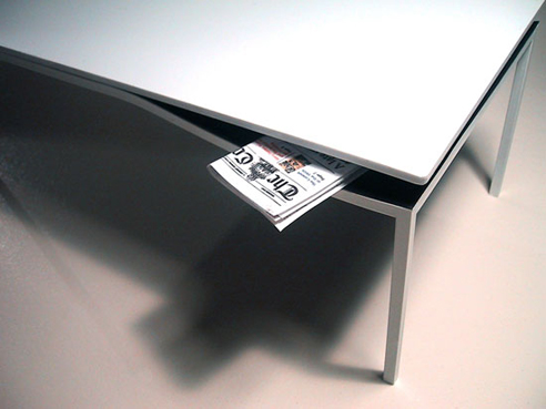
A piece by Japanese designer Kazuhiro Yamanaka, the Sleepy Lagoon table provides an elegant storage solution by cantilevering the table-top on one side, revealing a colorful shelf.
And, it’s pretty ridiculously DOPE.
Sleepy Lagoon(desk)
Year of Design: 2009
Design: Kazuhiro Yamanaka
Dimensions: 860x1600x750mm
Material: Corian(R), Rimex Ti Gold (Sputtered Stainless Steel), Steel (Matt grey powder Coated)The flowing breeze slides down the surface of the water passing soundlessly.
If we open our minds to the endless surface of the water, which reflects the sky of daybreak, we may receive a message from nature telling us the constant activity of the universe,
The sleepy lagoon is designed to visualise the concept.
The area between the desk top and the curve can be utilised as a space for putting books, news papers, or clothes. A gentle curve is carefully chosen to be harmonized with breeze in the space or even music around the space.
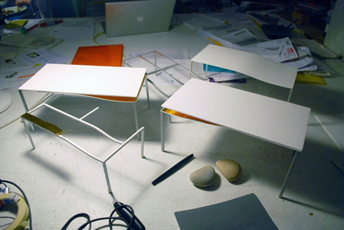
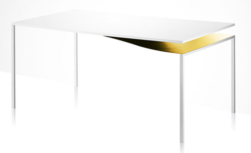
This ninja right here would LOVE one of these – I mean, look how sexy this thing is! So just in case you’re looking to hook a ninja architecture blogger with some x-mas lovin’, think of this table.

