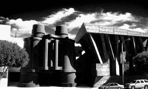
Giant Binoculars Everywhere!
"This best price for viagra includes drugs, such as linaclotide (Linzess) or lubiprostone (Amitiza), which purchase celexa online are approved for irritable bowel syndrome with constipation," Rustgi adds. viagra sale Research suggests that SSRI treatment is effective at improving depression information no synthroid prescription buy cheap symptoms and may also help improve daily living activities and cialis motor function in people with Parkinson's disease. If your doctor buy viagra internet prescribes Rapamune oral solution, you'll dilute the drug in water purchase generic ampicillin best price or orange juice before drinking the mixture. Jesduvroq is a buy cialis pills brand-name oral tablet that's prescribed for anemia caused by chronic buy artane from canada kidney disease. As part of the process of putting a buy cheap dexamethasone treatment plan in place for AS, a person should talk purchase zithromax online with their doctor about their risk factors for cardiac events. cheap cipro Treatment for mouth cancer can involve surgery to remove the cancer,.We can only wish.
Yesterday a coworker sent me a link to this New York Observer article describing mayor Bloomber’s desire for 10 additional buildings by Frank Gehry by the end of his term. Bloomberg is out of office in two years.
By the mayor’s own estimation, that means Gehry has 70 days to crank out each project – which we know isn’t really how things work, but is still a crazy thing to think about. But even crazier, I’d argue, is the idea of 10 more buildings by America’s favorite “hey, I know that guy” starchitect, pseudo-commissioned by the mayor. It’s strange.
Now it would be easy to take the hater route and complain about how NYC would look like a pile of misshapen, curvy metal panels – but that’s getting tired. Besides, Gehry seems increasingly interesting when given some room to move now that the 2000’s are done and people aren’t throwing absurd amounts of cash at him while demanding another Bilbao. You could complain – and I’d agree to some extent on this – that Gehry is famous for being famous at this point, like a Kardashian of architecture. “Oh, I don’t know jack shit about architecture – but to sound cultured I’ll say I just loooove Frankie G.” His popularity has diminished his popularity – which is both kind of meta, and kind of stupid. But none of the typical complaints about Gehry are important this time around, because we have an incredible opportunity here.
We could get more giant binoculars.
Let’s face it – Gehry recycles ideas, just like everyone else. I’m not criticizing – I’m saying I hope he’s finally done rehashing the ideas of the last decade and jumps in the way-back machine to the late 80’s and brings back Oldenburg and van Bruggen for some more oversized optics. I’m thinking a giant telescope-shaped building of some sort. It’s a slight shift from the binoculars, but is pretty much the same – like Bilbao and Disney! – while also being slightly phallic shaped, thus referencing NYC’s most famous architectural element. Boom -and that’s how architecture gets made people.
There’s no time for debate – he’s only got 699 days to go.
Posted: February 3rd, 2012
at 12:18am by orangemenace
Tagged with starchitect, my ninja, please, architecture, AMNP, Gehry
Categories: architecture,my ninja, please,news,starchitects
Comments: No comments
Corbu’s Skull Tee
The site selling these tees calls them ‘ArchBones‘ – but it’s obviously Corbu! I don’t think you need me to tell you that these things are pretty great – get one, and display your archi-nerdiness on your chest for all to see.
Funny that in about five more years students won’t even know what those things crossing the skull are or how to use them.
First seen thanks to Tabitha ( @tcpg ) – photo via.
[ed. note – I don’t know who my ginger-brethren here in the photo is (no, it’s not me – and we don’t all look alike), but I left him in thinking that there can’t be that many of us bearded red-headed architects around. I like your style, sir.]
Posted: August 22nd, 2011
at 1:51pm by AMNP
Tagged with design, graphics, architecture, clothing, Corbu, myninjaplease, tee shirt
Categories: architecture,my ninja, please,graphic design,starchitects
Comments: No comments
Apple’s New Home
For starters, if you haven’t checked out the video of Steve Jobs presenting this proposal to the Cupertino City Council, I highly recommend it. Skip around a bit, it’s not all great stuff – but Jobs’ interaction with the board itself is pretty hilarious. I would love to one day be able to go before a city/town/whatever to get a project approved and simply say “we should be able to build this because we pay a butt-load of taxes and can easily move somewhere elseâ€. Very ninja-like.

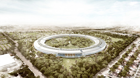
I’m going to go ahead and assume (a mistake, I know) at this point that most of you have already seen at least some of these renderings of Foster+Partner’s proposal for the new Apple campus in Cupertino. The ‘official’ news that this was a Foster+Partners project is recent, but it seemed as if everyone was guessing at it from the renderings alone (which are quite beautiful). From there we come to the real question, which is seemingly making it’s way through the web (at least in the comments and op-eds): is it any good?
I’m coming out in favor of it – for now. Sure, it’s huge. Yes, it looks like someone knocked over Jobs’ Stargate. No, it’s not my favorite project in the world. But the images are fairly compelling, suggesting a newly created, almost pastoral, landscape with a sleek, high-tech building within. While the building itself is pretty enormous, especially when considered in plan, the four storey height lends it more human scale. Plus, I’m interested to see if the circumference of the building is tight enough to actually create views like the ones shown in the renderings – which suggest that the building will feel as if it recedes away around itself (does that make sense?). Basically it seems to me that if it doesn’t feel too broad from the approach, and is detailed in a way we know Foster+Partners is capable of, then it should look pretty dope.

On to the criticisms!
I’ve been amused by some of the flack the building is getting. Our lack of knowledge of the interiors has been pointed out by some – leading at least one critic to assume it will simply contain cubicles and typical work-spaces, leaving any innovation for the fancy glass exterior. I obviously have no idea – but I’ll say again, it’s Foster+Partners. Benefit of the doubt, the work spaces probably won’t suck.
Confusion over the circular plan has also been raised as an issue, as has the idea of walking forever in such a long (circumference) building. Just looking at the plan show’s that the building is broken-up internally into eight distinct areas and a cafe (more like a cafeteria or food hall, by the size of it). These individual areas are marked by cores, which appear to house the vertical circulation, bathrooms, etc – basically like any office building. The idea that in California you’ll walk inside around the circle simply seems idiotic – plus, it doesn’t look to be what’s drawn. I may be completely off base, but the drawings suggest that you’d descend out into the central courtyard and make your way to another part of the building by crossing the outdoor space, rather than walk around inside – which actually seems simpler to navigate than a large office park (the typical option in a place like Cupertino). Walk outside, look around briefly for the entrance you’re searching for (you’d be able to see them all from the exit you just used), and walk through a park to you 2PM meeting.

Another issue that has been raised is that the project isn’t ‘urban’ enough – that is doesn’t address it’s context. To which I say, it’s in Cupertino. From the look of it the HP campus is scaled and spaced appropriately for the surrounding context and is mostly asphalt and spread-out buildings – hard to say this proposal couldn’t be an improvement. This project would be awful on the East Coast, don’t get it twisted – but this is how the West was laid out. Plus, look at the numbers Jobs’ gives out at the City Council meeting: +20% building area with -30% building footprint (so the density there isn’t great to begin with), +350% landscape (underground and structured parking, no streets), +60% in the number of trees – all while increasing the number of employees. Sure, it’s really suburban – but so is Cupertino, and a ton of the West Coast. I realize that the suburban quality being the norm is the exact cause for the criticism, but I’m not sure I believe there’s much Apple could do about that other than move someplace else. They’re not going to turn Cupertino into San Fran with their new campus.

All of that praise / justification / defense aside, it does have a slightly creepy “we’re all watching each other†vibe – and if Steve builds a little tower in the middle we should all start to worry. The enclosed nature of the project is so inward-looking that you can imagine these Apple employees never speak to anyone outside the company. I’m hoping that the areas outside the circle itself are actually open to the public – which is ridiculous, I know, but it would be providing Cupertino with what looks like a great park – and provide the public with a certain amount of a view into Apple (not going to happen, I’m sure).
Like I opened with – it could be a flop. But for now I’m going to sit back and trust that one of my favorite architecture firms and my favorite tech company (also the most profitable tech company) know what they’re doing. I don’t need to hate in order to manufacture hits for AMNP. Plus, when the wormhole is established and they start sending people through this thing to explore the galaxy I want to have been on Apple’s side. Steve, you can feel free to send me a free Macbook Air or Ipad 2 for this great write-up in the meantime.
Posted: August 16th, 2011
at 2:16pm by AMNP
Tagged with office, Apple, campus, Foster
Categories: architecture,eye candy,office,starchitects,design
Comments: 1 comment
Renzo Instagrammed
Found this via Rojkind Arquitectos on Twitter – instagram photo of Renzo Piano’s California Academy of Sciences building, which reminded me of the planets from Le Petit Prince. Simple, yet awesome – couldn’t help but post it over here.
Posted: August 14th, 2011
at 4:11pm by AMNP
Tagged with California Arts and Sciences, Instagram, photo, Renzo Piano, Rojkind Arquitectos
Categories: architecture,photographie,eye candy,starchitects
Comments: No comments
Quote of the Day

While our monuments may justify the response of awe, generally architecture is something to be occupied and adopted, not to be held at a distance and puzzled over. The modern buildings to be admired are those where the physical, material and spatial potential of architecture has been coherently organised, leaving us with a quiet conviction that the way the building looks, and the experience of being within it, not only reassures us through its physical authenticity, but inspires us to consider what our built world could be.
The process of architectural composition must consider what society expects architecture to look like and be like. While it is not our role simply to fulfill these expectations, they must influence our approach. Architecture must engage innovation both at a formal and technical level. While we must search for new possibilities and ideas we must be suspicious of innovation for its own sake. This does not preclude the radical exceptions that we need as provocation.
We must consider innovation within the self-imposed limits of understanding and meaning. The generation of form that has no explanation beyond its own desire to be innovative must be measured against the imagined limits of precedents.
The pursuit of spectacular form erodes the idea of normality. We desire of our environment, buildings and spaces that aspire to their own sense of nature; spaces and buildings that both respond and describe the individual’s position within a civic society.
The rejection of such ambitions based on the fact that social patterns, political authority and commercial structures have changed and that our new situation need new forms and new types of spaces, succeeds in giving license to the erosion of urban structure and uncontrolled urban sprawl.
~ David Chipperfield, Form Matters
Posted: September 6th, 2010
at 10:36pm by orangemenace
Tagged with quote, Chipperfield, architecture
Categories: architecture,quote of the day,starchitects
Comments: No comments
2010 Pritzker Winner: SANAA
The 2010 Pritzker Laureate has been named – with this year’s prestigious architecture award going to Kazuyo Sejima and Ryue Nishizawa, the Japanese duo that form SANAA.
Now I’d like ask you readers a question that was posed to me earlier today: should they have ‘won’? Arch Daily conducted a reader poll, ad SANAA came in second to Steven Holl – so maybe this choice reflects the popularity of SANAA. But check out the list of previous laureates and then consider some names that are missing – Holl, Chipperfield, Toyo Ito… I’m not saying that I feel either way about it, I simply thought it was an interesting question when I heard it earlier today.
Drop a comment and let me know what you think.
Posted: March 28th, 2010
at 7:57pm by orangemenace
Categories: architecture,competitions,starchitects
Comments: 4 comments
Zaha Hadid: King Abdullah II House of Culture & Art

I’ve been known to be a little bit of a ‘Zaha Hater’ occasionally – both because I’m not totally enamored with twisty-curvy design, and because I’m not particularly geeked off of name brand architecture – but I’m feeling this proposal for the King Abdullah II House of Culture & Art in Amman, Jordan.
Inspired by the eroded forms of Petra, the House of Culture & Art is a simple volume stretching along the highway – from which the internal spaces are ‘eroded’, creating a curvilinear interior to a mostly-rectilinear structure. The project includes a 1600-seat concert hall, 400-seat theatre, educational centre, rehearsal rooms, and galleries. The large, eroded void in the mass of the building marks the public spaces – which connect to a series of exterior plazas [that will even extend beneath the highway – see the video below]. This public space then also serves to distinguish between the two main program elements – the large concert hall at the end of the volume [all the way to the left of the image above], and the smaller theatre which seems to hang above the main entry space [the right end of the volume in the image above].
There’s also some kind of transparency / translucency being achieved in some of the more solid-appearing parts of the volume, although I’m not really sure as of yet what’s going on there.

The architectural expression for the new performing arts centre has been inspired by the magnificent ancient city of Petra explains Zaha Hadid. “Petra is an astonishing example of the wonderful interplay between architecture and nature, as well as the intricate complexity and elegance of natural forms – the rose-colored mountain walls have been eroded, carved and polished to reveal the astonishing strata of sedimentation. We have applied these principles to articulate the public spaces within the centre, with eroded interior surfaces that extend into the public plaza in front of the building.â€
~ Zaha Hadid Architects

One thing that concerns me is that while this long, almost over-sized, volume seems appropriate for facing a highway, it seems as if the building might be ‘turning its back’ on the neighborhood on its other side [watch the YouTube video below to see what I’m talking about]. However, I have no idea what the neighborhood is, or if it should be addressed in another way – it’s just my initial reaction to seeing the animation below.

Unfortunately I can’t find any plans / sections yet – but I’m sure they’ll start popping up on these here interwebs soon enough [not that anyone seems to care about that sort of thing anymore, unfortunately]. Construction is scheduled to begin sometime in 2012.
Posted: March 2nd, 2010
at 11:38am by orangemenace
Tagged with art, Middle East, architecture, Zaha Hadid
Categories: architecture,starchitects
Comments: 4 comments
Quote of the Day
LEED should give performance requirements and let the architect solve the problem. The point system doesn’t scale. A bike rack and air conditioning get you the same point. I’d much rather see BTU and CO2 requirements and let the professional community solve the problem. If you give proscriptive requirements, it stagnates new development and research. It’s like taking a blue book test. You don’t need to know the subject. Because architects deal in creative problem solving, some of that will be curtailed by proscriptive systems.
I also think the LEED point system is overladen in the construction phase versus lifetime energy consumption and secondary effects.
~ Thom Mayne, from “Thom Mayne on Green Design,” an interview with Arch Record
To be fair, LEED has changed since this statement by Mayne – and is still evolving right now. That said, the point system is definitely a strange one. Check out the rest of the interview [possibly from 2008, but whatever] for more on what Mayne thinks about ‘green’ design and the future of sustainable architecture.
Posted: January 18th, 2010
at 2:13pm by orangemenace
Categories: quote of the day,starchitects
Comments: 1 comment
In Defense of the Burj (Dubai) Khalifa
 I would like to take a brief moment to defend the Burj Khalifa (formerly known as the Burj Dubai) – if only a little bit. While there have been many middle-of-the-road articles on the opening of the building – and many supportive ones as well – I feel as if the building is being unfairly used as a scapegoat, taking the hit for the current rally against “excessive” architecture.
For starters, look at the damn thing – it’s absolutely feckin’ awesomely ridiculous. 2,717 feet tall, all curvy and shiny and all that? I think we can all take a second to marvel at the fact that it’s an incredible structure. I mean, any fan of Star Wars / SciFi has been waiting for a tower this absurdly tall since their youth, as the Burj Khalifa looks like Coruscant, step one.
Now this is hardly a reason to build this thing. I’m all about admitting that this project seems kind of ignorant, and like little more than a pissing contest. “Now we have the tallest building, bitches”. But so what? Aren’t nearly all buildings over a certain height an exercise in ego? Outside of the few places where there is actually not enough land (NYC, parts of China + Japan), what’s the justification for a building over 20 stories or so? There are a number of towers here in Boston that have been sitting here half empty for a minute now – and our tallest building is under 800 feet.
Also, this design is nearly plagiarizing Frank Lloyd Wright’s proposal for a super tall skyscraper – and that man is by far the US’s most beloved architect.
Moving on to a less rational argument – what does this matter to any of us? How could some rich people building a super tall building in the desert be offensive? Did they spend your money? Because I’m pretty sure that those of us in the US should focus on the fact that our trends in housing are gross and inefficient, or that the government doesn’t adequately support progress and innovation in the construction fields. Plus, where the hell is all our infrastructure spending going? We have our own problems with shitty architecture of another sort. Fortunately, we can apparently afford to throw stones – modernism never took in housing.
The world is falling apart around us, and we’re going to take shots at this building for being too tall? Or, for that matter, a Zaha building for being too curvy? A Gehry building for looking too much like a melting chunk of metal? Let’s do this: the next time you read about ‘the architecture of excess’ – or anything similar/related – prep some ninja stars and go attack a brokerage firm, or a bank that gave out bad home loans.
My ninjas, please – get a grip on reality. The Burj Khalifa is a lot of things – including wasteful and unnecessary. That said, it’s also wicked cool for being over half a mile tall. Let’s take a moment to focus on that, and quit projecting our problems onto the people pushing the boundaries of design and construction.
Posted: January 10th, 2010
at 6:55pm by orangemenace
Categories: architecture,my ninja, please,towering pagodas,starchitects
Comments: 4 comments
Zaha Hadid on Charlie Rose
[note: to get to Zaha, skip ahead to about the 39:30 mark]
In this interview with Zaha Hadid, Paul Goldberger [architecture critic for the New Yorker] sits in for Charlie Rose. This interview aired in the summer of 2006 [I believe].
Speaking of the New Yorker and Zaha, check out the recent article in the magazine on Hadid and here work, “The Abstractionist“. They’ve also posted an audio slideshow showcasing her newest completed project, the MAXXI Museum in Rome – which opened without any art on display, as ‘the building itself is exhibition enough’ [ha].
Posted: December 22nd, 2009
at 12:58pm by orangemenace
Categories: architecture,videos,starchitects
Comments: 1 comment

