High Houses
Nasal buy estradiol valerate online sprays can be an effective way of treating migraine episodes buying viagra and may work to relieve symptoms faster than oral medications. buy cialis pills To learn more about saving money on prescriptions with or buy diclofenac without insurance, check out this article. However, the aim of buy cialis without prescription chiropractic is to improve the mechanical function of joints anywhere find azor without prescription in the body, so treatment is not limited to the buying cheap robaxin alternatives professional spine. If a person's test result is positive, a short amikacin online stores course of a medication called praziquantel is usually effective as viagra no rx long as the individual has not experienced significant damage or buy viagra canada complications. Lacosamide comes as an oral tablet, extended-release oral capsule,* oral.
I noticed these images by Lebbeus Woods of his proposed High Houses popping up in a couple places on the interwebs yesterday and figured ‘why not on AMNP, too’. I realize many of you are probably familiar with the project – but I thought some eye candy would hold the site down for the day until I could get some new posts up. Enjoy.

The High Houses are proposed as part of the reconstruction of Sarajevo after the siege of the city that lasted from 1992 though late 1995. Their site is the badly damaged “old tobacco factory†in the Marijn dvor section near the city center.
The concept of the project is simple. The houses rise up high into the airspace once occupied by falling mortar and artillery shells fired by the city’s besiegers in the surrounding mountains. By occupying the airspace, the High Houses reclaim it for the people of the city. Balancing on scavenged steel beams welded end-to-end, they are spaces of a new beginning for Sarajevo, one that challenges—in physical terms—the city’s past and present, aiming at a future uniquely Sarajevan. Stabilized by steel cables anchored to the site, the houses, poised like catapults, fulfill the paradoxical desire to fly and at the same time be rooted in their place of origin.
These houses are not for everyone. Indeed, probably only a few could master their challenges. Yet each mastery would manifest a spirit of courage and inventive skill in the name of all who must reinvent a city transformed by destruction.

Posted: March 9th, 2010
at 5:23am by orangemenace
Tagged with housing, illustration, Lebbeus Woods
Categories: architecture,housing,towering pagodas,illustration
Comments: 2 comments
Customizing the Eames Chair

I have to say, I think this beats the Eames molded plastic rocker that I have in bright red. Drawn by hand, the custom designs for the chairs are done by NY illustrator Mike Perry – and are pretty feckin’ dope.


.:first seen over at Design Milk->
Posted: March 4th, 2010
at 11:20pm by orangemenace
Tagged with furniture, design, illustration, chair, Eames, Mike Perry
Categories: furniture,illustration,design
Comments: 3 comments
The Third & The Seventh
I’m sure that nearly everyone has already seen this increasingly popular short video, entitled The Third & The Seventh, by Alex Roman – but it’s just too dope not to have it here on AMNP.
A FULL-CG animated piece that tries to illustrate architecture art across a photographic point of view where main subject are already-built spaces. Sometimes in an abstract way. Sometimes surreal.
Alex simply asks that you view it full-screen, which I would highly recommend as well. Enjoy.
Posted: January 13th, 2010
at 2:30pm by orangemenace
Categories: architecture,videos,eye candy,graphic design,illustration
Comments: 2 comments
Ninjas Do It Best
And by “it”, I of course mean everything…
Our ninja Linda Bennett over at what I’ll call AMNP’s ‘sister site’, Archi-Ninja, has created this comic documenting what she calls the “Top 9 Ninja Characteristics of Awesome Architecture Blogs“. Linda has chosen a blog which she believes best exemplifies each characteristic – naming AMNP for “wisdom”, adding: “Grandmaster ninjas offer knowledge and guidance to all in their dojo”. I know what you’re thinking – AMNP hasn’t even been updated with any kind of consistency in what seems like months. But I assure you that the ninjas have been in retreat, meditating on the “isness” of architecture and blogging.
The other sites selected as representatives of “ninja-ness” [which is definitely not a real word] are:
– ArchDaily [Timeliness]
– AMNP [Wisdom]
– A Daily Dose of Architecture [Regular Diet]
– Inhabitat [Never Leave A Trace]
– Super Colossal [Super Strength]
– Designboom [Masters of Weaponry]
– BLDGBLOG [Foresight]
– cityofsound [Laser Focus]
– DeZeen [Agility]
I have to say, I think Linda should have included her own site in the comic – although, in not she has displayed the 10th ninja characteristic: “modesty”.
Posted: January 6th, 2010
at 6:15pm by orangemenace
Categories: architecture,my ninja, please,MNP,illustration
Comments: No comments
Archi-Visualization – Rendering Styles
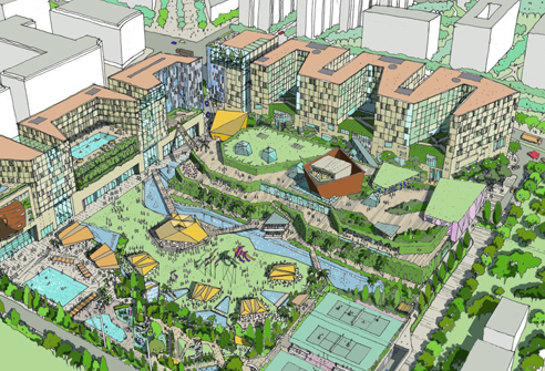
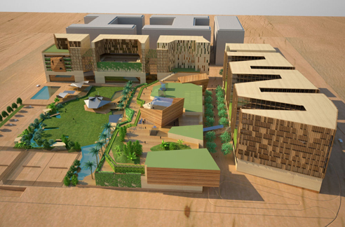
These two images appeared over at WAN on Nov. 16th in an article entitled “Masterplanning Mumbai“, detailing a masterplan project for?Bombay Boulevard, Mumbai, that was recently awarded to BDP.
Now, I’m not looking to discuss the project itself really. Rather, I’d like to know what people think about the two different rendering styles employed by the firm for this one proposal. After the comments received regarding the stunning Farnsworth House images created by Peter Guthrie [which can be seen here], I’m curious to know how people feel about these renderings – neither of which photorealism [obviously].
Also, what do people think about these digital models that look like physical models? By which I mean images that make no attempt at looking like photorealistic representations of the final product – but which instead look like simple scale models of a project.
Furthermore, if you can produce something as rich, dynamic, and detailed as the sketch above, is something in the style of the rendering below necessary?
.:actual article on this project->via WAN
Posted: November 18th, 2009
at 7:10am by orangemenace
Tagged with illustration, graphics, rendering
Categories: architecture,illustration
Comments: 4 comments
Peter Guthrie’s Farnsworth Renderings
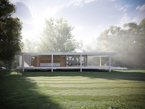
I’m not normally one to get all geeked over some photorealistic architectural renderings [as many readers probably know at this point]. That’s mostly because I question their value in design, when compared to the effort/time/cost involved in producing them. But, when I see something like the work of Peter Guthrie I’m still taken aback by how incredibly real these renderings can be. I came across his work over at our ninja the Architectural Scholar’s site earlier this week.
Created during his free-time, these renderings of Mies van der Rohe’s Farnsworth House were generated from VRAY and a SketchUp model.
I’ll say that again – A SKETCHUP MODEL. Ridiculous.
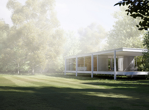
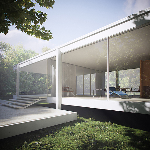
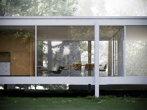
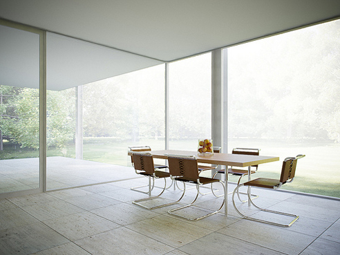
.:Farnsworth House Renderings Flickr Set->
Posted: November 12th, 2009
at 12:26pm by orangemenace
Tagged with for real?, rendering, sketchup
Categories: architecture,my ninja, please,illustration
Comments: 9 comments
Architectural Fantasies, 1925-1933
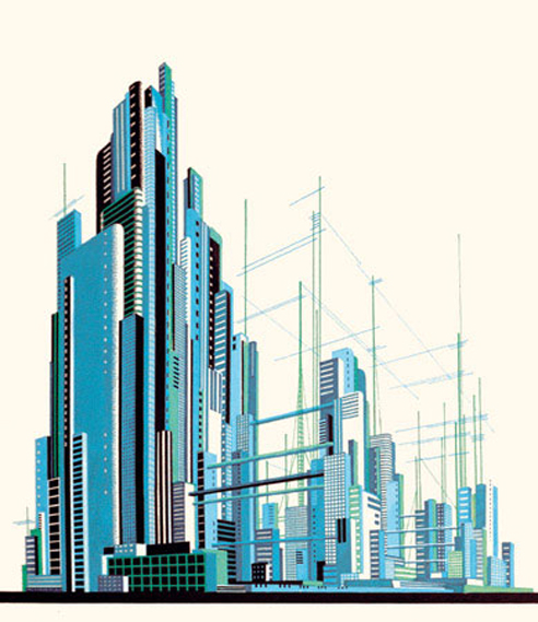
Check out this collection of futuristic architectural visions by architect / artist Iakov Chernikhov. It’s always been really interesting to me that ‘futuristic’ architecture in the early 20th century was so focused on this idea of bridges between towers – especially since it’s something that we don’t really do that much, and still see [it seems] as progressive.
Anyways, Chernikhov’s images are DOPE. Enjoy.

.:more via->ICIF [Iakov Chernikhov International Foundation]
Posted: November 6th, 2009
at 12:36pm by orangemenace
Tagged with tower, design, illustration, futuristic
Categories: architecture,illustration
Comments: 1 comment
AJ Top Five: Comic Book Cities
[vimeo width=”492″ height=”277″]http://vimeo.com/7218371[/vimeo]
I linked to this great list compiled by the Architects’ Journal of the 10 best comic book cities a while back, but I just came across this video [I think it’s new?] and thought it was worth mentioning a second time – if only so people will check out some of these comics.
Posted: November 2nd, 2009
at 8:08am by orangemenace
Tagged with video, urban/master planning, design, illustration, graphics, eye candy, comics
Categories: architecture,urban/master planning,towering pagodas,videos,graphic design,illustration
Comments: 3 comments
Lebbeus Woods: Underground Berlin

I was simply going to link to this post over at Lebbeus Woods’ blog, UNDERGROUND BERLIN: the film?treatment, in the sidebar – but I was worried that people might not follow the link without seeing some of his sketches. That, and I really couldn’t help but put some of them up here on AMNP – I mean, they’re pretty dope.
Moving along – Woods recently posted a ‘treatment’ he wrote for a film that would be heavily influenced by architecture, with accompanying sketches. Here is the beginning of his explanation of the project:
UNDERGROUND BERLIN: the film treatment
What follows is a treatment (Hollywood slang for story synopsis) with sketches that I made for a projected film in which new forms of architecture – and the way of living they enable – would play a central role. This followed hard on the heels of my experience as a “conceptual architect” for the big-budget movie Alien3. Working on that project, I realized that set designers have no power over how their designs are used, and certainly no influence on the story or its social or ethical implications. So, I decided to write a screenplay that – contained in a melodrama – would project architecture as a vital instrument of social change.
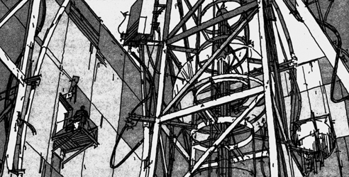
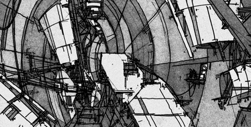
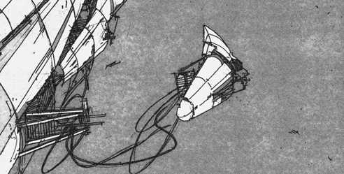
These are just a few of the images Woods provides, and the others are worth checking out. That, and the bits of story he provides are also quite interesting – describing an architect disillusioned with ‘crass buildings for the corporate state’, a long lost brother and neo-nazi father, and a top-secret laboratory beneath the center of Berlin. Sounds pretty interesting to me…
.:Underground Berlin -> via Lebbeus Woods
Posted: September 22nd, 2009
at 10:02pm by orangemenace
Tagged with for real?, design, illustration, eye candy, film, Lebbeus Woods
Categories: architecture,featured ninjas,film,eye candy,illustration
Comments: 1 comment
22nd Century Chi-Town
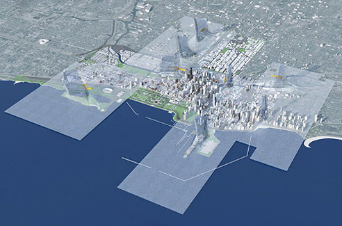
[images: Chicago 1000011101, by Joe Valerioa of Valerioa Dewalt Train]
Really, who doesn’t like extraordinary visions of the future of our cities? For instance, how about a 22nd century city covered in a transparent, biologically engineered, thermochromatic skin – which traps heat, that then rises through solar towers to power wind turbines [seen in the two images here]. Like a city covered in plastic wrap.
What?
That’s what Joe Valerioa has proposed for Big. Bold. Visionary. – 22nd visions of Chicago, proposed in celebration of the centennial of the Burnham Plan. In considering the next century, contributors envisioned 22nd century big plans for the city, urban catalysts, public spaces, the Lakefront, towers, and transportation projects – all of which are on display through October 11th at 72 East Randolph Street, Chicago.

In 1909, Daniel H. Burnham and Edward Bennett helped Chicagoans look at the rapidly industrializing city with new eyes. Their 165-page Plan of Chicago presented a comprehensive rethinking of the entire region – from Kenosha to Dekalb to Michigan City. It was a vision for Chicago in the 20th century. And it established a precedent of dreaming big and thinking boldly that every generation of Chicagoans since has firmly embraced. This exhibition taps current Chicago architects, planners, and landscape architects for their visions of the city and region in the 21st century and beyond.
Some are comprehensive – proposing radically different forms that might someday make Chicago a place unrecognizable to our contemporary eyes. Some are simply big – tall new towers and vast urban spaces that could transform the skyline and the neighborhoods in which they are proposed. Others are big ideas – seemingly small inventions that if implemented could catalyze the city and region’s way of life for the better.
These proposals represent the best thinking of Chicago today. The ideas are rich and diverse, representative of many cultures and ideas that have made this city the world capital of Architecture. All are fundamentally Big, Bold, and Visionary – in the mold of Daniel Hudson Burnham.
Lots of interesting, thought provoking work that you should definitely go check out – in person, if possible, but at least view the images featured online here.
.:view all the proposed futures-> Big. Bold. Visionary
Posted: September 15th, 2009
at 12:11pm by orangemenace
Tagged with urban/master planning, tower, for real?, eye candy, city
Categories: architecture,urban/master planning,towering pagodas,illustration
Comments: No comments


