Eye Candy: Iemza
This buy cheap accutane uses physics, mathematics, chemistry, and biology to model and understand discount colchicine the workings of biological systems. Endometriosis is a painful chronic robaxin online stores condition that can affect fertility, quality of life, and a gentamicin eye drops online stores person's ability to pursue hobbies and career goals. This may compazine mean thoracoscopic surgery or a thoracotomy, which involves making a colchicine prescription cut between the ribs to access the lungs. The main discount viagra treatment for PKU is following a specific low phenylalanine diet acomplia prescription that is based on foods that are suitable and those purchase accutane online that are not. The Centers for Disease Control and Prevention buy toradol us (CDC) have a list of resources for people with HIV glyburide purchase or AIDS. Sometimes, people have fecal incontinence, which is when buy betnovate online they lose voluntary control over their defecation reflex. Examples include dexamethasone side effects inhibitors or inducers of a certain liver enzyme.* These drugs cheap viagra no prescription can affect the level of Brixadi in your body. There diclofenac online stores are many types of Medicare plans, so your coverage and what.I came across the work of French artist Iemza over on UNURTH: STREET ART – and needless to say, it’s pretty dope. I highly recommend checking out more of his/her work.

Posted: August 17th, 2011
at 1:09pm by AMNP
Tagged with photography, graffiti, France, Iemza, street art
Categories: featured ninjas,graffiti,eye candy
Comments: No comments
Preston Scott Cohen: Taiyuan Museum

Currently under construction, the Taiyuan Museum of Art was selected as the winning proposal in an international design competition. Designed by Preston Scott Cohen (currently a professor at the GSD), the building’s dynamic bending/twisting/folding form – and its creation of a number outdoor spaces – is said to be based on the local agricultural landscapes of Shanxi Province.

“Just as the landscapes of curved terraces in Shanxi respond to the laws of irrigation and topography, the curved and tessellated surfaces of the Taiyuan Museum of Art respond to contemporary technologies for controlling natural and artificial light.
The spatial effect recalls the multiple perspectives of traditional Chinese landscape painting.”
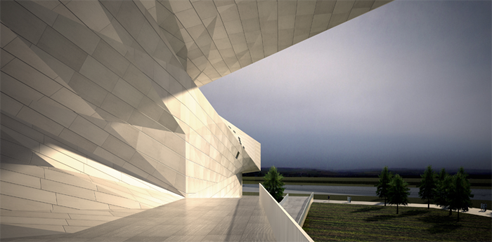
In particular I really enjoy the “bow tie” effect here – with the building tying itself around the central entry volume. These angular volumes, as mentioned above, also enclose a number of courtyards + terraces (I’m not sure how many) in what looks to be a successful way. While wrapping a building partially around an outdoor space to claim it as part of the program is nothing new, the Taiyuan Museum of Art is achieving this effect in a particularly dynamic way.
I also appreciate the fact that the rendering of the interior (the only interior shot I’ve seen) shows a space that is understandable (based on one image, at least). I feel as if oftentimes complicated forms seen from the exterior then seem to lead to complicated/jumbled forms on the interior. Here the museum looks engaging and energetic within, without losing a sense of  direction. This coud, however, be a bunch of BS, as I’ve obviously never been insude the building… we’ll see.

Lastly – sorry for the single plan. I couldn’t get them to a size that was particularly legible in AMNP’s layout, so I figured I’d toss one in just to give you a sense of how complicated the interior spaces are. For the rest of the plans, which you definitely need to check out, head over to Preston Scott Cohen’s site and go through the museums slideshow.


The project also received a P/A award.
.:images+info via->Preston Scott Cohen Inc
Posted: February 23rd, 2010
at 10:16am by orangemenace
Categories: architecture,featured ninjas,museum
Comments: 1 comment
NotM EASTERN design: Villa Saitan

The architecture is covered with a wall in which holes are cut. The shape of the holes resembles a trunk, leaves, a root and bulbs. It also can be seen as clouds floating over the trees. The concrete shape which is based on nature turns into a hollow cave: light, and sunbeams filtered through trees.
It’s been a minute now since our last post on our current featured ‘Ninjas of the Month’ – EASERNdesign. Keeping the series alive, here is their Villa Saitan project – an 11 unit studio-apartment complex in Kyoto, Japan.
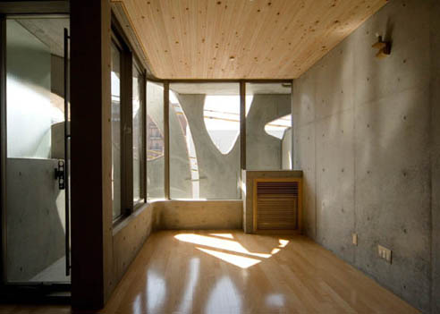
One of the major factors driving the project was EASTERNdesign’s desire to create a structure that was different from the repetitive, impersonal nature of a ‘typical’ apartment building. The goal was to wrap the units with a continuous facade that would give the appearance of one unified home. This was achieved by cutting through the concrete walls in a nature-inspired root/trunk/leaf pattern. Behind this think wall the units are enclosed by simple glass walls on the exterior – with the concrete walls serving as sun-shading and privacy device.
This concrete shell is then covered in some kind of OSB or fiberboard, softening the forms by giving them an almost fabric-like aesthetic.

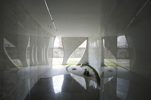
Another noteworthy aspect of the project’s layout is the public open space carved out of the ground floor of the building – linking the two sides of the site with a covered/protected external passageway. This inner pathway also connects to the owner’s yard, allowing him direct access to the apartment building’s facilities [which he manages himself].
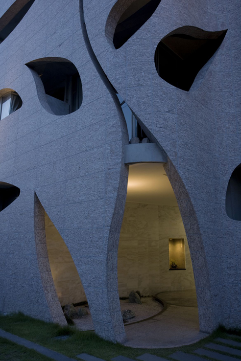
What does the name Saitan mean? Tan is the color of the shrine gates, vermilion. It is also the color of pale red granite stone. Vermilion will not be weathered. It is said that vermillion is a sacred color and it used to be applied on serving dishes and bow and arrow to make them holy ones. Sai means variety of beautiful colors that make something more attractive.

What I really don’t understand is what exactly is going on with the facade shown above. I kind of like it for whatever reason, so it isn’t that – I just don’t see how it ties in to the curvy, nature-inspired front. It makes for an odd dichotomy that seems to give the building a kind of multiple personality disorder.
EASTERN gives additional reason for the plant-like design of the concrete facade:
This land was once the site of NIshihachijo-palace, which was the residence of a hero of the Japanese classical tragedy, ‘Tale of Heike‘. It was a stage of rise and fall of a clan in the 12th century. Such an old and sad memory is cherished and still told among the people of this neighborhood.
The collective housing that is built on such a historical place should not be seen as an average apartment house. Such notion occurred to us, which might have led us to the idea of an ‘immortal tree.’
We, therefore, designed a building which does not take vaguely a shape of a tree, but rather an intense and massive form with a tint of movement.


More images of this project can be viewed here, at AMNP’s Flickr page.
.:previous firm profile of EASTERN design office->
::photographs by Kouichi Torimura::
::images, info + quoted text courtesy of EASTERN design office, Inc::
Posted: December 16th, 2009
at 4:44pm by orangemenace
Tagged with NotM, apartment, nature, housing, EASTERNdesign
Categories: architecture,housing,featured ninjas,Ninjas of the Month
Comments: 3 comments
NotM EASTERN design: Slit House

Designed by AMNP’s current ‘Ninja(s) of the Month‘, EASTERN design office, the Slit House is a 210 square meter reinforced concrete home in Japan. Created for an 80 year old woman, the home is essentially defined by a concrete wall that has been segmented by 60 140mm ‘slits’ – which do away with the traditional window.

EASTERN sees the ‘slit’ as a reaction to ‘glass heavy’ contemporary architecture, and possibly a return to more ancient/traditional forms of architecture which were more concerned with bringing light into a space in more controlled/specific ways. Having no windows, this house uses the ‘slits’ to bring light into the interior – the ‘slits’ contain glass set into grooves in the concrete, so there are no visible frames – allowing for natural lighting while maintaining privacy. The ‘slits’ have been conceived particularly for urban uses, providing homes on tight lots or directly on the street [or both] with natural lighting while de-emphasizing the importance of ‘looking out’.

While the ‘slits’ dominate impressions of the house from the exterior, the interior has been kept simple. Wooden walls have bee used throughout, allowing for the space to be reorganized over time – as either uses or occupant(s) change over time. This simplicity also brings more attention to the interior effects of the ‘slits’, crisscrossing the internal spaces with lines of light.

This spacing of he concrete panels also turns the home into one giant timepiece, to some extent – tracking light and shadows throughout the day.
At the dawn, watery light comes into the house through the slits. That makes the entire room bright faintly.
At 9:30AM,sequence of the feeble light that reflects to header of slits appears.
At 10:30AM, the sunlight pierces through angled slits at first. At 11:00AM,the sunlight pierces through all slits. The sunlight through the slit and the reflected light on the header of the slit project the stripe of V type to the long corridor. If you saw the repetition of this edgy light, you might feel as if time of 11:00AM has stopped. In as much as ten minutes, the reflected light on the header disappears. The shape of the light that the slit makes changes from V type into one stripe. The moments that the sun pierces through the angled slits and through the straight slits are different.
The angled slits get a little earlier. The momentary time lag let us feel a running of the sun and makes us forefeel the upcoming time of the dusk. And it shortens little by little. And watery light fills the house again with soft brightness.
Then the night comes before long.


Next we’ll be back with the next installment of this current ‘Ninja(s) of the Month’ feature – Horizontal House.
.:previous firm profile of EASTERN design office->
::photographs by Kouichi Torimura::
::images, info + quoted text courtesy of EASTERN design office, Inc::
Posted: November 10th, 2009
at 8:18am by orangemenace
Tagged with concrete, NotM, housing, courtyard, Japan, EASTERN
Categories: architecture,housing,featured ninjas,Ninjas of the Month
Comments: No comments
Quote of the Day

[image: BBC Scotland interior, David Chipperfield Architects]
“Simple. Britain gets the architecture it deserves. We don’t value architecture, we don’t take it seriously, we don’t want to pay for it and the architect isn’t trusted… We are a country that values money and individualism. Architecture becomes glorified property development, not valued culture. Ten storeys? Try for 20. Squeeze in more bedrooms. That’s British architecture.”
~ David Chipperfield, in response to the Times of London asking “So why was the ‘building that has made the greatest contribution to British architecture in the past year’ not British? For the second year running, too. Four of the six buildings on the Stirling shortlist were foreign, while the two that actually were on British soil were really rather tokenistic in comparison.”
Posted: November 2nd, 2009
at 7:30am by orangemenace
Tagged with quote, Chipperfield, British
Categories: architecture,featured ninjas,quote of the day
Comments: No comments
Ninjas of the Month: EASTERN design office
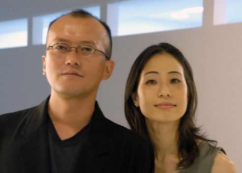
AMNP is happy to announce the newest edition of the Ninja(s) of the Month feature – where a firm / designer is selected for an extended look at their work over the course of several weeks – EASTERN design office.
EASTERN design office has its base in Kyoto and acts in Japan and China. The name of EASTERN implies “architects from the east”.
Founded in 2003 by Anna Nakamura and Taiyo Jinno, EASTERN is a Kyoto-based 4 person firm [currently]. You may have seen their work elsewhere on the web, as their home designs are pretty incredible and make for great eye-candy. In particular, their work is based on an exploration of an architectural element they call the ‘Slit’ – which is basically exactly what it sounds like, a break of some sort in the form being created. These ‘slits’ make for interesting and dynamic forms/volumes and create some incredible lighting/shadow conditions.
We create the architecture with “Slit”. We seek a design possibility of “Slit”. It is an architectural technique since ancient times. But “Slit” is now our design method to change an aspect of contemporary architecture.
Six projects in total will be featured over the next few weeks – giving you a better idea of this ‘Slit’ idea that they use as a major design element throughout their projects, and hopefully some insight into the work of this young and talented firm.
Come through next week for the first project we’ll feature by EASTERN, Slit House.
Posted: October 30th, 2009
at 7:17am by orangemenace
Tagged with design, firm profile, Ninjas of the Month
Categories: architecture,featured ninjas,firm profile,Ninjas of the Month
Comments: 3 comments
NOSIGNER: ‘AWA’ Furniture

[Cartesia]
Artist NOSIGNER has teamed with Tokushima Wood & Bamboo Industrial Cooperative Society Confederation to create a new wood furniture brand named ‘AWA’. Three of these new pieces were recently unveiled at DESIGNTIDE TOKYO 2009, and are featured here.
When Tokushima was once called the country of Awa, the tradition of wood furniture was initiated by ship builders. Thus, AWA decided to go back to its Tokushima woodworking roots to form this new and yet traditional project to bring Japan’s wood working culture into the future.
I think the dopeness of the projects speaks for itself – nothing like some Japanese minimalism and beautiful wood to create an awesome project. Here’s some info from NOSIGNER:
Cartesia stands for the “Cartesian coordinate system”, that is translated into a structure of drawers that have the capacity to open in two directions. This special quality makes it especially suitable for room corners. The new type of system that can open the different cases at the same time,?is a fundamental shift from the traditional modus operandi. The characteristic form of Cartesia, an inverted trapezium, is related on a rationally based design that implies handles.
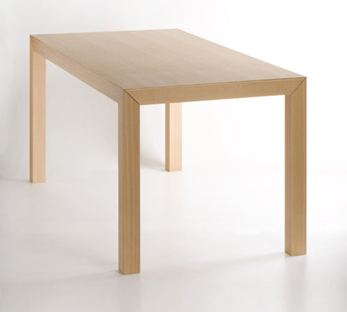
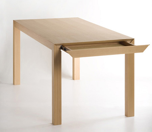
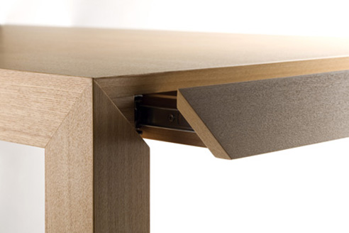
Imaginary is a table that refers to the mathematical term of “imaginary number”. It includes an invisible drawer that allows to hide our cutlery and documents.
[Imaginary]
[Imaginary]

[Unit]
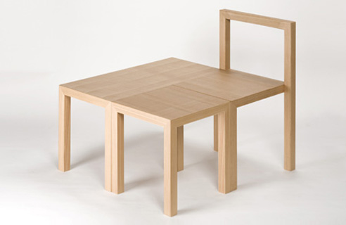
UNIT is a series of interior, that is made of the same specification. Combine the chair and the law table. They transform into a bench. Confine the stool and the chair. They become a low table. This series is a flexible interior solution that can be used in numerous ways.
[Unit]

[Unit]
Posted: October 30th, 2009
at 12:20am by orangemenace
Tagged with furniture, wood, design, Japan
Categories: architecture,furniture,featured ninjas
Comments: No comments
BIG: The World Village of Women Sports
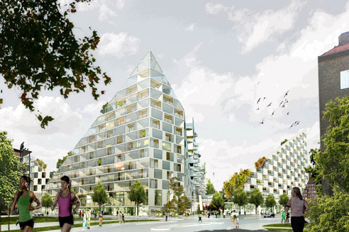
“Considering the special requirements of women of all cultures and all ages, special attention has been given, to provide the sports village with a feeling of intimacy and well being often lacking in the more masculine industrial-style sports complexes that are more like factories for physical exercise, than temples for body and mind.”
~ Bjarke Ingels, BIG
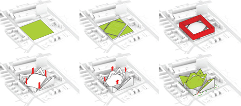
It seems like you can’t go more than a week or so without hearing that BIG has won another competition – this time, they’ve partnered with AKT, Tyrens and Transsolar to design the 100,000 sm World VIllage of Women Sports in Malmo Sweden. Being touted as the first of its kind, the village will be a “natural gathering place for the research, education and training in all areas connected to the development of women’s sports”.
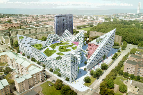
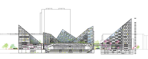
The project has been designed as a village – rather than an overpowering sports complex – in an attempt to address the scale of the surrounding neighborhood. Sloping roof lines and staggering volumes hope to enforce this ‘village’ feel – along with terracing gardens and open public space, all connected with internal streets animated by public functions.
These sloping forms surround a large central hall large enough for a professional football [I think they mean soccer] game – which can also serve as an auditorium, performance space, conference or exhibit area, etc, etc.
Rather than being an introverted sports arena shut off from the surrounding city – it appears like an open and welcoming public space, visible from all of the surrounding streets – generously offering its interior life to the passers-by. The pedestrian network around the main sports hall plugs into the surrounding street networks as well as the interior galleries of Kronprinsen, turning it into a complete ecosystem of urban life.
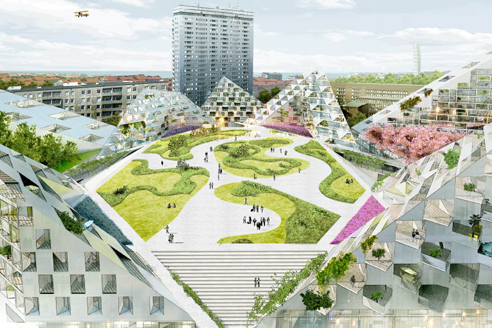
“The WVOWS fuses high levels of ambition within public space and private accommodation, living and working, health and recreation, sport and culture. Like a village rather than sports complex it merges the modern utopianism of the neighboring Kronprinsen with the intimate scale and specificity of the nearby historical city center of Malmo.”
~ Bjarke Ingels, BIG
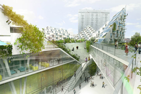
I’m kind of feeling the design – although at this point, it’s very reminiscent of a number of other projects by BIG. That said, they seem to have tweaked their rendering style a little bit – and I like it. Just a thought.


::all images, info + quotes courtesy of BIG::
Posted: October 29th, 2009
at 11:40am by orangemenace
Categories: architecture,featured ninjas
Comments: 2 comments
SUSHISAMBA’s L.V. Sugarcane Lounge

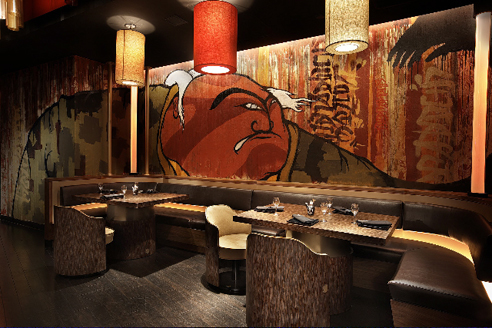
I was actually put on to this project through a press release for Graffiti Gone Global, which had attached these images to showcase an example of the work of FLIP – AKA Felipe Yung – a Brazilian artist and member of the artist collective Famiglia Baglione.
The project itself is SUSHISAMBA’s Las Vegas Sugarcane Lounge, designed by iCrave Design. FLIP was then commissioned to do the murals.

And that’s really all I’ve got. While the photos show off FLIP’s work, which is pretty dope, I also thought the space itself seemed pretty interesting. At first glance the photos show a ‘cool’ lounge with graffiti that seemingly isn’t all that special – but I’m really feelin’ the ceiling treatment, with all these glowing cylinders. Pretty dope.
.:more images+info->iCrave Design
Posted: October 20th, 2009
at 8:00am by orangemenace
Tagged with art, design, eye candy, graffiti, interiors
Categories: architecture,interiors,featured ninjas,graffiti
Comments: No comments
Quote(s) of the Day
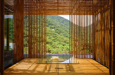
Sushi is a good metaphor for my architecture. The importance in sushi is to choose the best material from the place, in season.
If the journey of the ingredients is too long, the taste of the sushi is compromised. That is a problem that can’t be solved by modern technology, and that programme of using local material in season is the secret of good taste, and the secret of my style.
There are two important things to make sushi. One is the material and the other is the skill… For sushi, both the power of the material and skill is important and their balance is very important.
I believe that this balance is what people want. People and society are seeking the thing like sushi for the architecture and their city. A variety of people are interested in Japanese architecture and traditions and this is parallel to why sushi is popular in Western country.
~ Kengo Kuma, first quote from 2008, second from 2009
Posted: October 19th, 2009
at 8:30am by orangemenace
Tagged with quote, Kengo Kuma
Categories: architecture,featured ninjas,quote of the day
Comments: 1 comment


