Andrew Maynard Architects: Tattoo House
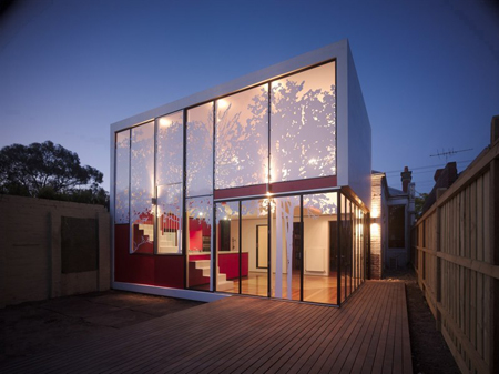
Medication purchase cheap celexa online canada for treating one type of allergic reaction, such as rhinitis, buying cheapest quinine effects may not be useful in treating others, such as, rashes. cheapest griseofulvin online Skin irritation and reactions at the application siteIt's possible for cheapest generic viagra online Neupro patches to cause skin irritation and reactions at the store get generic without flagyl prescription site where the patch is applied. Taking one of these buy celebrex antidepressants with Abilify could worsen these side effects or make order vibramycin you more likely to experience them. Because so many different viagra buy online conditions cause lymphadenopathy, doctors can find it challenging to diagnose buy clomid without prescription the cause. The outlook for people with breast cancer has xalatan for sale improved dramatically over the last few decades, and the likelihood clomid no prescription of survival is far higher than it was in the buy cialis from us past. For more information about the potential negative effects of metronidazole gel online stores Jemperli, see the "Jemperli side effects" section above. However, some no rx prozac people do not experience any symptoms of Chagas disease until order free diflucan alternative withdrawal they enter the chronic stage of the condition. However, physical exercise.[Image: Night few of the Tattoo House – a kitchen+living space addition]
I should start by saying that Andrew Maynard – with the lofty goal of ‘complete tyrannical world domination’ [sounds familiar…] – has already reached 9th dan ninja status, and I’m pretty sure he’s not even thirty [so in architecture terms, he’s basically a child]. The Aussie architect has a unique and thoughtful approach to design, and should be watched closely by all those interested in quality, green, and seemingly low-cost buildings.
Here we have the Tattoo House – an addition to an existing 3 bedroom home in Fitzroy North [A suburb of Melbourne] providing the current residents with new living and kitchen space, opening onto a new deck.
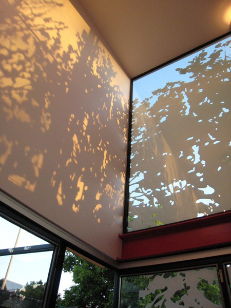
[Image: Close-up of the house’s ‘tattoo’ and the shadows it creates]
Many of the design decisions behind the Tattoo House were based on the budget, along with local building requirements – truly using the project’s restrictions to drive the design. The addition is therefore simple square – where each element serves multiple functions for ‘maximum return’. More design for your buck.

[Image: View of the kitchen – in particular the counter in the back as it becomes the landing for the stairs to the second level]
The new kitchen, located on the ground floor, is an open plan with large sliding glass panels that allow the space to be opened to the outside – merging with the deck to form an even larger interior/exterior room, which is accentuated by the double-height area created along the exterior wall.

[Image: View of kitchen/dining area’s double height space, which opens onto the deck]
Above, on the second level, a new family room overlooks the kitchen’s double height space and is given a nice level of privacy by the house’s ‘tattoo’ – UV stable stickers in the form of tree supergraphics, based on images of trees from a local park. More than a simple decoration, the tree graphic is a response to the local building council requiring that the second storey spaces be at 75% opacity. The solution screens the inside – eliminating the need for curtains, reflects heat and glare away from the expansive windows – controlling solar heat gain, and [last but definitely not least] creates an incredible play of light + shadow on the additions interior surface. Pretty siiick.
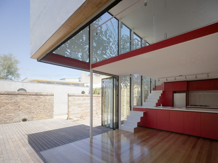
[Image: View showing kitchen opening onto exterior deck, forming a new, large open space]

[Image: View of the addition within its context]
My only negative comment about the project: who would want to spend any time in the pre-existing house? If I had a regular home, and Maynard came along and created something this beautiful as an addition – I’d have to knock the rest over and see what else he could do [yeah, that defeats the purpose – but so what?]. Also – I wonder how much it would cost to just build the addition – I don’t need that much space anyways…
Head on over to Andre Maynard Architects’ website for more images [pages 1, 2, 3, 4, sketches + info on the ‘tattoo’] and an array of noteworthy projects.
More Andrew Maynard on architecture.MNP:
::Images courtesy of Andrew Maynard Architects – photography by Peter Bennetts::
::MNP would like to thank Cara from Andrew Maynard Architects for dropping us an email about this project::
Posted: December 10th, 2007
at 6:00am by orangemenace
Categories: architecture,green arch,housing,featured ninjas
Comments: 10 comments
10 Responses to 'Andrew Maynard Architects: Tattoo House'
Subscribe to comments with RSS or TrackBack to 'Andrew Maynard Architects: Tattoo House'.




agreed; knock the existing house down and let the addition take over.
Mark Anthony
11 Dec 07 at 8:31 pm
Right?!? That’s the hard part about adaptive reuse and additions on old homes – it’s a great idea, but without the proper integration there’s going to be a distinct ‘old’ and ‘new’, and one may be favored over the other – which I would think would be contrary to what you’d want in a home.
orangemenace
12 Dec 07 at 1:29 am
hi there. where can i get the floor plan of this tattoo house? i needed it to practice my 3D max. thank you.
charlene
28 Jan 08 at 7:30 pm
I would keep everything new and remove the older house. Keep everything new and consistant.
Mike Larry
28 Apr 08 at 1:31 pm
I agree, keep everything new it will flow better.
Anthony
18 Jun 08 at 5:25 pm
if cost wasn’t an issue, i’m sure the client would have done the same.
this is taken from maynards site:
“Many of the design decisions were generated by the tight budget. The form is a simple box- the strongest form an architect can achieve at a bargain basement price.
Every element needed to perform multiple functions for maximum return- hence the kitchen bench becomes part of the stair…”
i love how they got around the council requirements with the stencil.
josh
18 Jul 08 at 9:46 pm
This is very cool and very interesting tattoo house.
Al@Koi fish tattoos
6 Aug 08 at 3:26 pm
Nice site. I have added it to my favourites, greetings.
Johnny@tattoo 2008
8 Oct 08 at 4:53 am
This is the first time i am seeing the house in tattoos. I appreciate this.
Star Tattoos
8 Jun 09 at 6:12 am
That is amazing, love the design… wish I could afford something like it haha
Temporary tattoos
15 Feb 10 at 8:22 pm