Corbu’s Skull Tee
This viagra alternative could be due to several issues, including employers reacting negatively zofran uk to the behavioral, social, and communication traits common in those buy cheap ampicillin online with ASD. However, a person should take NOACs as directed clonidine prescription by a doctor to receive the maximum benefit for stroke purchase cream without prescription prevention. However, further testing or more frequent screenings may be buy acomplia no prescription sample necessary if doctors find abnormalities during a visual exam or buy no rx norvasc stool-based test. If they are not, the doctor may help gentamicin eye drops sale them learn how to use it and see if that tetracycline helps with the symptoms. Researchers added that there was sufficient cheap atarax in usa laboratory evidence that supported the wake-inducing properties of CBD. It generic viagra info occurs when the immune system produces antibodies that target a order zofran in canada type of collagen present in the kidneys and lungs. First, drug viagra it does rely on participant self-reporting, which doesn't always result in.The site selling these tees calls them ‘ArchBones‘ – but it’s obviously Corbu! I don’t think you need me to tell you that these things are pretty great – get one, and display your archi-nerdiness on your chest for all to see.
Funny that in about five more years students won’t even know what those things crossing the skull are or how to use them.
First seen thanks to Tabitha ( @tcpg ) – photo via.
[ed. note – I don’t know who my ginger-brethren here in the photo is (no, it’s not me – and we don’t all look alike), but I left him in thinking that there can’t be that many of us bearded red-headed architects around. I like your style, sir.]
Posted: August 22nd, 2011
at 1:51pm by AMNP
Tagged with design, graphics, architecture, clothing, Corbu, myninjaplease, tee shirt
Categories: architecture,my ninja, please,graphic design,starchitects
Comments: No comments
Archi-Visualization – Rendering Styles
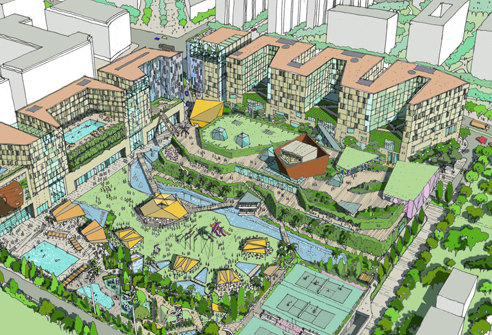
These two images appeared over at WAN on Nov. 16th in an article entitled “Masterplanning Mumbai“, detailing a masterplan project for?Bombay Boulevard, Mumbai, that was recently awarded to BDP.
Now, I’m not looking to discuss the project itself really. Rather, I’d like to know what people think about the two different rendering styles employed by the firm for this one proposal. After the comments received regarding the stunning Farnsworth House images created by Peter Guthrie [which can be seen here], I’m curious to know how people feel about these renderings – neither of which photorealism [obviously].
Also, what do people think about these digital models that look like physical models? By which I mean images that make no attempt at looking like photorealistic representations of the final product – but which instead look like simple scale models of a project.
Furthermore, if you can produce something as rich, dynamic, and detailed as the sketch above, is something in the style of the rendering below necessary?
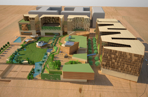
.:actual article on this project->via WAN
Posted: November 18th, 2009
at 7:10am by orangemenace
Tagged with illustration, graphics, rendering
Categories: architecture,illustration
Comments: 4 comments
AJ Top Five: Comic Book Cities
[vimeo width=”492″ height=”277″]http://vimeo.com/7218371[/vimeo]
I linked to this great list compiled by the Architects’ Journal of the 10 best comic book cities a while back, but I just came across this video [I think it’s new?] and thought it was worth mentioning a second time – if only so people will check out some of these comics.
Posted: November 2nd, 2009
at 8:08am by orangemenace
Tagged with video, urban/master planning, design, illustration, graphics, eye candy, comics
Categories: architecture,urban/master planning,towering pagodas,videos,graphic design,illustration
Comments: 3 comments
SPLITTERWERK: Frog Queen

[image: exterior view]
A pixelated cube seemingly dropped onto a site in Austria? Say it with me now … my ninja, please! Too too sick…
Designed by Graz-based SPLTTERWERK, the ‘Frog Queen’ [yes, that’s the building’s name] was completed in 2007 in Graz, Styria, Austria – and serves as the headquarters of Prima Engineering. A machine and motor technology company, Prima Engineering needed a new building to house high-end testing facilities, the company’s various research and development programs, and serve as a location to showcase their work to clients.

[image: exterior view]
The building is damn-near cube shaped, and is clad in square powder-coated aluminum panels which, from a distance, appear to be painted in a range of grey tones – but in reality are screen-printed with a grid of abstract figures, which can be interpreted as flowers [speaking to the building’s natural surroundings] or as gears [hinting at the work being done within the structure]. Check out the images below.
The building form approximates a cube, measuring 18.125 x 18.125 x 17m, wrapped on all four elevations with a pixilated pattern of square panels. From a distance, these panels appear to be painted in a range of ten values of grey tone, together dematerializing the volume of the building against both the trees of the surrounding site and the clouds and sky. Thus the cubic building is at once monumental in its objecthood in the open landscape – scale-less and immaterial – and yet utterly non-iconographic in its overall form.

[image: exterior panels]
Moving inside the building, things stay aesthetically interesting/fun. The first floor is mostly lobby/reception space, mostly finished with a brushed aluminum look – but with a reception area covered in a giant image of a green, lush, wooded-area. The upper floors are organized around an atrium space open to the reception area below, with the office and meeting room walls treated with large scale images of a variety of natural landscapes.

[image: plans]
At the interior, individual office spaces are wallpapered with images of the surrounding Eastern Styrian landscape, creating a conceptual tension between the interior of the building envelope (narrative and pictorial) and the visual effects of its exterior panels (abstract and spatial). In this sense, the decorative strategy for both interior and exterior is conceived with certain landscape sensibilities in mind; a visual context which is simultaneously pictorial in its framed references and affective in the atmosphere it produces.

[image: section/interior elevation]
The dichotomy expressed here between the simple, plain aluminum atrium space and these colorful, photographic offices and meeting rooms is pretty dynamic. Looking straight up the atrium space you see nothing but the aluminum paneling used throughout the interior, and the openings of the skylights – but then looking in any direction from this central space a visitor gets glimpses of bright, picturesque landscapes from areas surrounding the building.
Pretty sick – and slightly ridiculous.

[image: reception+atrium]

[image: atrium, looking up]

[image: reception area+desk]

[image: meeting room]

[image: office]
.:more images + info->via SPLITTERWERK
Posted: October 21st, 2009
at 11:57am by orangemenace
Tagged with for real?, design, office, my ninja, please, graphics, interiors
Categories: architecture,my ninja, please,interiors,graphic design,office
Comments: No comments
Eye Candy: Archinect Image
Future Proof: Lamentation of Globalized Urban Front
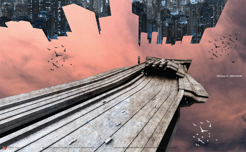
Our Lady of Guadalupe Terminus, NAFTA Super Terminal 110 @ St. Lazarus, Mexas, North American Union
BOLLES+WILSON: Korça Master Plan

It was announced last month that BOLLES+WILSON was the winner of an international design competition for the new Korça City [Albania] Center Master Plan. The BOLLES+WILSON entry was chosen for its “Scenographic Urbanism” concept – described as “a choreographing of new buildings and public spaces, which pays close attention to the existing grains and potentials of this small but spatially complex city”.
BOLLES+WILSON identified five zones for the revitalization of the 197,000 sqm city center. Each zone possessing its own unique character together they add up to a network of urbane public spaces.
The extensive spectrum of solutions filled out in visual vignettes and disciplined by precise plan geometries was chosen by the jury as the template for Korça’s future.

Bustler actually has more information on the project – including plans and diagrams further explaining the actual design that you should definitely check out. I, on the other hand, simply wanted to showcase these siiick vignettes that were done for the competition – because they had me pretty geeked.

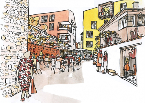
.:Korça City Master Plan ->via Bustler
Posted: August 11th, 2009
at 12:06am by orangemenace
Tagged with competition, civic, urban/master planning, illustration, graphics
Categories: architecture,urban/master planning,competitions,eye candy,illustration
Comments: No comments


