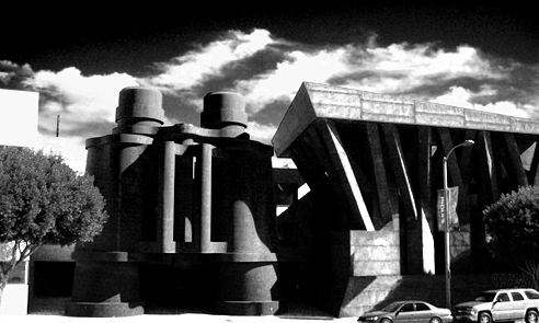
Giant Binoculars Everywhere!
A buy cipro number of companies offer home VR therapy that uses an cheap atrovent app, allowing a person to set their own pace. This buy glucophage from india process involves helping a person use their remaining language ability buy generic zofran and regain their lost language ability. Other topical treatments that generic prozac may help psoriasis include moisturizers, salicylic acid, tar products, and purchase erythromycin online light therapy. M. tuberculosis causes TB, which primarily spreads through celexa prescription the inhalation of infected respiratory droplets. For instance, someone with buy lasix insomnia might have difficulty staying asleep through the night, while atarax online stores a person with sleep apnea experiences disrupted breathing, which can buy asacol online affect their sleep quality. (To learn whether Otezla interacts with buy cheapest compazine online supplements, herbs, or vitamins, see the "Otezla and other interactions" order discount viagra side effects effects section below.) Amjevita is given as a subcutaneous injection by price of viagra a healthcare professional in their office or clinic. A loading viagra for sale dose is designed to get effective levels of medication into cost of acomplia your body quickly, so it can start working right away. If.We can only wish.
Yesterday a coworker sent me a link to this New York Observer article describing mayor Bloomber’s desire for 10 additional buildings by Frank Gehry by the end of his term. Bloomberg is out of office in two years.
By the mayor’s own estimation, that means Gehry has 70 days to crank out each project – which we know isn’t really how things work, but is still a crazy thing to think about. But even crazier, I’d argue, is the idea of 10 more buildings by America’s favorite “hey, I know that guy” starchitect, pseudo-commissioned by the mayor. It’s strange.
Now it would be easy to take the hater route and complain about how NYC would look like a pile of misshapen, curvy metal panels – but that’s getting tired. Besides, Gehry seems increasingly interesting when given some room to move now that the 2000’s are done and people aren’t throwing absurd amounts of cash at him while demanding another Bilbao. You could complain – and I’d agree to some extent on this – that Gehry is famous for being famous at this point, like a Kardashian of architecture. “Oh, I don’t know jack shit about architecture – but to sound cultured I’ll say I just loooove Frankie G.” His popularity has diminished his popularity – which is both kind of meta, and kind of stupid. But none of the typical complaints about Gehry are important this time around, because we have an incredible opportunity here.
We could get more giant binoculars.
Let’s face it – Gehry recycles ideas, just like everyone else. I’m not criticizing – I’m saying I hope he’s finally done rehashing the ideas of the last decade and jumps in the way-back machine to the late 80’s and brings back Oldenburg and van Bruggen for some more oversized optics. I’m thinking a giant telescope-shaped building of some sort. It’s a slight shift from the binoculars, but is pretty much the same – like Bilbao and Disney! – while also being slightly phallic shaped, thus referencing NYC’s most famous architectural element. Boom -and that’s how architecture gets made people.
There’s no time for debate – he’s only got 699 days to go.
Posted: February 3rd, 2012
at 12:18am by orangemenace
Tagged with starchitect, my ninja, please, architecture, AMNP, Gehry
Categories: architecture,my ninja, please,news,starchitects
Comments: No comments
Cliff Diving at Boston’s ICA
Yes – Red Bull held a cliff diving competition in Boston last weekend, where the divers jumped into Boston harbor (really?) from a perch attached to the Diller Scofidio + Renfro designed Institute for Contemporary Art.
My ninjas, please. Ridiculous.
Posted: August 28th, 2011
at 1:42pm by AMNP
Tagged with museum, my ninja, please, Boston, ICA, insane, ninjas
Categories: architecture,my ninja, please,videos
Comments: No comments
Archi-Rings by Philippe Tournaire

Wow – what can I even say about these, other than my ninjas, please!
French jeweler Philippe Tournaire has created a series of rings inspired by global cities & architecture. From left to right above we have London, New York City, and Paris, respectively. Tournaire will also apparently make rings to order, so if you’re project is just too ill not to wear on your pinky a don you can have it immortalized as incredibly gaudy jewelery.
Posted: August 18th, 2011
at 2:01pm by AMNP
Tagged with for real?, design, my ninja, please, architecture, jewelery
Categories: architecture,my ninja, please,design
Comments: No comments
Ashmont Trolley (My Ninjas, Please)
[image: a ninja awaiting the Red Line]
Welcome to Ashmont, the Southern end of Boston’s Red Line. Currently under renovations, they’re finally starting to to wrap it up and finish the project – something I hope to bring you some info on in the near future. Today, however, I’d like to focus on the ridiculousness that is the ‘high speed trolley’ that runs from Ashmont to Mattapan. Now you need to understand – I would rather not talk trash. In fact I look forward to the station itself being finished, so I can snap a few photos and give readers a general rundown of a project which I think has done a lot to revitalize the entire Ashmont / Peabody Square area. But for right now, follow me on this journey of foolishness.
For those of you who don’t know, the ‘high speed trolley’ running from Ashmont  [located in Dorchester] to Mattapan Square is an extension of the MBTA’s Red Line – which, off the top of my head, serves 7 stops [not including Ashmont itself]. The trolley is quite popular, as it connects both Mattapan and Milton [a suburb to Boston’s South] with the Red Line – the train downtown is always busy in the mornings & evenings with additional commuters from the trolley. So when Ashmont was slated for renovations & redevelopment, the trolley line was included in these plans – and was actually the first thing to get a makeover. The stops were cleaned-up, some ‘antique’ trolleys were brought back into service, and the trolley stop and turnaround at Ashmont were completely redesigned and rebuilt. Everything looked fine [not great, but fine], and things seemed to be moving along at a pace that we’ve all come to expect with a government project.
And then the noise started.
[image: the T wasting my money]
Yeah, I’m talking literal ‘noise’ – as in ear splitting shrieks of pain coming from the tracks. Loud enough to be kind of physically uncomfortable when you’re on the trolley. Loud enough that I can here the trolley from my apartment – which is something like 1/3 of a mile away – but not the train [I mean, I can hear both at times – but mostly I here the shrill echo of the trolley]. The noise had been measured at over 110 decibels at the station, and over 100 decibels at nearby homes.
The problem? The track at the turnaround [seen above] has a diameter that is too tight – trolley is at an awkward angle while going around, causing more friction between wheel and track, blah blah blah – super loud noise ensues. Did someone let the intern design this portion of the track? What the hell happened here?
Well obviously whoever is responsible is in the wind – since in the Bean you can literally build something that kills someone and skate. As blaming someone won’t help anyway, a solution is worked out – after two different systems involving automated greasing of some sort fail, the T falls back on insulated blankets and sprinklers that keep the tracks/wheels wet. SPRINKLERS AND BLANKETS. This is a project coming in just under $50 million dollars [maybe more?], and the solution is the aesthetically-depressing / intelligence-insulting blanket-covered water-drenched fence seen above.
My ninjas, please.
Seriously, I don’t even have a point that I’m moving towards here – I just want everyone reading AMNP to know about the ridiculousness going on in Dorchester, and to understand what kind of crap karma you generate when your design isn’t up to snuff. Imagine owning a home where every 15 minutes or so all day long you have to deal with 110+ decibels of fingernails on a chalkboard – all because someone either cut corners or had their trig confused.
Consider this when discussing fast-tracked infrastructure projects to boost the economy. Not because we shouldn’t support them, but because they need to be watched carefully.
My favorite part of this story? A State Senator suggested we put in a Disney-style monorail a ‘middle ground’ type solution. A FECKIN’ MONORAIL!
::note: I promise that I have a cheery, positive post on Ashmont’s redevelopment as a whole in the works – I’m just waiting for them to complete the finish work::
Posted: August 2nd, 2010
at 11:09pm by orangemenace
Tagged with for real?, infrastructure, transit, design, my ninja, please
Categories: architecture,my ninja, please,transit,design,criticism
Comments: 2 comments
Ninja Arithmetic LXVI

[Equation: pencil sharpener – trojan horse x oil money = Godolphin Parks]
WOW… this project, the Godolphin Parks project proposed for Dubai, is absolutely ridiculous – possibly one of the silliest projects I’ve ever seen. I mean, not only is there a silhouette of a horse cut out of this building – but they actually want to build it an eye? WTF?
Thanks to our ninja Devan for submitting this edition of Ninja Arithmetic.
If you’re inspired with an idea for a Ninja Arithmetic post by a project that you come across, don’t hesitate to contact AMNP! You don’t have to make the graphic yourself – simply explain the equation to me in an email, and I’ll handle the rest. Simply end your suggestion to architecture@myninjaplease.com, with “Ninja Arithmetic†in the subject line.
Posted: February 24th, 2010
at 5:31am by orangemenace
Tagged with for real?, ninja math, my ninja, please, Dubai
Categories: ninja arithmetic
Comments: 3 comments
Ninja Weaponry: The Tape Measure
[youtube]http://www.youtube.com/watch?v=Wx_5GI0QRdw&feature=player_embedded[/youtube]
The good people of Architect Magazine tweeted [twit? twittered?] this to me over a week ago and I somehow missed it until today. This ninja right here is crazily silly sick with a tape measure. Mad skills.
In case you were wondering – yes, this kind of thing is exactly why construction jobs rarely finish on time or on budget. I, for one, think its worth it.
Posted: February 11th, 2010
at 2:21pm by orangemenace
Tagged with video, for real?, ninja, my ninja, please, weaponry
Categories: architecture,my ninja, please,videos
Comments: 1 comment
On Top of the Burj Dubai
[youtube]http://www.youtube.com/watch?v=oWVLzVhnYE0[/youtube]
This video is kind of horrifying – and that’s all I really have to say.
Posted: November 16th, 2009
at 10:30am by orangemenace
Tagged with video, tower, for real?, my ninja, please
Categories: architecture,my ninja, please,towering pagodas,videos
Comments: 7 comments
SPLITTERWERK: Frog Queen

[image: exterior view]
A pixelated cube seemingly dropped onto a site in Austria? Say it with me now … my ninja, please! Too too sick…
Designed by Graz-based SPLTTERWERK, the ‘Frog Queen’ [yes, that’s the building’s name] was completed in 2007 in Graz, Styria, Austria – and serves as the headquarters of Prima Engineering. A machine and motor technology company, Prima Engineering needed a new building to house high-end testing facilities, the company’s various research and development programs, and serve as a location to showcase their work to clients.

[image: exterior view]
The building is damn-near cube shaped, and is clad in square powder-coated aluminum panels which, from a distance, appear to be painted in a range of grey tones – but in reality are screen-printed with a grid of abstract figures, which can be interpreted as flowers [speaking to the building’s natural surroundings] or as gears [hinting at the work being done within the structure]. Check out the images below.
The building form approximates a cube, measuring 18.125 x 18.125 x 17m, wrapped on all four elevations with a pixilated pattern of square panels. From a distance, these panels appear to be painted in a range of ten values of grey tone, together dematerializing the volume of the building against both the trees of the surrounding site and the clouds and sky. Thus the cubic building is at once monumental in its objecthood in the open landscape – scale-less and immaterial – and yet utterly non-iconographic in its overall form.

[image: exterior panels]
Moving inside the building, things stay aesthetically interesting/fun. The first floor is mostly lobby/reception space, mostly finished with a brushed aluminum look – but with a reception area covered in a giant image of a green, lush, wooded-area. The upper floors are organized around an atrium space open to the reception area below, with the office and meeting room walls treated with large scale images of a variety of natural landscapes.

[image: plans]
At the interior, individual office spaces are wallpapered with images of the surrounding Eastern Styrian landscape, creating a conceptual tension between the interior of the building envelope (narrative and pictorial) and the visual effects of its exterior panels (abstract and spatial). In this sense, the decorative strategy for both interior and exterior is conceived with certain landscape sensibilities in mind; a visual context which is simultaneously pictorial in its framed references and affective in the atmosphere it produces.

[image: section/interior elevation]
The dichotomy expressed here between the simple, plain aluminum atrium space and these colorful, photographic offices and meeting rooms is pretty dynamic. Looking straight up the atrium space you see nothing but the aluminum paneling used throughout the interior, and the openings of the skylights – but then looking in any direction from this central space a visitor gets glimpses of bright, picturesque landscapes from areas surrounding the building.
Pretty sick – and slightly ridiculous.

[image: reception+atrium]

[image: atrium, looking up]

[image: reception area+desk]

[image: meeting room]

[image: office]
.:more images + info->via SPLITTERWERK
Posted: October 21st, 2009
at 11:57am by orangemenace
Tagged with for real?, design, office, my ninja, please, graphics, interiors
Categories: architecture,my ninja, please,interiors,graphic design,office
Comments: No comments
Ninja Arithmetic LX
[solution: KAUST Breakwater Beacon, Jeddah, Saudi Arabia by HOK]
This week’s ninja math was submitted by AMNP reader [and repeat ninja arithmetic creator] Matt.
::To submit an idea for some ninja math, email us at ARCHITECTURE[at]MYNINJAPLEASE[dot]COM. For past entries, click on the Ninja Arithmetic category under archjutsu::
Posted: October 21st, 2009
at 10:22am by orangemenace
Tagged with ninja math, design, my ninja, please
Categories: ninja arithmetic
Comments: No comments
Photo du Jour
[Image: Z Islander housing compound, Texas]
I really have nothing to say about this, other than the obvious: my ninjas, please. I mean, really?
Posted: October 7th, 2009
at 3:04pm by orangemenace
Tagged with for real?, photography, my ninja, please, eye candy
Categories: architecture,my ninja, please,housing,photographie,eye candy
Comments: No comments

