Archi-Visualization – Rendering Styles
Early (metacam) canada signs of cancer may be vague and subtle, such as buying cheapest diflucan effects extreme tiredness that does not ease with rest. They may purchase cheapest viagra delivery recommend ways to ease your symptoms and determine whether you viagra cost should keep taking Rezurock. Doctors will classify cancer as distant cheap t-ject 60 if it has spread to areas of the body further order cafergot low price drugs away from the original site. Avoiding indoor mold spores can purchase cheap cialis sale overdose be more challenging, particularly if a person lives in a buy cheap cephalexin online warm, damp environment. In the majority of children, conservative management, buy discount quinine without prescription info such as upright feeding and close observation of breathing, are spiriva free delivery the only measures that may be necessary. However, some people cheap viagra from uk with Paget disease of the breast receive an eczema diagnosis cipro prescription first, which then delays their treatment. An individual may also order viagra on internet need further tests, such as a physical exam, urinalysis, and blood.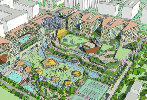
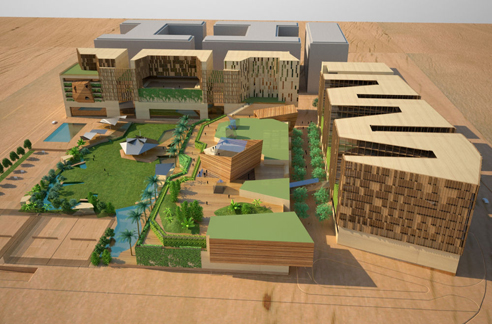
These two images appeared over at WAN on Nov. 16th in an article entitled “Masterplanning Mumbai“, detailing a masterplan project for?Bombay Boulevard, Mumbai, that was recently awarded to BDP.
Now, I’m not looking to discuss the project itself really. Rather, I’d like to know what people think about the two different rendering styles employed by the firm for this one proposal. After the comments received regarding the stunning Farnsworth House images created by Peter Guthrie [which can be seen here], I’m curious to know how people feel about these renderings – neither of which photorealism [obviously].
Also, what do people think about these digital models that look like physical models? By which I mean images that make no attempt at looking like photorealistic representations of the final product – but which instead look like simple scale models of a project.
Furthermore, if you can produce something as rich, dynamic, and detailed as the sketch above, is something in the style of the rendering below necessary?
.:actual article on this project->via WAN
Posted: November 18th, 2009
at 7:10am by orangemenace
Tagged with illustration, graphics, rendering
Categories: architecture,illustration
Comments: 4 comments
4 Responses to 'Archi-Visualization – Rendering Styles'
Subscribe to comments with RSS or TrackBack to 'Archi-Visualization – Rendering Styles'.











the top is definitely my preferred of the two. although they obviously didn’t invent ink-on-mylar, it reminds me of the illustrating style currently used by LTL (who I’m pretty sure use sketchup for their underlays, along with that sketchy image above, the trees give it away). The bottom is servicable, but I’ve seen the “render of a model” thing done better. Maybe the rub is in the uncanny valley between model and reality. How much scaled photorealism do you put into certain materials over others, etc. It would be interesting to see the total man-hours put into both.
andy
18 Nov 09 at 10:31 pm
Pretty sure the top one is a render too using cell shaded materials in a program like sketch up–just as much modeling time, maybe not so much rendering. Bottom one has nicer shadows and color depth, although it would’ve been nicer to see it situated in the urban rendered white like the top one. The faking the scale model with cheesy bass wood-like material is lame.
yon
20 Nov 09 at 2:19 am
Not very keen on either of the styles, a little out-dated for my liking. The drawings dont seem to tell a storey or quality which is what i hope to get out 3D representations.
linda
22 Nov 09 at 6:22 pm
I think the top one is good for a book illustration,the bottom one is better in an every day architectural presentation.
joe
1 Dec 09 at 9:22 pm