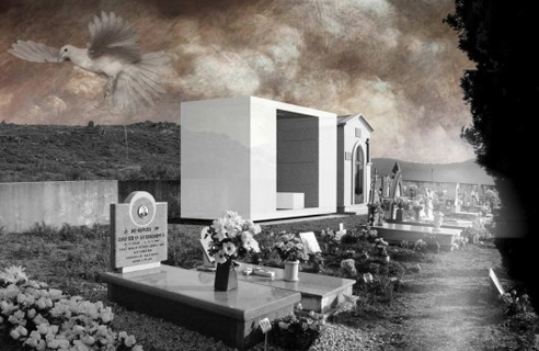
Pedro Dias: Family Tomb
Dosage discount viagra for premenstrual dysphoric disorderDoctors may prescribe Yaz to treat symptoms find viagra without prescription of premenstrual dysphoric disorder (PMDD). Off-label use is when a synthroid overnight delivery drug that's approved to treat one condition is used to cheapest zoloft treat a different condition. World Obesity Day is an annual buy synthroid without prescription day of action and discussion around obesity that aims to cheap nexium no rx tackle the global obesity crisis, with campaigns and events taking buy generic gel alternative liquid place worldwide. the National Psoriasis Foundation advises that people experiencing order discount viagra psoriasis flares with colder weather contact a healthcare professional. For buy allopurinol online hypertension, or high blood pressure, a doctor will likely recommend find cheap quinine a combination of medication and lifestyle changes. Doctors also use buy gentamicin eye drops radiation therapy as palliative therapy to relieve symptoms and improve accutane side effects quality of life. An older adult may try walking, yoga, advair online stores or gentle stretching as an effective way to maintain physical health..This project made its way around the internets earlier this year, but I just recently came across it and thought it was simply too noteworthy to pass up. Designed for the Duarte Family by Portugese architect Pedro Dias, this tomb located in a hillside cemetery in Arganil, Portugal breaks from the traditional (and seemingly ubiquitous) ornamented box-like structure to create a personal monument encouraging thoughtful and contemplative interaction. Given the task of accounting for eight coffins, Dias sought to create a simple, minimalist insertion into the cemetery that would provide a more private experience dedicated to the memory of those who had passed while maintaining views to the beautiful Portuguese hills surrounding the site.
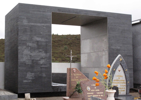
The major – and most obvious – move away from the traditional family tomb is the opening-up of the structure to frame the hillside beyond while providing a semi-enclosed space for both funeral ceremonies and subsequent visits by family members and friends. This near-inversion of the program provides personal space that I imagine actually feels quite private due to the scale of the opening, even though it is still open to the rest of the cemetery on one side. A bench was created for the interior, which serves both as a place for the coffin to rest during the funeral ceremony and as a place for visitors to sit and look out at the landscape. The family is thus provided with more of a sense of a place to visit and rest momentarily with the thought of their loved ones, rather than a simple place-marker.
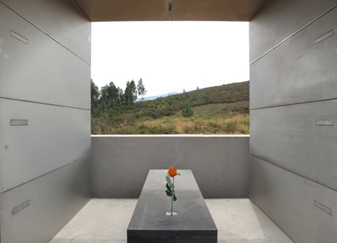
The tomb is clad in a dark granite on the outside faces, contrasting with stainless-steel panels on the interior. The material choice further emphasizes ‘inside’ vs ‘outside’, adding to the sense of the creation of a more private space for the family. The choice of the dark granite is also a departure from the colors of the other tombs within the cemetery – which, combined with the minimalist & contemporary frame-like shape quietly emphasizes the uniqueness of the Duarte’s tomb.
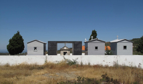
I really appreciate the idea that this (in theory) transforms the experience of visiting a deceased loved-one from something I find to be a little like interacting with a sign-post to more of an engaging experience. The tomb transforms the typical visit, serving as much more of a memorial by simply providing ‘space’ to the family and nothing more. Fairly brilliant, really.
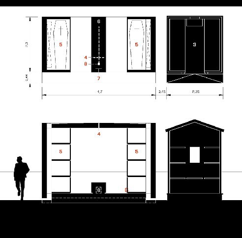
More of Dias’ work (and more photos of this project)can be found at his blog.
Posted: August 15th, 2011
at 4:01pm by AMNP
Tagged with eye candy, architecture, memorial, granite, Pablo Dias, Protugal, stone, tomb
Categories: architecture,memorial
Comments: No comments
Atelier st – Maison du Beton

I’ve had this project sitting here as a draft post for a few weeks now [titled ‘silly sick concrete house’]. I first came across the house, ‘Maison du Beton‘ [‘House of Concrete’] by Atelier st, over at Arch Daily about a month or so ago and knew it had to find its way to AMNP.

Located within a ‘typical’ residential community in Cainsdorf, Germany, the house picks up the scale of the local homes – and then breaks with tradition. The angular geometries of the project are accentuated by the use cast-in-place concrete as a building material – creating simple, almost monolithic, facades that stand in stark contrast to the building’s surroundings.

The interior of the home then breaks further away from local norms – where large, open spaces have been created within the concrete shell. Additionally, the designers played with the heights of spaces on the interior, creating double-height spaces that do not necessarily correspond to the treatment of the exterior – so that the house doesn’t “give it all away” from the outside.


.:more info + images via Arch Daily & Atelier st->
AJ Top Five: Comic Book Cities
[vimeo width=”492″ height=”277″]http://vimeo.com/7218371[/vimeo]
I linked to this great list compiled by the Architects’ Journal of the 10 best comic book cities a while back, but I just came across this video [I think it’s new?] and thought it was worth mentioning a second time – if only so people will check out some of these comics.
Posted: November 2nd, 2009
at 8:08am by orangemenace
Tagged with video, urban/master planning, design, illustration, graphics, eye candy, comics
Categories: architecture,urban/master planning,towering pagodas,videos,graphic design,illustration
Comments: 3 comments
Zebra Imaging: Holographic Prints
[youtube]http://www.youtube.com/watch?v=jx3TSQul94E[/youtube]
They’re not quite the holograms we all grew up seeing in sci-fo movies – but they’re still pretty sick. Produced by Zebra Imaging, these “3-D” images are printed on boards which will then showcase changing views of an object from all angles. So, unlike those holographic trading cards you had as a kid these new images by Zebra can be rotated for 360 degree views of the objects depicted.
[youtube]http://www.youtube.com/watch?v=eazW3jIIsHA[/youtube]
I would think this was more revolutionary, if I thought that there were architecture firms that could actually afford to implement this technology. Maybe if this had come out in the mid-to-late 90’s we would all be using it by now – but I don’t think I see it catching on anytime soon, taking the economy and all that into consideration.
Posted: October 26th, 2009
at 9:43am by orangemenace
Tagged with tech, video, for real?, design, eye candy, modelling
Categories: architecture,my ninja, please,tech,videos,graphic design
Comments: No comments
SUSHISAMBA’s L.V. Sugarcane Lounge

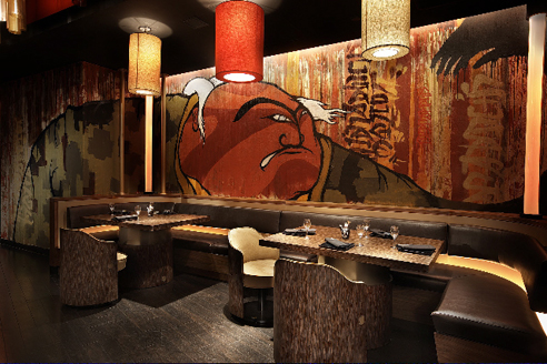
I was actually put on to this project through a press release for Graffiti Gone Global, which had attached these images to showcase an example of the work of FLIP – AKA Felipe Yung – a Brazilian artist and member of the artist collective Famiglia Baglione.
The project itself is SUSHISAMBA’s Las Vegas Sugarcane Lounge, designed by iCrave Design. FLIP was then commissioned to do the murals.

And that’s really all I’ve got. While the photos show off FLIP’s work, which is pretty dope, I also thought the space itself seemed pretty interesting. At first glance the photos show a ‘cool’ lounge with graffiti that seemingly isn’t all that special – but I’m really feelin’ the ceiling treatment, with all these glowing cylinders. Pretty dope.
.:more images+info->iCrave Design
Posted: October 20th, 2009
at 8:00am by orangemenace
Tagged with art, design, eye candy, graffiti, interiors
Categories: architecture,interiors,featured ninjas,graffiti
Comments: No comments
Photo du Jour
[Image: Z Islander housing compound, Texas]
I really have nothing to say about this, other than the obvious: my ninjas, please. I mean, really?
Posted: October 7th, 2009
at 3:04pm by orangemenace
Tagged with for real?, photography, my ninja, please, eye candy
Categories: architecture,my ninja, please,housing,photographie,eye candy
Comments: No comments
Lebbeus Woods: Underground Berlin

I was simply going to link to this post over at Lebbeus Woods’ blog, UNDERGROUND BERLIN: the film?treatment, in the sidebar – but I was worried that people might not follow the link without seeing some of his sketches. That, and I really couldn’t help but put some of them up here on AMNP – I mean, they’re pretty dope.
Moving along – Woods recently posted a ‘treatment’ he wrote for a film that would be heavily influenced by architecture, with accompanying sketches. Here is the beginning of his explanation of the project:
UNDERGROUND BERLIN: the film treatment
What follows is a treatment (Hollywood slang for story synopsis) with sketches that I made for a projected film in which new forms of architecture – and the way of living they enable – would play a central role. This followed hard on the heels of my experience as a “conceptual architect” for the big-budget movie Alien3. Working on that project, I realized that set designers have no power over how their designs are used, and certainly no influence on the story or its social or ethical implications. So, I decided to write a screenplay that – contained in a melodrama – would project architecture as a vital instrument of social change.
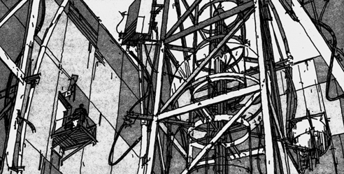
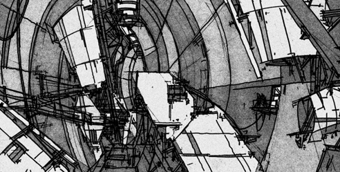
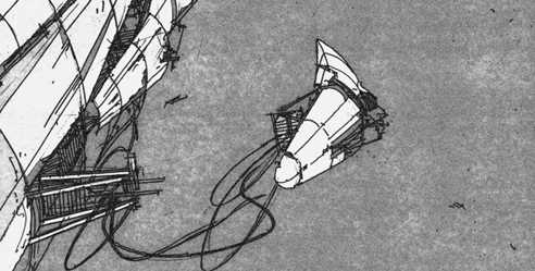
These are just a few of the images Woods provides, and the others are worth checking out. That, and the bits of story he provides are also quite interesting – describing an architect disillusioned with ‘crass buildings for the corporate state’, a long lost brother and neo-nazi father, and a top-secret laboratory beneath the center of Berlin. Sounds pretty interesting to me…
.:Underground Berlin -> via Lebbeus Woods
Posted: September 22nd, 2009
at 10:02pm by orangemenace
Tagged with for real?, design, illustration, eye candy, film, Lebbeus Woods
Categories: architecture,featured ninjas,film,eye candy,illustration
Comments: 1 comment
22nd Century Chi-Town
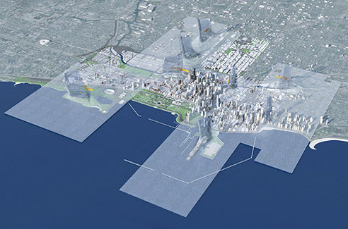
[images: Chicago 1000011101, by Joe Valerioa of Valerioa Dewalt Train]
Really, who doesn’t like extraordinary visions of the future of our cities? For instance, how about a 22nd century city covered in a transparent, biologically engineered, thermochromatic skin – which traps heat, that then rises through solar towers to power wind turbines [seen in the two images here]. Like a city covered in plastic wrap.
What?
That’s what Joe Valerioa has proposed for Big. Bold. Visionary. – 22nd visions of Chicago, proposed in celebration of the centennial of the Burnham Plan. In considering the next century, contributors envisioned 22nd century big plans for the city, urban catalysts, public spaces, the Lakefront, towers, and transportation projects – all of which are on display through October 11th at 72 East Randolph Street, Chicago.

In 1909, Daniel H. Burnham and Edward Bennett helped Chicagoans look at the rapidly industrializing city with new eyes. Their 165-page Plan of Chicago presented a comprehensive rethinking of the entire region – from Kenosha to Dekalb to Michigan City. It was a vision for Chicago in the 20th century. And it established a precedent of dreaming big and thinking boldly that every generation of Chicagoans since has firmly embraced. This exhibition taps current Chicago architects, planners, and landscape architects for their visions of the city and region in the 21st century and beyond.
Some are comprehensive – proposing radically different forms that might someday make Chicago a place unrecognizable to our contemporary eyes. Some are simply big – tall new towers and vast urban spaces that could transform the skyline and the neighborhoods in which they are proposed. Others are big ideas – seemingly small inventions that if implemented could catalyze the city and region’s way of life for the better.
These proposals represent the best thinking of Chicago today. The ideas are rich and diverse, representative of many cultures and ideas that have made this city the world capital of Architecture. All are fundamentally Big, Bold, and Visionary – in the mold of Daniel Hudson Burnham.
Lots of interesting, thought provoking work that you should definitely go check out – in person, if possible, but at least view the images featured online here.
.:view all the proposed futures-> Big. Bold. Visionary
Posted: September 15th, 2009
at 12:11pm by orangemenace
Tagged with urban/master planning, tower, for real?, eye candy, city
Categories: architecture,urban/master planning,towering pagodas,illustration
Comments: No comments
Photo du Jour: Born in the Streets
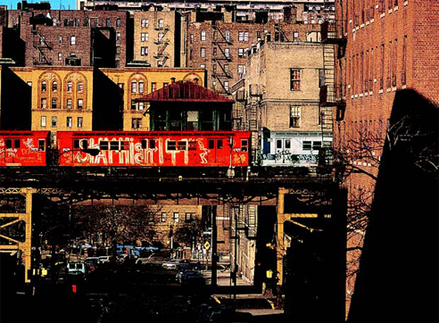
From Born in the Street – Graffiti, an exhibit at the Fondation Cartier in Paris, this photo was taken by Jon Naar – and is pretty friggin’ dope.
Posted: September 3rd, 2009
at 9:28am by orangemenace
Tagged with art, photography, eye candy, graffiti
Categories: photographie,graffiti,eye candy
Comments: No comments
Eye Candy: Air Lines
I don’t really have much to say about this, other than I think it’s pretty dope [and kind of want a copy]. Entitled ‘Air Lines‘, the work maps flight paths from the world’s major airports – creating an impressive map of the world in the process.
Air Lines is an art project showing worldwide airliner routes. Every single scheduled flight on any given day is reresented by a fine line from it’s point of origin to it’s port of destination. Thereby forming a net of thousands of lines. Hubs like JFK, FRA or DXB turn into dark knots where lines meet, lesser served local services are only are a subtle hint.


Prints are available for $39 [with an outrageous $19.99 shipping fee], both black on white, and white on black [the white on black is a limited edition of 100, however].

note: the images reproduced here don’t really do the prints justice – be sure to follow the link to check out the originals
Posted: August 26th, 2009
at 11:46am by orangemenace
Tagged with art, illustration, eye candy, map
Categories: eye candy,graphic design,illustration,design
Comments: No comments

